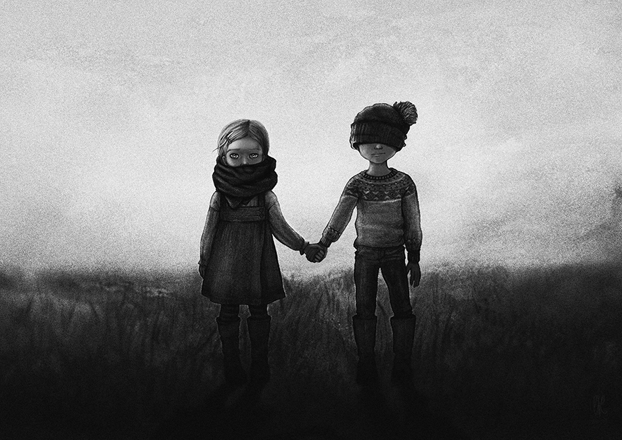
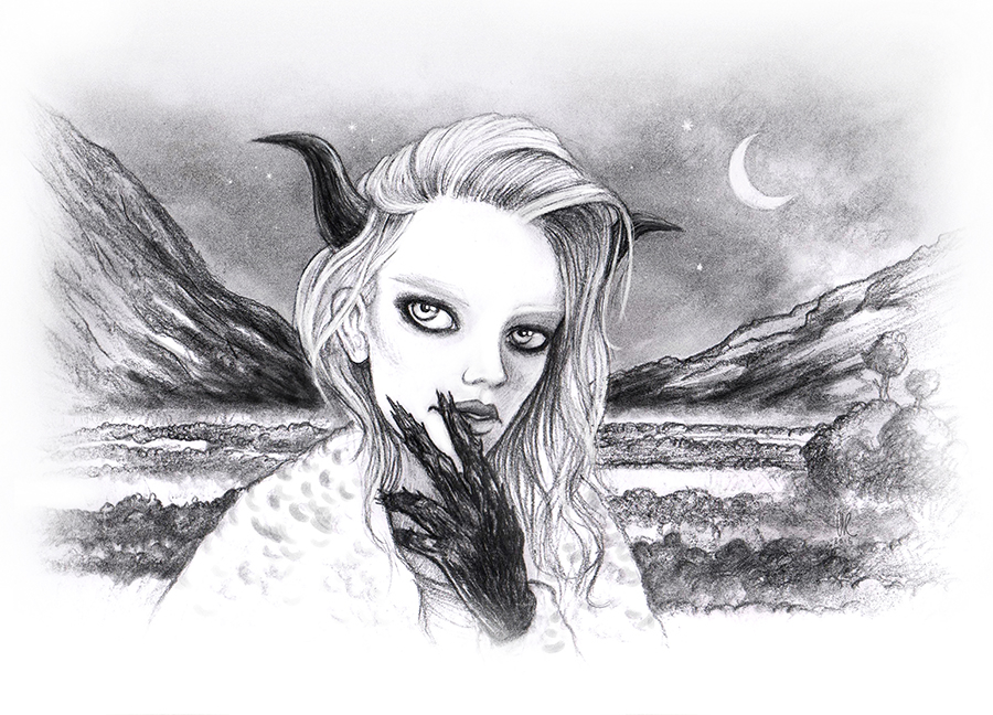
by Christopher Hutchinson
Pedagogy
noun, plural pedagogies.
1.the function or work of a teacher; teaching.
2.the art or science of teaching; education; instructional methods. http://www.dictionary.com/browse/pedagogy
This opinion has developed from years of experience teaching visual art on the collegiate level and recognizing that there are an increasing number of students that want to be art majors–and the majority consider themselves illustrators. Most of these students come to introduction art classes ill-equipped and advised. This article is an exploratory investigation into such a student’s attitude and pedagogy.
This trend was confirmed recently during a visiting lecture to a mixed media classroom of high school students that overwhelmingly wanted to be illustrators. The classroom of students had their portfolios and every student had the same bad habits that they will have to unlearn to become successful in the average college visual art foundation courses.
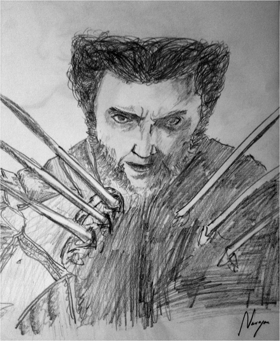
Note 1-Illustrators struggle in drawing class
Many of these high school students believe that illustration is an easier, freer, and cooler path to eventually produce their own cartoon/manga. In the very beginning of a student’s visual art journey, one should be open to many mediums and processes. Elementary through undergrad should be a fertile ground of experimentation with everything visual. Each medium and field has its champion or interest that leads to further development, a development that cannot be fulfilled with just illustration. Any young artist that has not explored these with the same lust for creating is missing out. Settling on illustration/animation in 9th grade is the equivalent of saying “hotdogs are the best food ever and there is nothing you can say to change my mind.” In the high school years students should become a fan of art and other processes. They should be open to receive and consume all aspects of art to eventually make informed decisions. Experiment with everything such as watercolor, etching, oil paint, drawing–especially drawing.
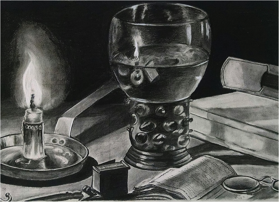
Note 2- Doodles are not drawing studies
In art, a study is a drawing, sketch or painting done in preparation for a finished piece, or as visual notes. Studies are often used to understand the problems involved in rendering subjects and to plan the elements to be used in finished works, such as light, color, form, perspective and composition. https://en.wikipedia.org/wiki/Study_(art)
Many of these self-proclaimed illustrators/animators cannot draw and have a very difficult time in introductory drawing classes on the collegiate level. These students often do not perform as well as students who are taking the course as a elective. The elective students have not built up years of bad habits. Elective students have not built up years of ego so they have the patience to receive proper information.
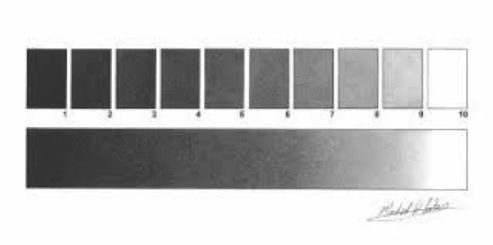
By focusing on illustration/animation as a student’s initial point of interest, bad habits get ingrained and affirmed for years. Students are actually training themselves to have extreme contrast as a form of reality, but in reality contrast is not nearly so common. They end up using super black sharpie markers and mechanical pencils, with no understanding of the many levels of gradation and value there are.
Sharpies and mechanical pencils are not the tools of someone interested in drawing. This problem is evident when these students attempt a a simple value scale.
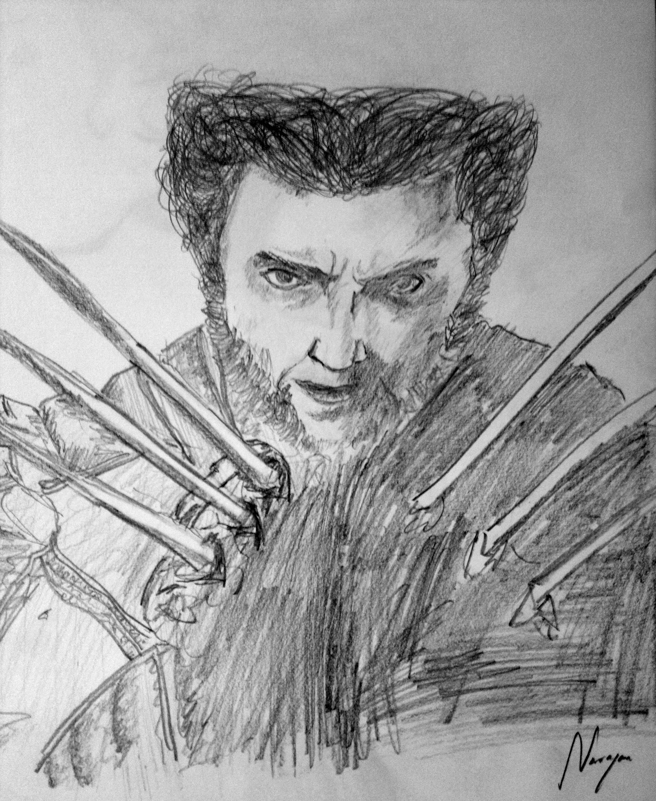
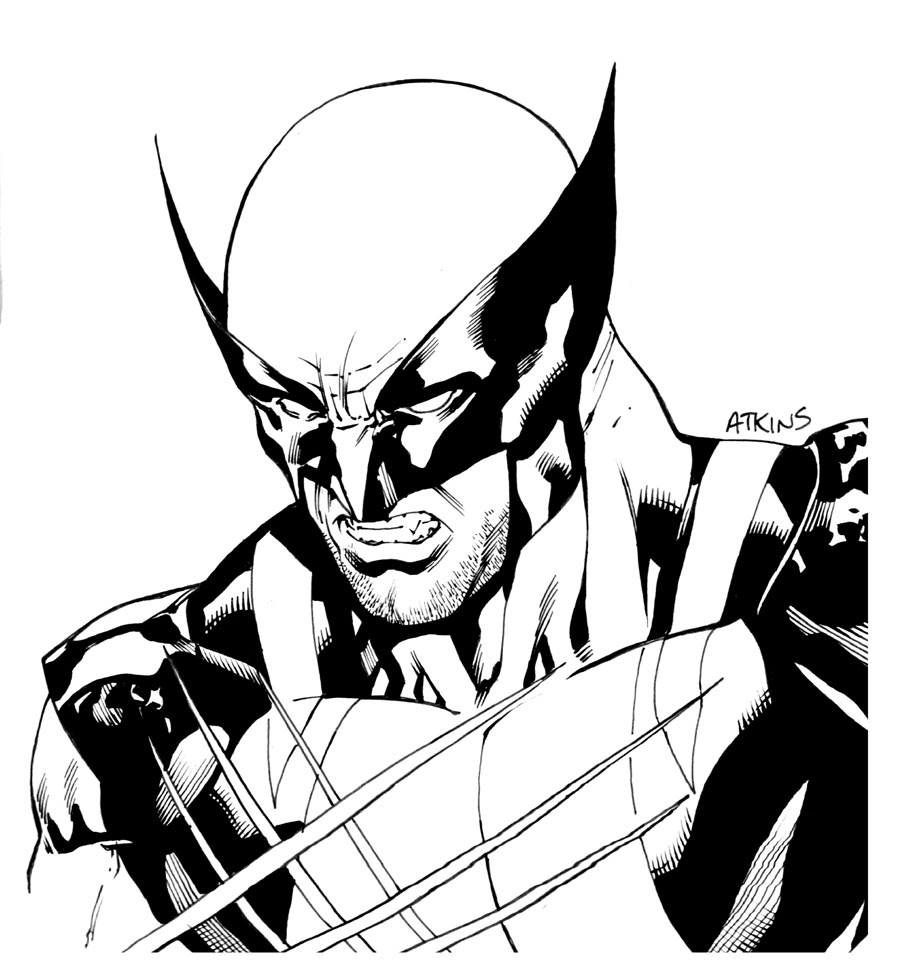
At best, the years of copying their favorite X-Men characters leads to lineweight. But surprisingly, many of these students’ linework also lacking.
Lineweight is a term that describes the relative ‘weight’ – strength, heaviness, or darkness – of the line against the background or support. It is governed by the pressure on your drawing tool as you make your line – whether this is decreasing or increasing the pressure on the tip so that it leaves behind more or less medium – or altering the angle so that more of the tip is in contact with the paper. http://drawsketch.about.com/od/drawingglossary/g/lineweight.htm
These doodles might as well be scribbles due to the fact that learning the nuances are not learned, rather they are crude lines void of aesthetic. The doodles of these students are not learning when the majority of what they are practicing is copying a flat image, not looking at life. Those doodles are not studies.
These students’ doodles represent another major problem on the collegiate level: not being able to finish a work of art. They have many sketchbooks of doodles without a portfolio of large complete pieces. The work for years without ever completing anything. The point of the study is to learn to finish. These students end up with a huge ego and years of unfinished work. Ego comes from completion, not hype.
Note 3- Copying a style is not creative or unique
Students that claim to be interested in illustration/animation are not actually interested in drawing or art making. They are interested in developing a “style unique to themselves.” This usually means they want to copy a specific type of style and change the accessories of the character to make it “unique.” Most of these students come with this in mind as a valid pursuit of a career. This is a huge mistake. Copying a style is not a creative or artistic choice and definitely not unique.
Note 4-Pedagogy
After a little critique and probing of the high school classroom portfolios, the real reasons began to emerge as to the motivation behind wanting to become an illustrator. What came up was excitement about the narrative, the movement, and the color of illustration. Here is where pedagogy can have a huge effect with some additional probing, some additional recommendations, and support. If a student is more interested in narrative, they need to be more equipped as a writer. If a student is more interested in movement, then what kind of movement–physical movement or illustrated movement? If color–interested in what kind of color–muted, saturated, color application?
This new crop of self-proclaimed illustrators and teachers have to explore and challenge what illustration really means. Many of these students, when they come to to the collegiate level, end up changing majors due to being ill-equipped artists that believe the skill of copying is an art form. They are very impatient students and expect quick results. There is a reason art classes are 3-5 hours long. Artmaking is not for the someone interested in quick results.
 Christopher Hutchinson is an accomplished Jamaican conceptual artist, professor and contributor to the art community as a writer, critic and founder of the nonprofit Smoke School of Art. He is a Professor of Art at Atlanta Metropolitan State College and has been featured as a lecturer including prestigious engagements at University of Alabama and the Auburn Avenue Research Library. For two decades, Chris has been a practicing artist. His works have been exhibited in internationally recognized institutions including City College New York (CUNY) and featured at the world’s leading international galleries such as Art Basel Miami. He has always had an innate passion for creating spaces where Africans and people of African descent contribute to an inclusive contemporary dialogue—ever evolving, not reflexive but pioneering. This requires challenging the rubric of the canon of art history, a systemic space of exclusion for the Other: women and non-Whites, and where necessary he rewrites it. He received his Master of Fine Arts Degree in Painting from Savannah College of Art & Design, Atlanta and his Bachelor of Arts Degree from the University of Alabama in Huntsville, Alabama.

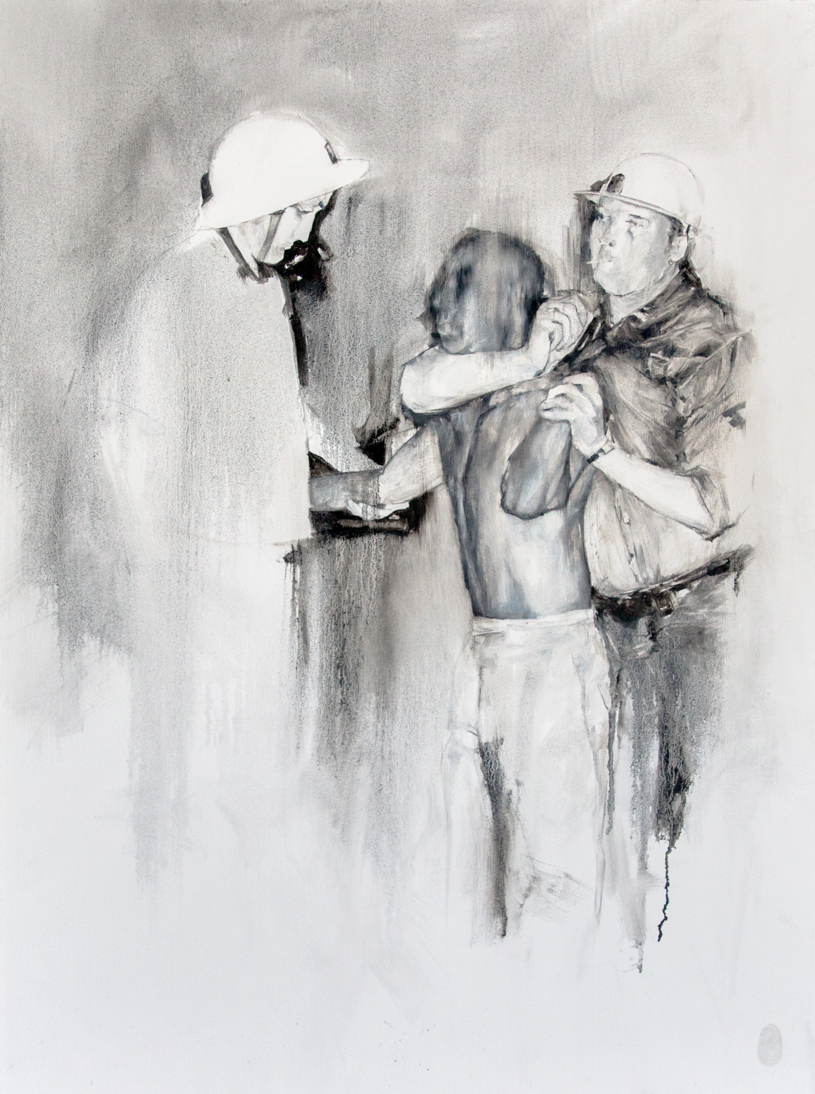
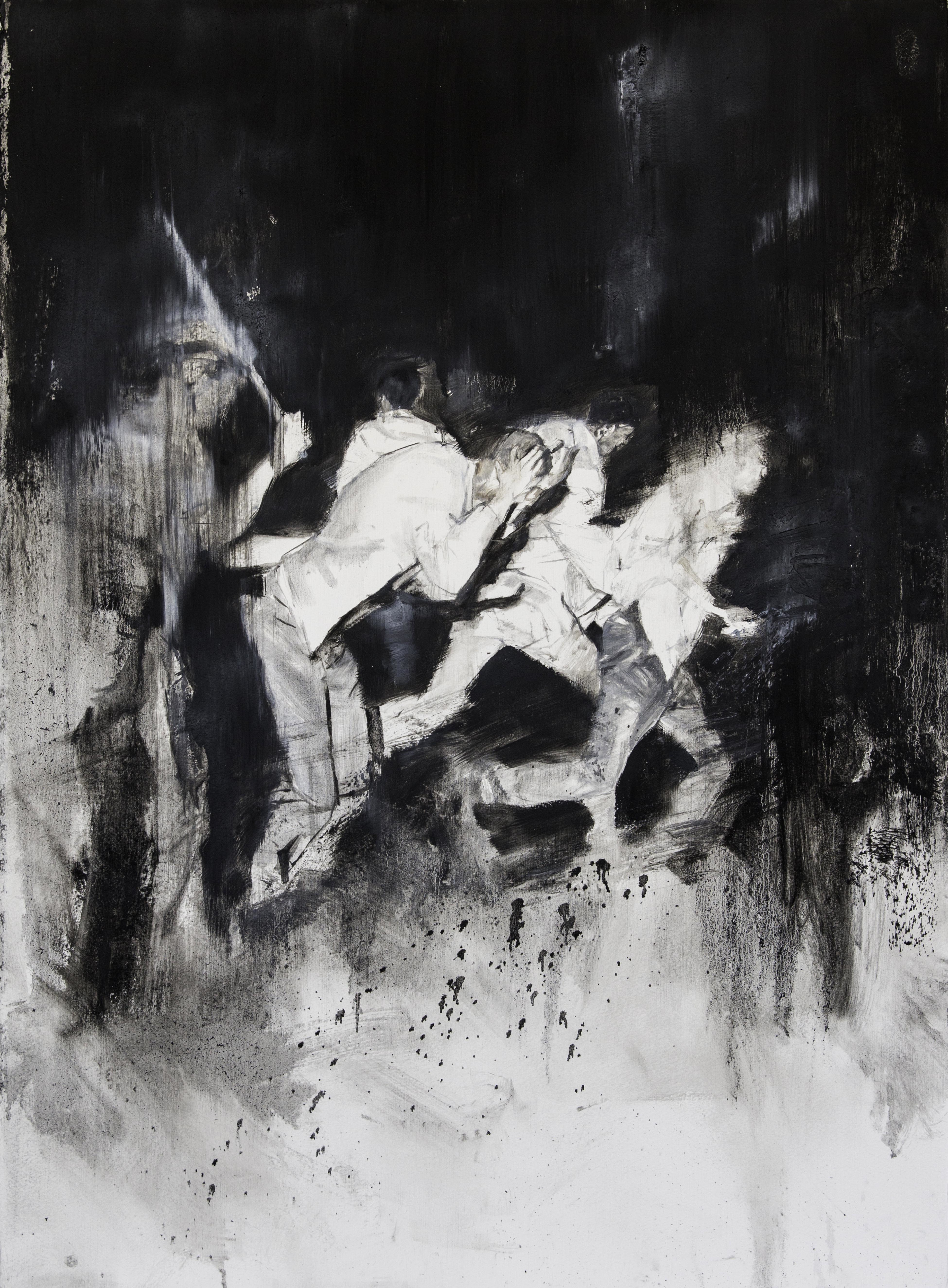
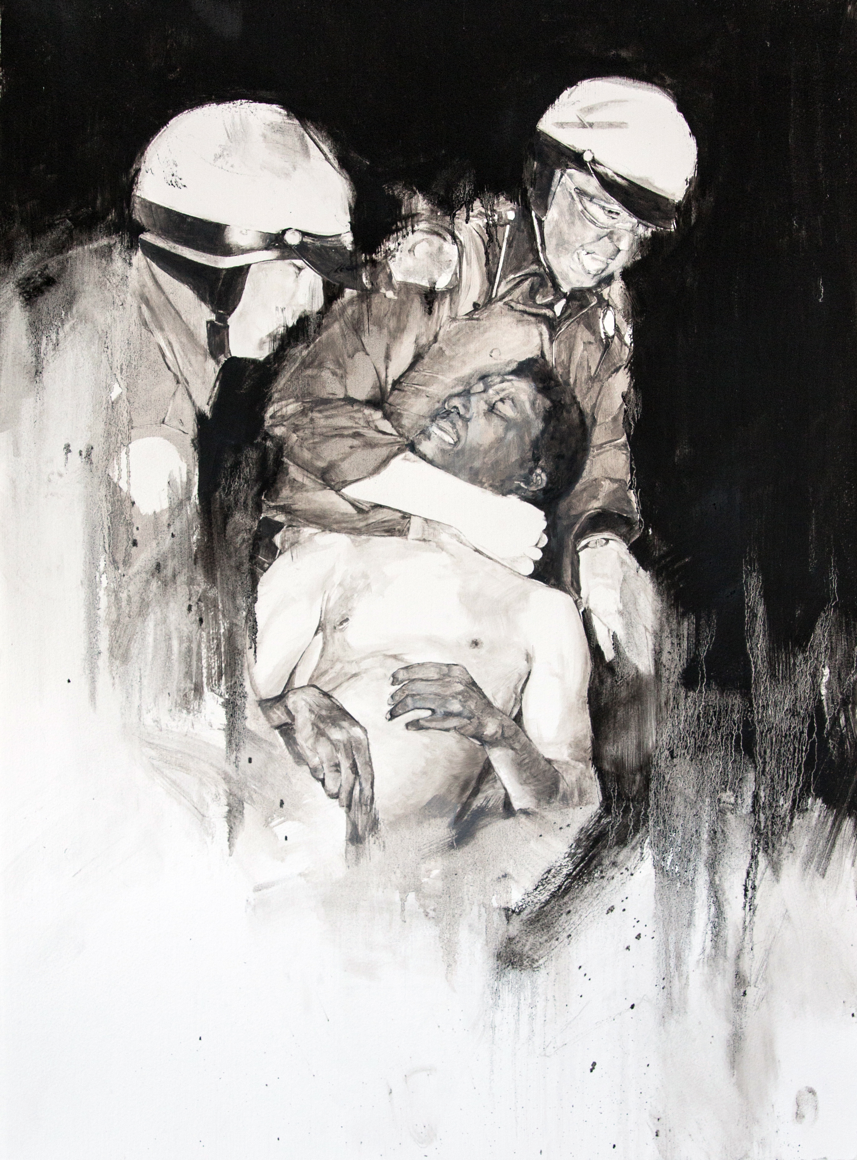
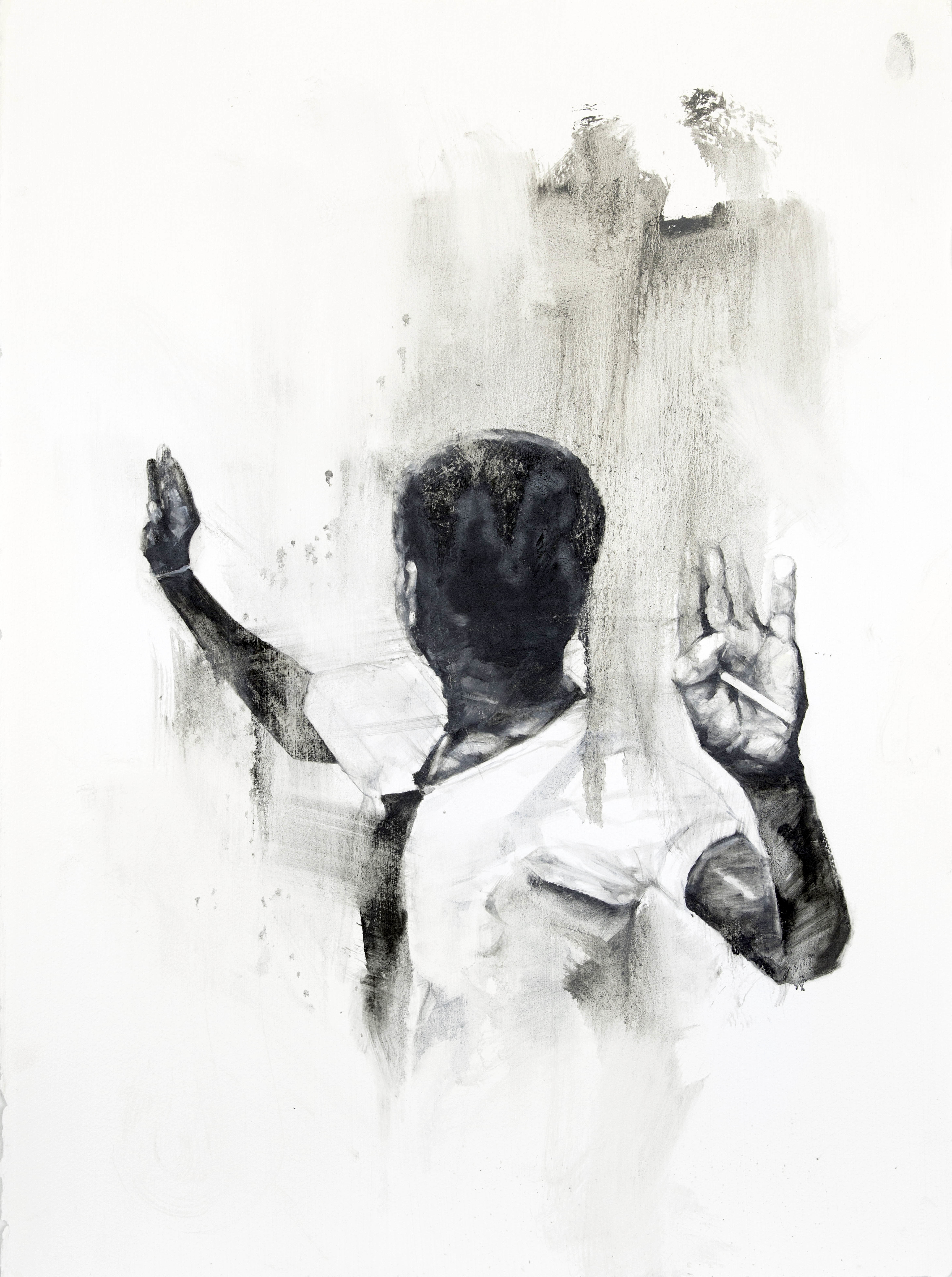
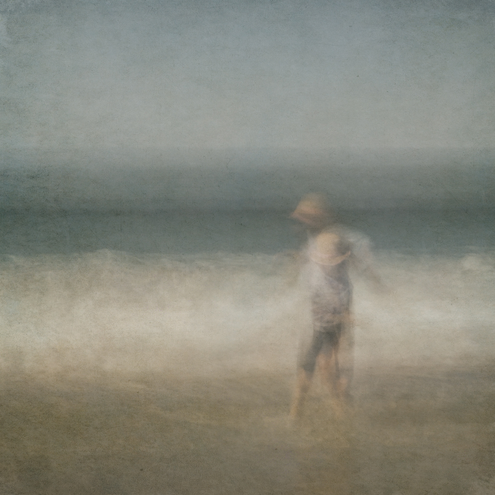
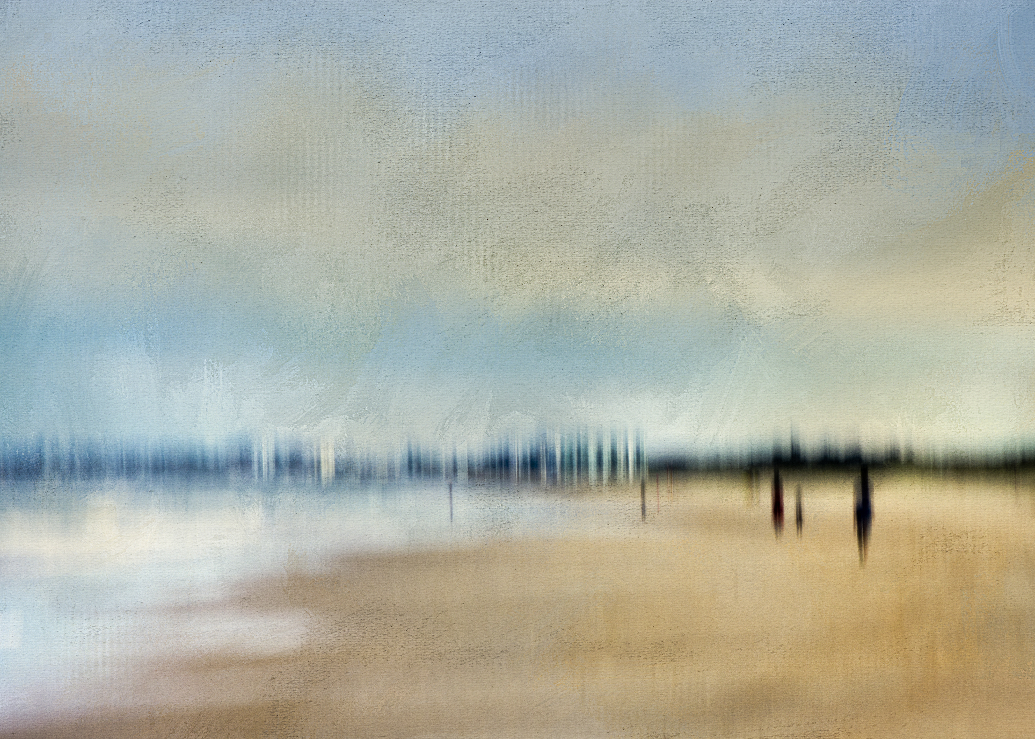
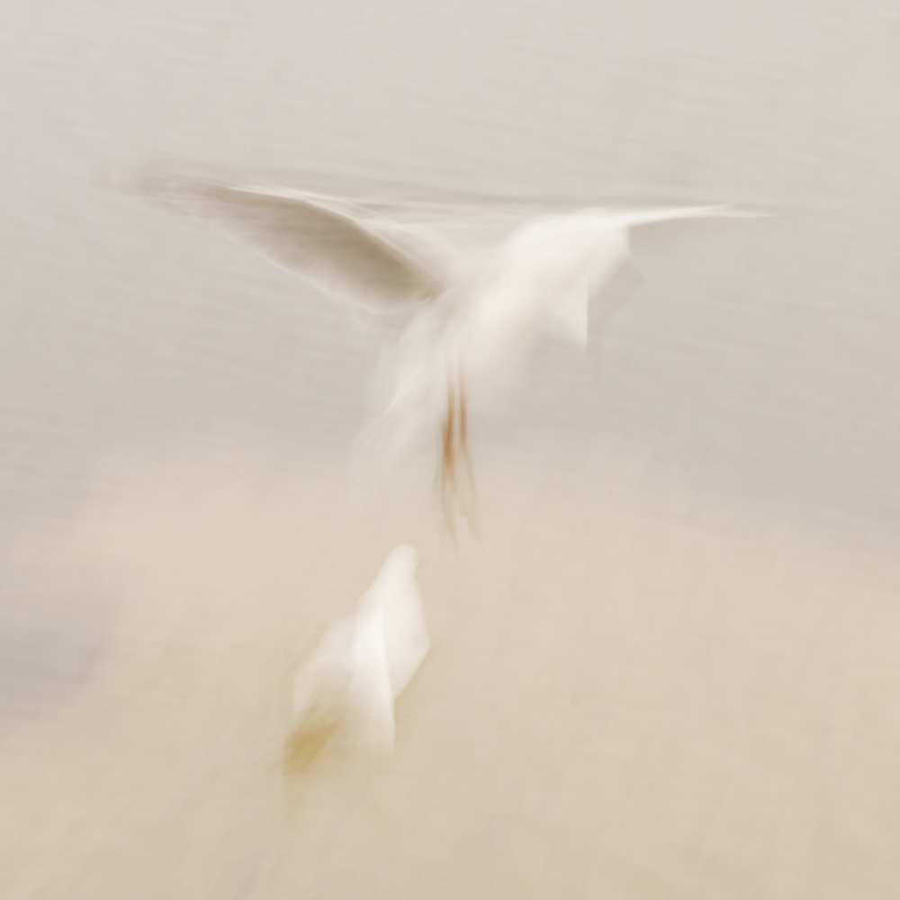
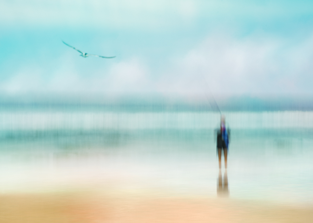
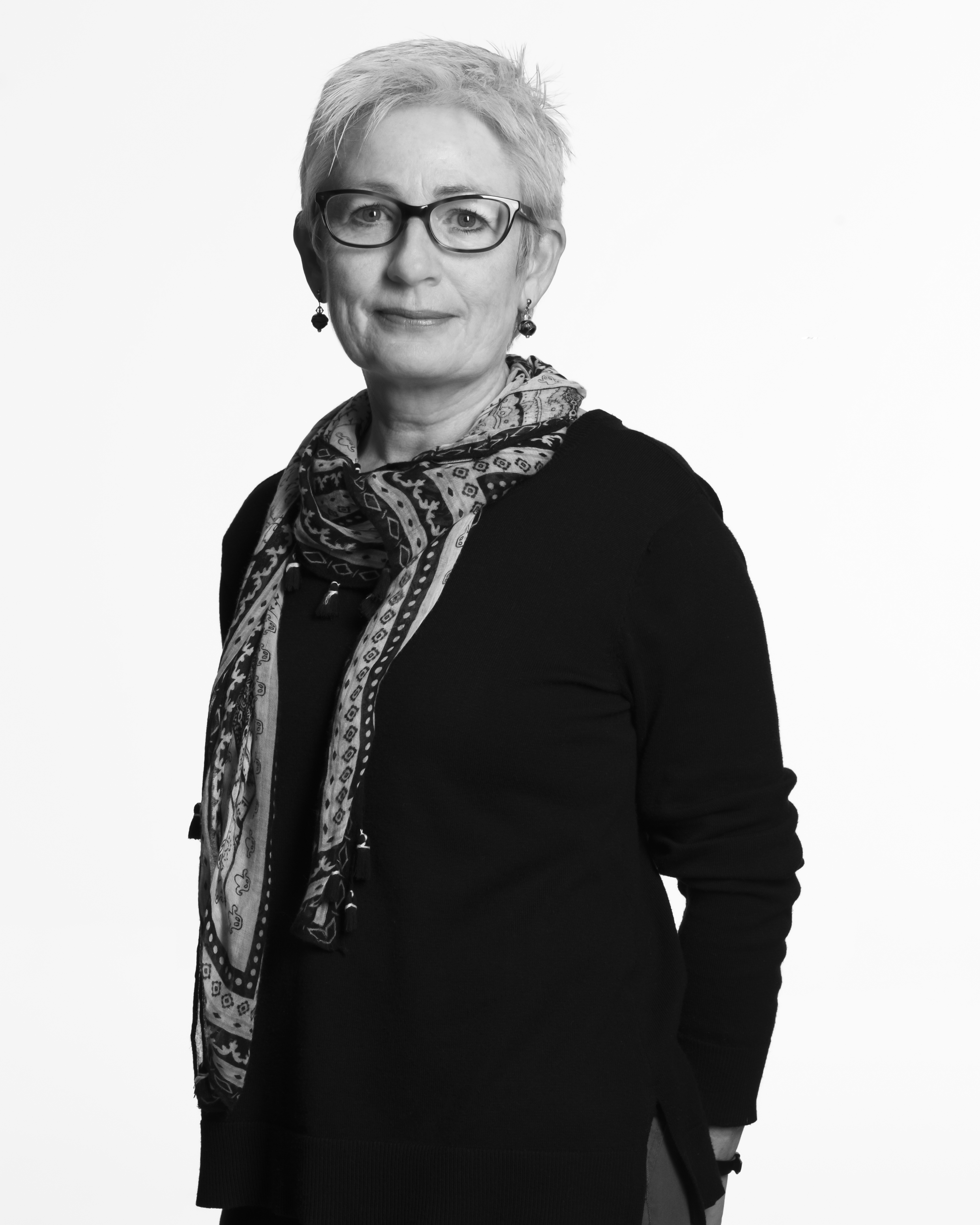
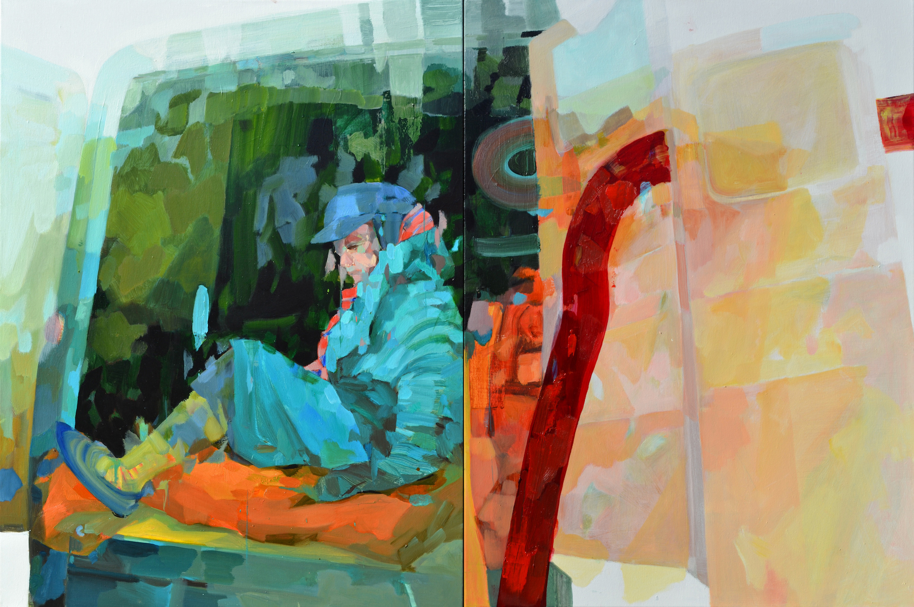
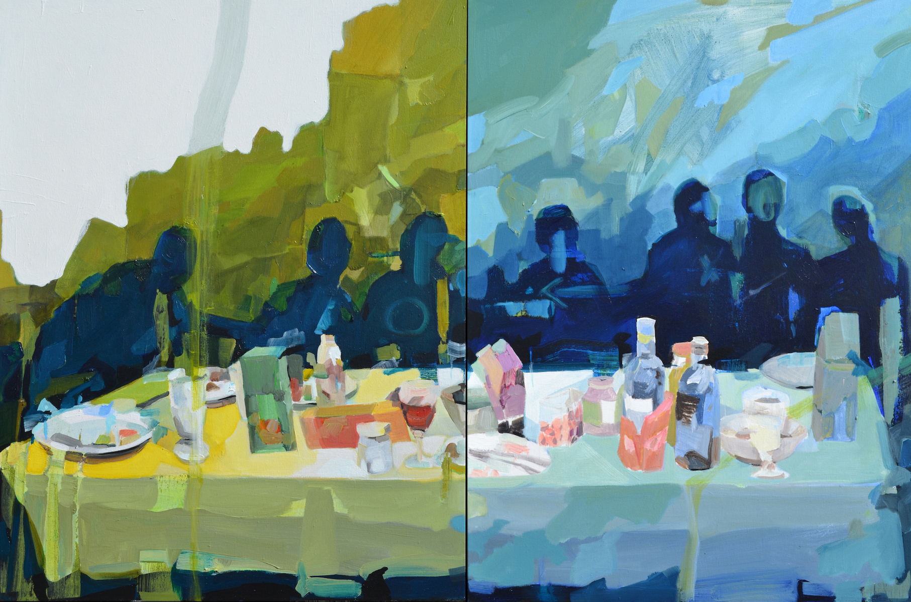
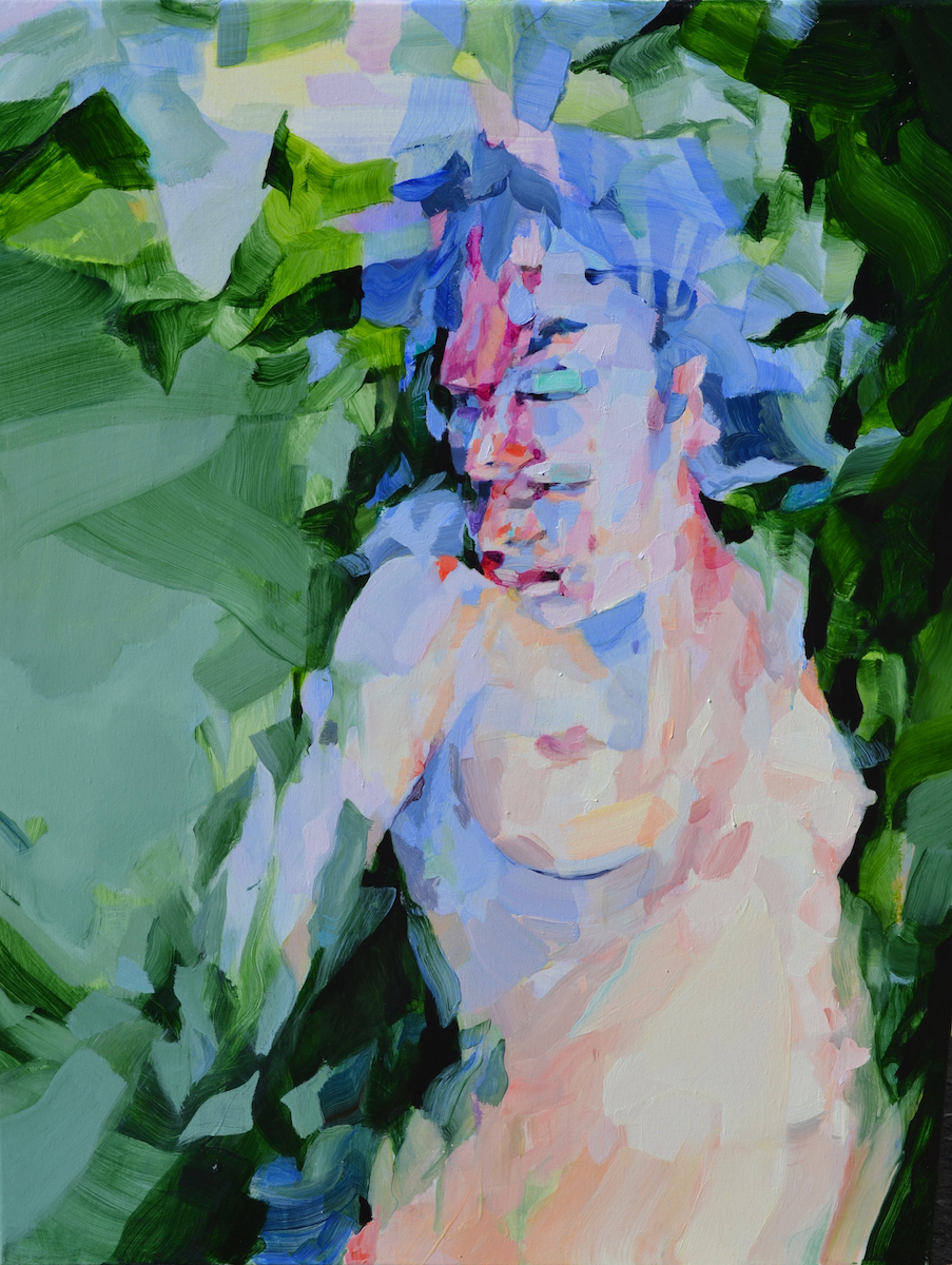
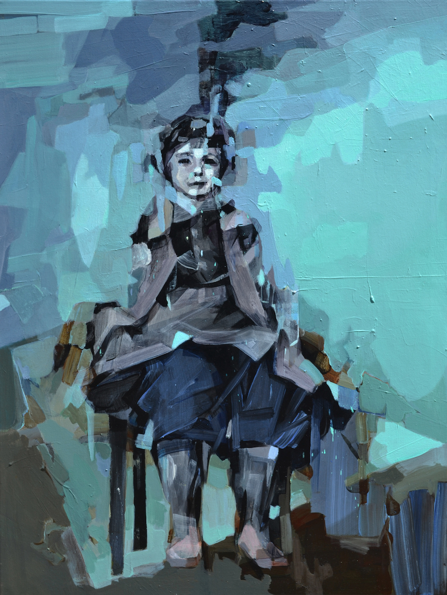
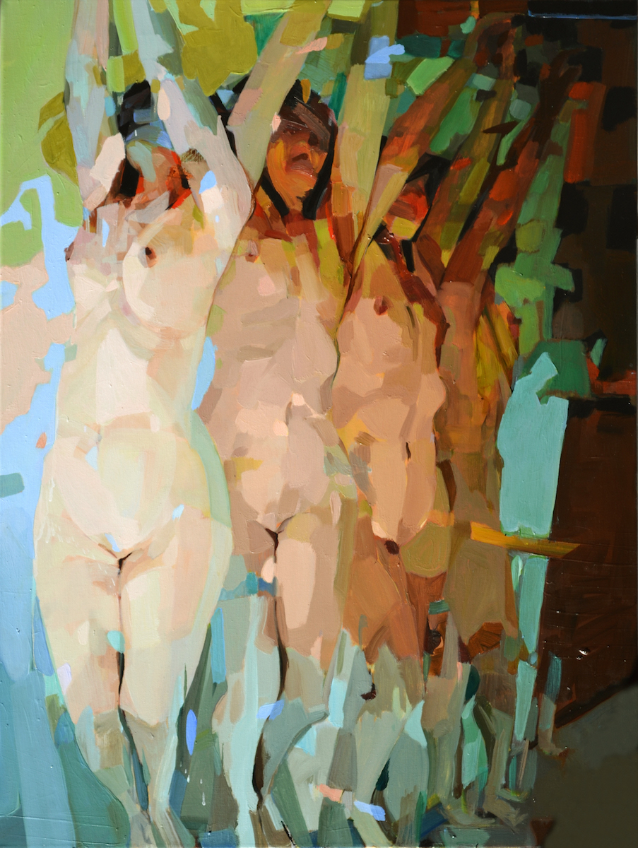
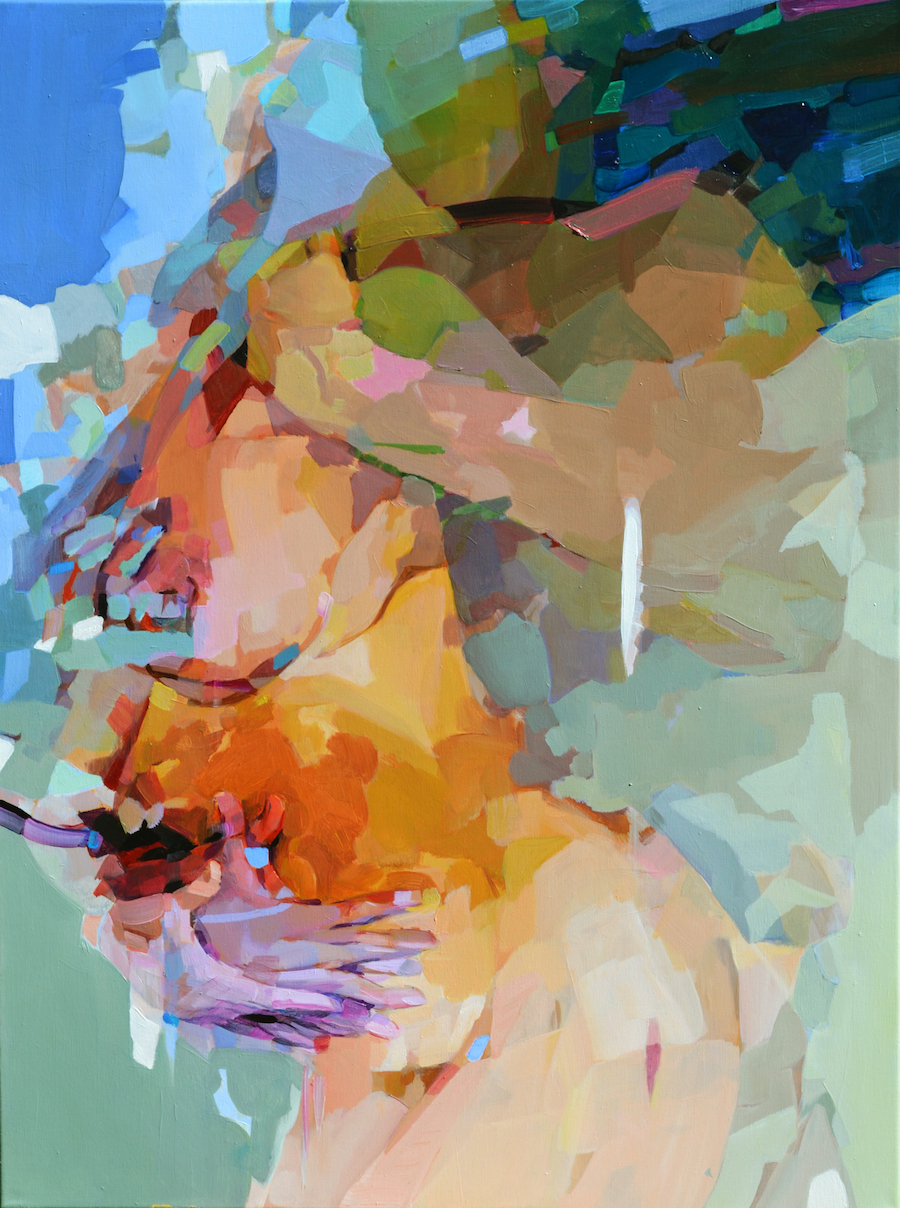
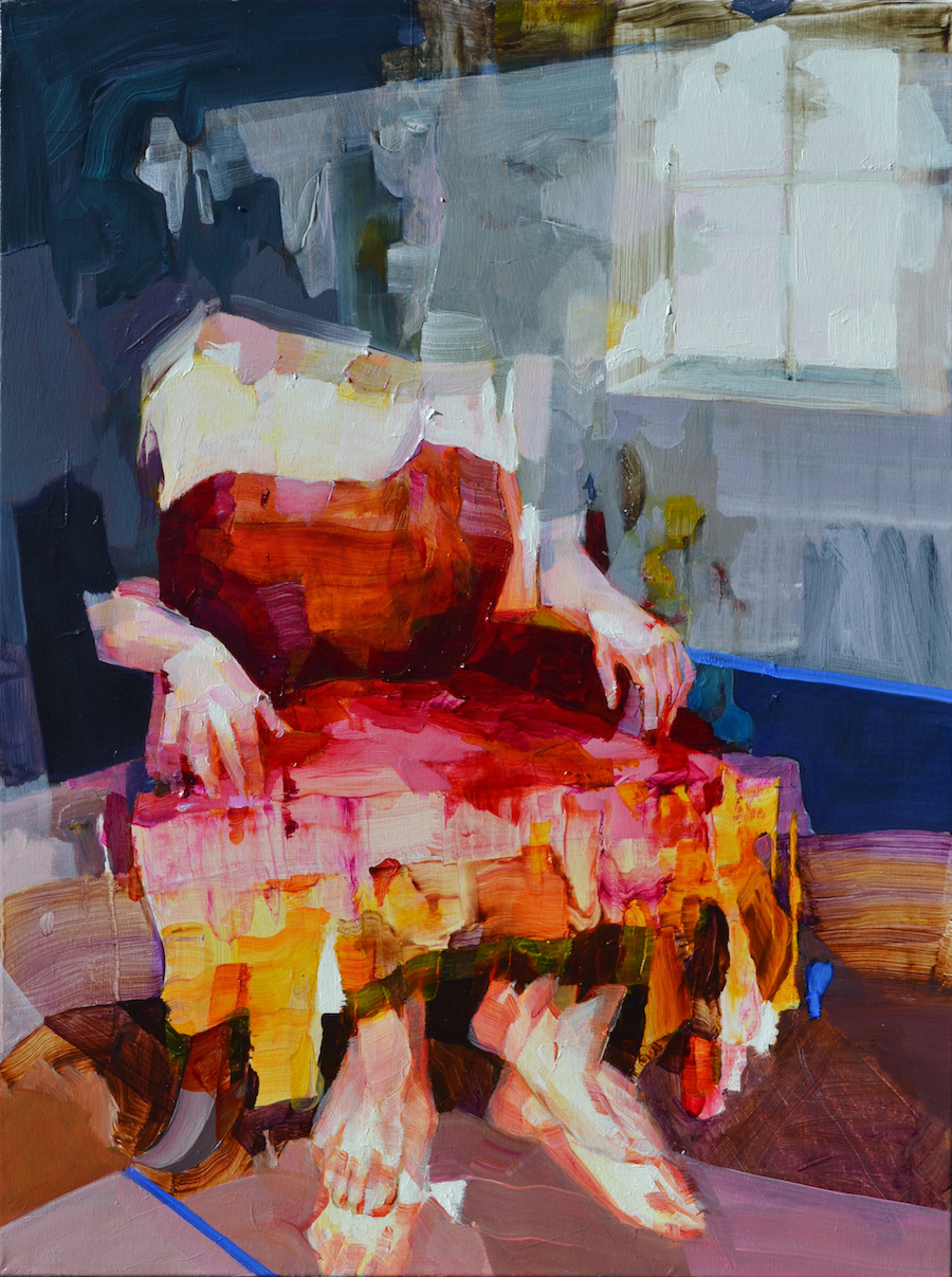
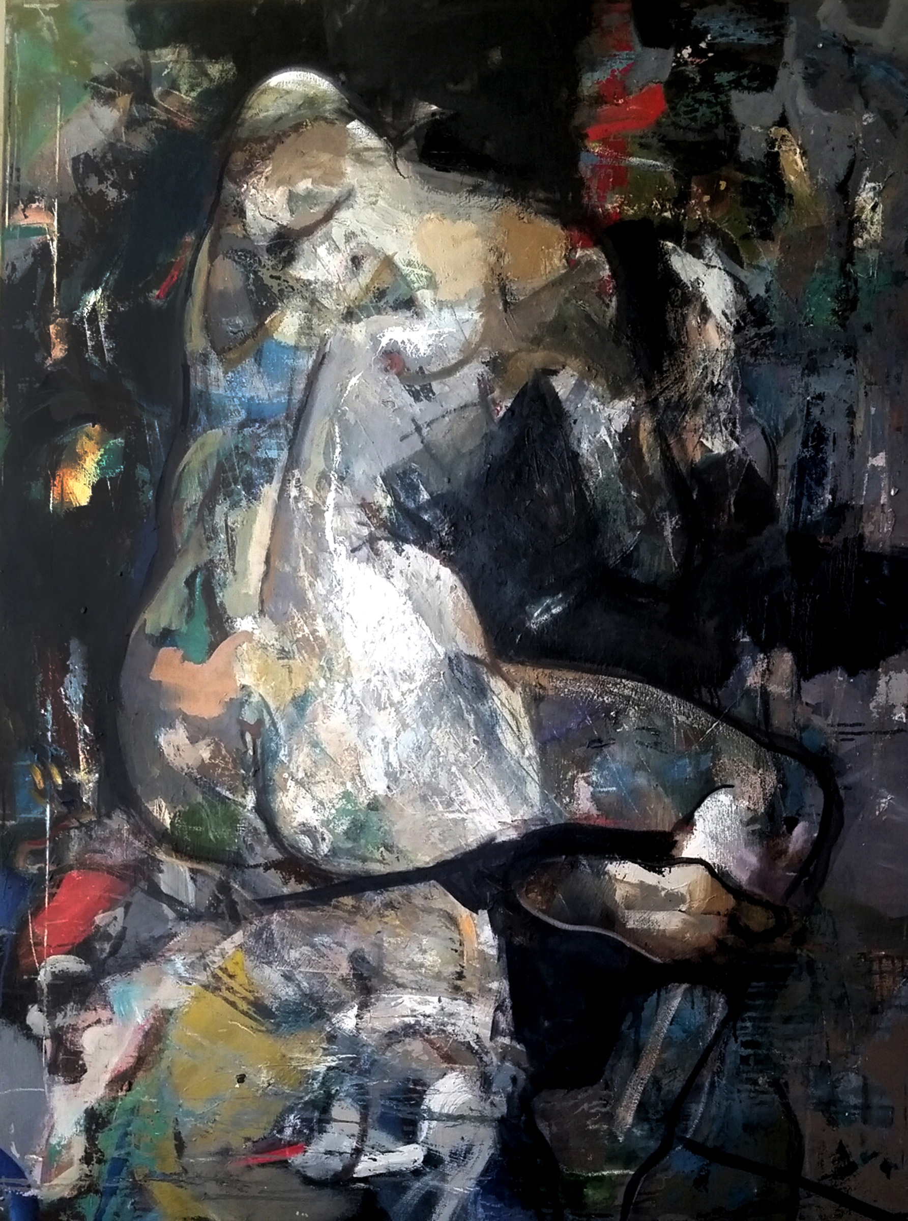
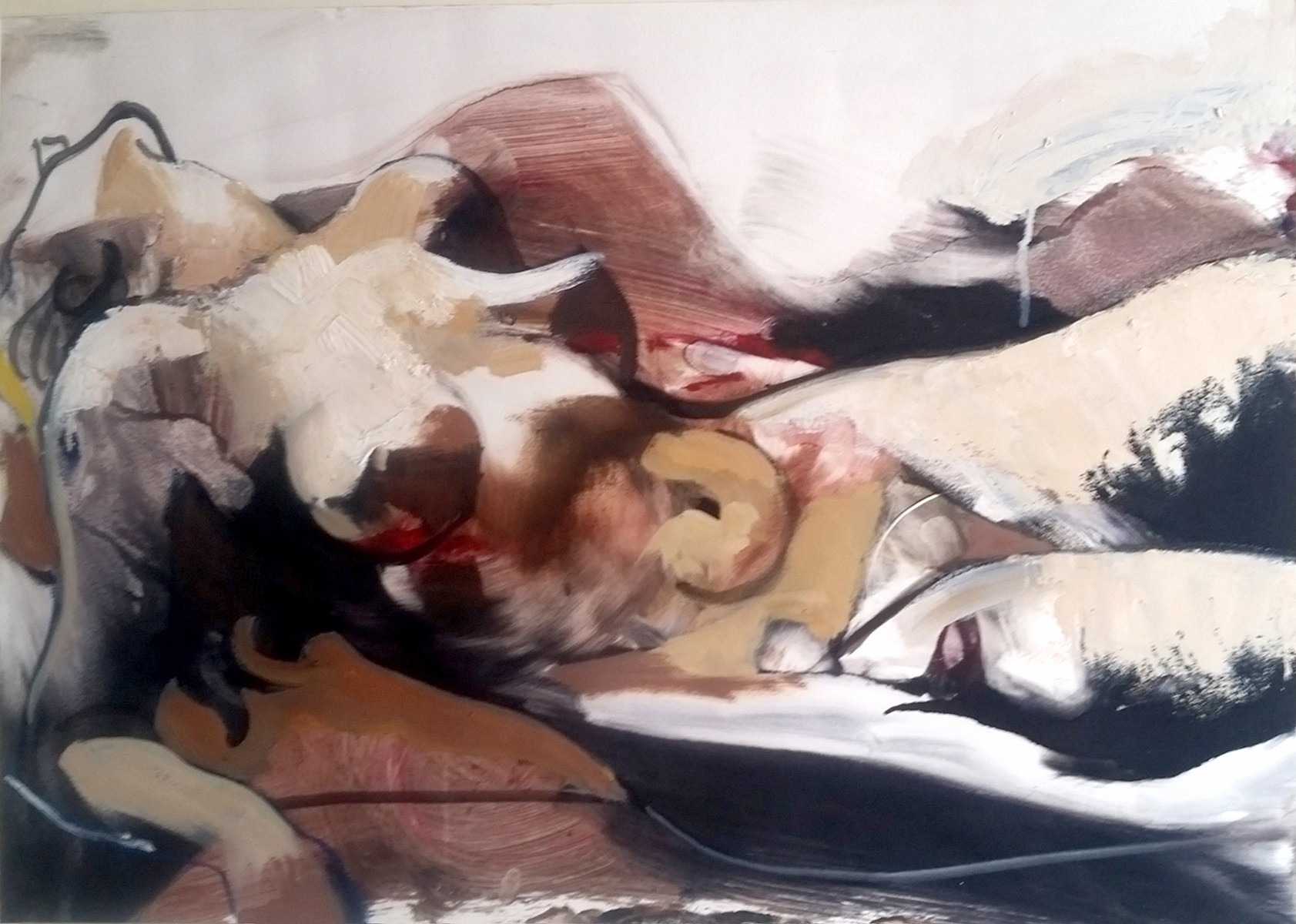
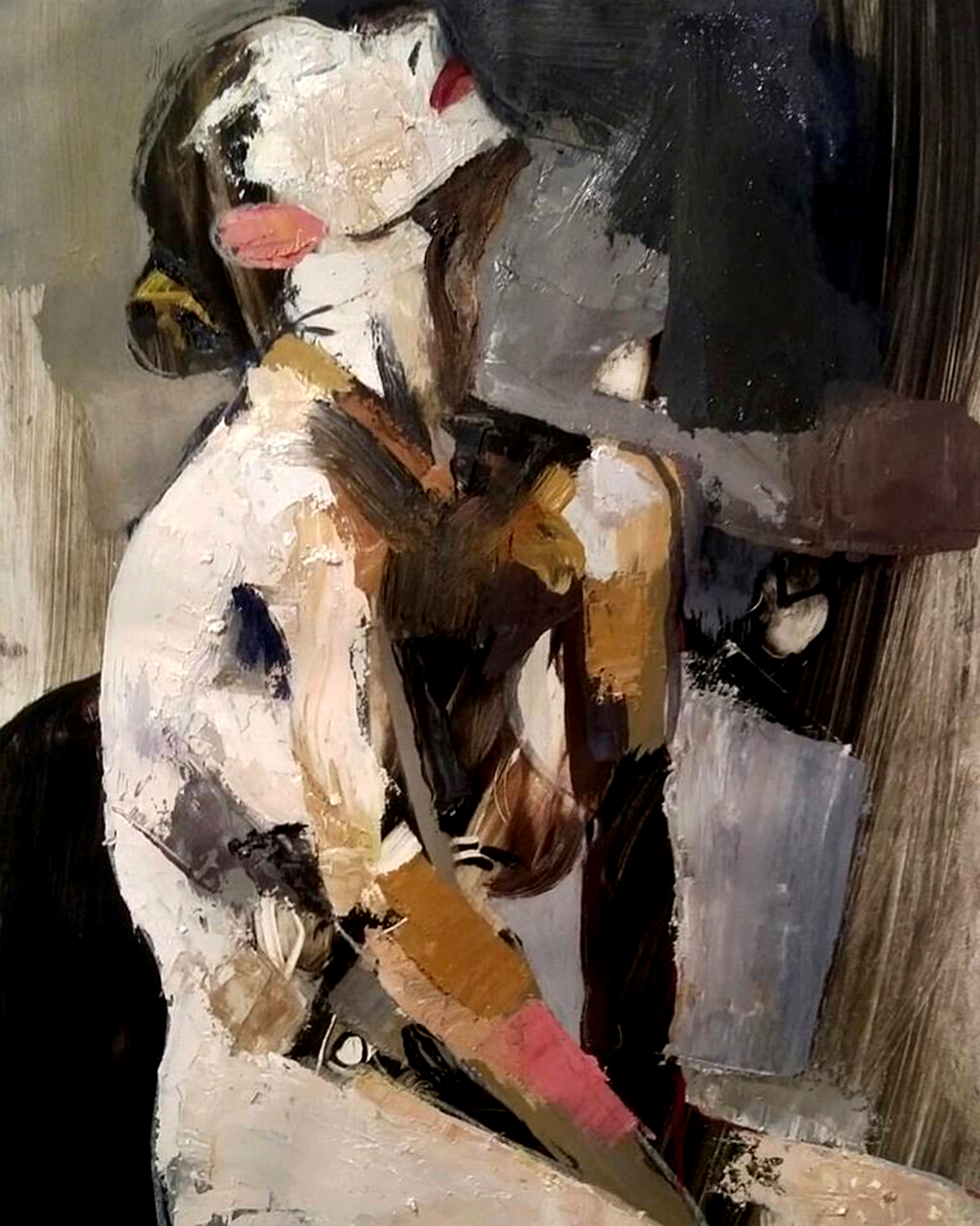
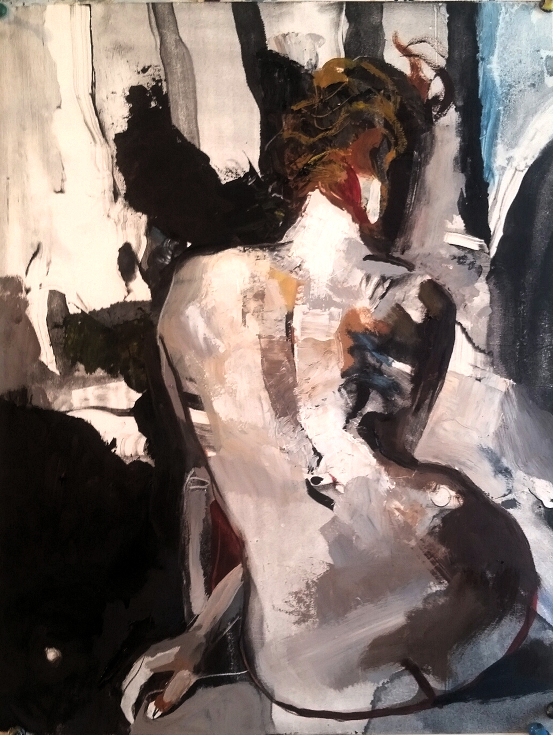
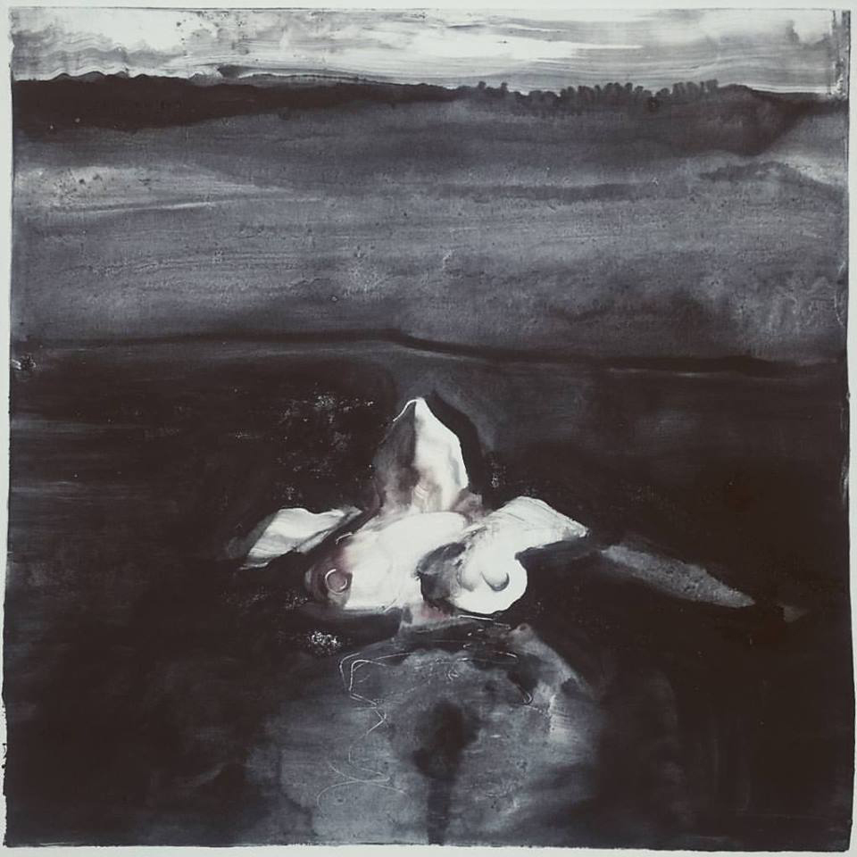
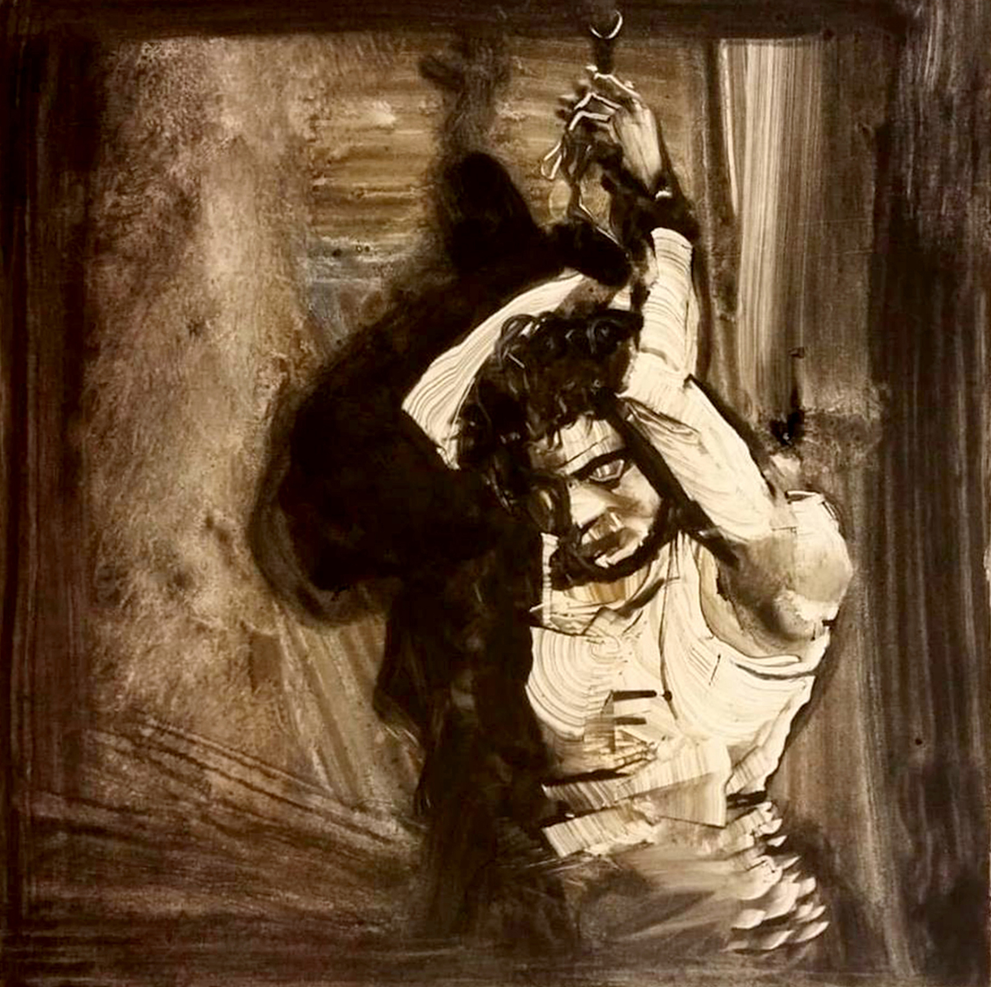
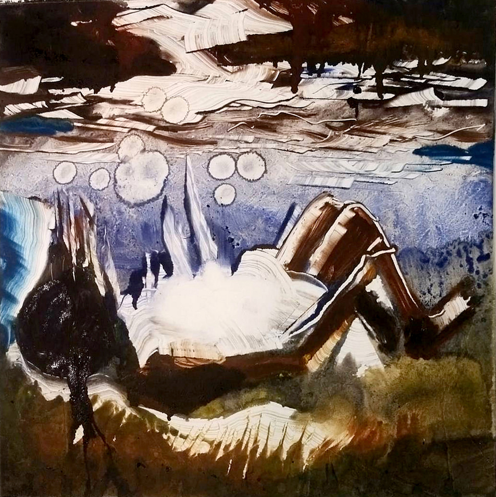
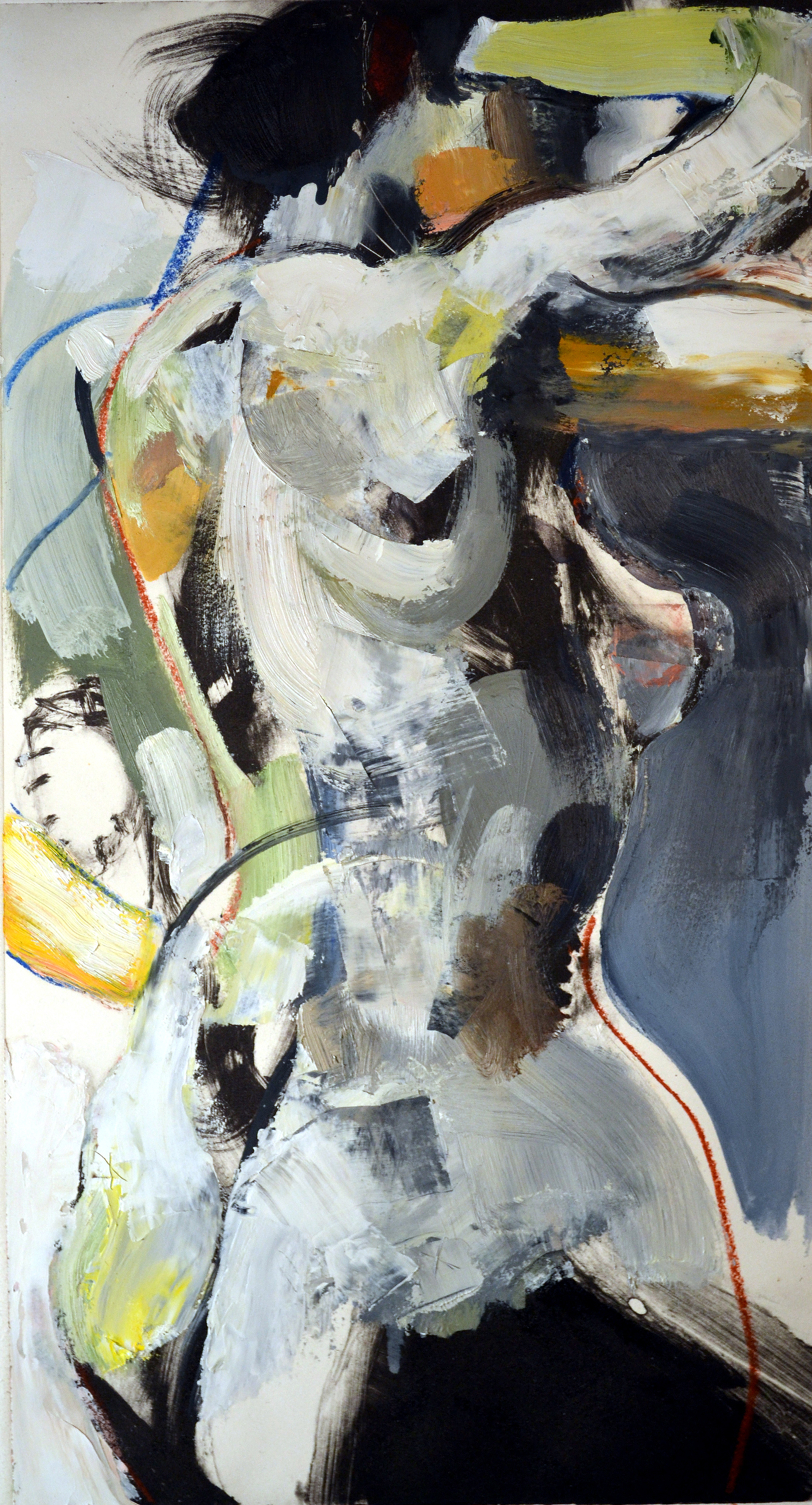
 Charles Williams is a professional contemporary realist painter from Georgetown, South Carolina and a graduate of the Savannah College of Art and Design (SCAD) in Savannah, Georgia with a Bachelors Degree in Fine Art. From utilizing oils for the basis of landscapes, each painting captures his reflection of human emotions in response to and in sync with the natural environment. Recent achievements and awards include a Hudson River Landscape Fellowship, featured work in the Artists Magazines 28th Annual Art Competition, honorable mention from Southwest Art Magazines 21 Emerging Under 31 competition, 2012 Winner of the Fine Art Category from Creative Quarterly and featured cover artist of Composite and Professional Artist Magazine. Williams’ works has been shown in American Art Collector, Empty, Charleston Magazine, Grand Strand, Studio Visit, Bluecanvas and other national publications. He was recently interviewed and broadcast on ETV/ NPR station, entitled: Nature Through the Eyes of an Artist. His contemporary landscapes have been exhibited in group and solo exhibitions in galleries in New York, Vermont, California, Georgia, South Carolina and several other southeastern states.


