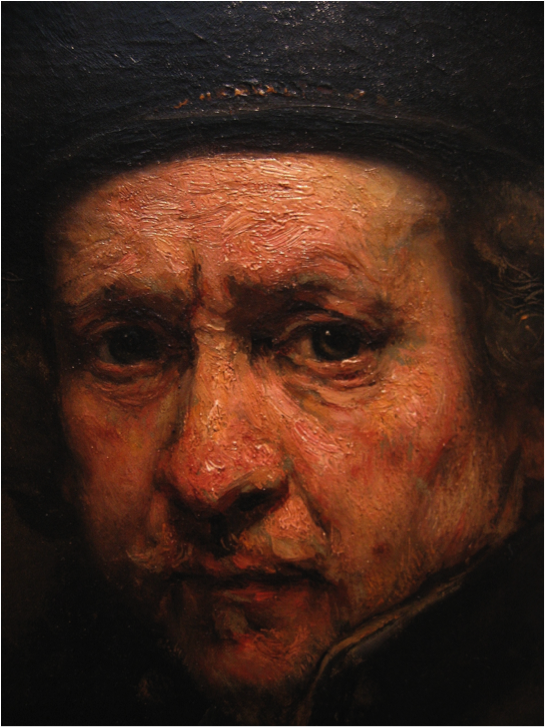
By Christopher Hutchinson
Hall’s essay on cultural identity is the very best essay on the problem of identity currently. In these 16 pages Hall challenges each notion of identity from African and European places and how Caribbean cinema has chosen to refute the influence of Europe as well as embrace it. Hall began the essay with deconstructing the make-up of the black subject. Hall’s essay is meant to be read, then re-read, as he uses many metaphors that are interchangeable. He also destabilizes words that were previously thought to be concrete. These unstable metaphors are so well articulated that the very process of trying to add or deny Hall’s contribution to this subject is a mere reflection of your own place and viewpoint. Hall uses Said, Ghandi, Garvey, Rastafarianism, China, Jamaica and many more in a fluid essay that does exactly what he wishes we should apply to the dialogue of identity, an identity of difference.
different view of cultural identity. This second position recognises that, as well as the many points of similarity, there are also critical points of deep and significant difference which constitute ‘what we really are’; or rather- since history has intervened – ‘what we have become’. We cannot speak for very long, with any exactness, about ‘one experience, one identity’, without acknowledging its other side – the ruptures and discontinuities which constitute, precisely, the Caribbean’s ‘uniqueness’. Cultural identity, in this second sense, is a matter of ‘becoming’ as well as of ‘being’.-p225
http://www.unipa.it/~michele.cometa/hall_cultural_identity.pdf
Identity & Production
Before Hall gets to his identity in difference he calls into question the very problematic issue of identity as production and its relation to the black subject. The attempt to create a monolithic Afro-Caribbean/Afro-American culture is wrong due to all the cultural editing one would have to do to achieve that oneness.
The first position defines ‘cultural identity’ in terms of one, shared culture, a sort of collective ‘one true self’, hiding inside the many other, more superficial or artificially imposed ‘selves’, which people with a shared history and ancestry hold in common. Within the terms of this definition, our cultural identities reflect the common
historical experiences and shared cultural codes which provide us, as ‘one people’, with stable, unchanging and continuous frames of reference and meaning, beneath the shifting divisions and vicissitudes of our actual history. This ‘oneness’, underlying all the other,
more superficial differences, is the truth, the essence, of ‘Caribbeanness’,of the black experience. It is this identity which a Caribbean or black diaspora must discover, excavate, bring to light and express through cinematic representation.-p223
http://www.unipa.it/~michele.cometa/hall_cultural_identity.pdf
Identity in Hall’s context is not the identity of victimhood. This was hard to digest, how could unity be wrong? How could standing as a collective be a weakness? How could Hall advocate this divisive stance? That imposed unity that people of color have strived for is just as manufactured and false as In …enforced separations from Africa – already figured, in the European imaginary, as ‘the Dark Continent’.
Africa Signified
Africa, the signified which could not be represented directly in slavery, remained and remains the unspoken, unspeakable ‘presence’ in Caribbean culture. It is ‘hiding’ behind every verbal inflection, every narrative twist of Caribbean cultural life. It is the secret code with which every Western text was ‘re-read’. It is the ground-bass of every rhythm and bodily movement. This was- i s – the ‘Africa’ that ‘is alive and well in the diaspora’. -p230
http://www.unipa.it/~michele.cometa/hall_cultural_identity.pdf
This definition of Africa signified is obviously also present in the everyday encoding of African/American language, bass, rhythm, and bodily movement. That evidence of Africa can then manifest itself in the very real imaginative geography and history.
We must not collude with the West which, precisely, normalises and appropriates Africa by freezing it into some timeless zone of the primitive, unchanging past. Africa must at last be reckoned with by Caribbean people, but it cannot in any simple sense by merely recovered-p231
http://www.unipa.it/~michele.cometa/hall_cultural_identity.pdf
Imaginative Geography & History
‘imaginative geography and history’, which helps ‘the mind to intensify its own sense of itself by dramatising the difference between what is close to it and what is far away’. It ‘has acquired an imaginative or figurative value we can name and feel’.7 Our belongingness to it constitutes what Benedict Anderson calls ‘an imagined community’.8 To this ‘Africa’, which is a necessary part of the Caribbean imaginary, we can’t literally go home again.
Hall’s definition of the imaginative is by no means fictitious. Hall here uses the imaginative geography and history as a solid state to stand. It is not a simulacrum of pretend realities that rely on the elaborate sets to trick the viewer into a state of an alternate reality. The Imaginative here cannot be used as the hegemonic tool to oversimplify and produce a manufactured culture. It is not fashion.
Presence European
Presence Europeenne is almost as complex as the ‘dialogue’ with Africa. In terms of popular cultural life, it is nowhere to be found in its pure, pristine state. It is always-already fused, syncretised, with other cultural elements. It is always-already creolised – not lost beyond the Middle Passage, but ever-present: from the harmonics in our musics to the ground-bass of Africa, traversing and intersecting our lives at every point. How can we stage this dialogue so that, finally, we can place it, without terror or violence, rather than being forever placed by it? Can we ever recognise its irreversible influence, whilst resisting its imperializing eye? The engima is impossible, so far, to resolve. It requires the most complex of cultural strategies. –p234
http://www.unipa.it/~michele.cometa/hall_cultural_identity.pdf
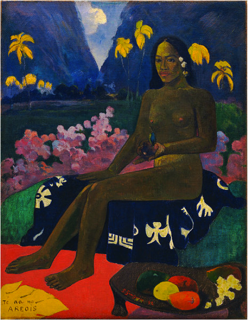
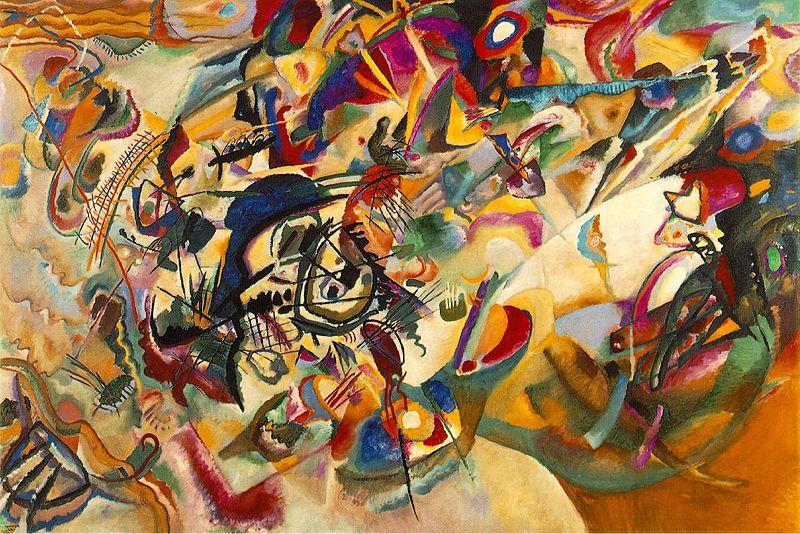
Gauguin is an example of the Presence Europeenne, so loved for his exotic depictions of Tahiti of which Tahiti benefits from in Tourism. The cultural identity of the Caribbean as a Romantic post-card has been offered as a true depiction of the culture that is actually present. Gauguin’s success is derived from the hyper-color, the abstract sensual nude figure, the simulacra of Tahiti. How much of this savage narrative of the Caribbean has been accepted as the rubric for the now Caribbean folk art identity? This connection to the rubric of Europe is the reason for the stagnation in Caribbean art as well African-American art.
Out of Many, One People
This is the vocation of modern black cinemas: by allowing us to see and recognise the different parts and histories of ourselves, to construct those points of identification, those positionalities we call in retrospect our ‘cultural identities’. –p234
http://www.unipa.it/~michele.cometa/hall_cultural_identity.pdf
Hall’s essay imagine’s concretely the Jamaican motto Out of Many, One People to be the new rubric of the New Africa, unity of difference, where difference is ideal.
 Christopher Hutchinson is an Assistant Professor of Art at Atlanta Metropolitan State College, Archetype Art Gallery Owner in Atlanta, Ga, and Smoke School of Art Founder. He received his Master of Fine Arts Degree in Painting from Savannah College of art & Design, Atlanta and his Bachelor of Arts Degree from the University of Alabama in Huntsville, Alabama. He lived in Alabama for 10 years before moving to Atlanta in 2008.
Learn more about Christopher and his work at Black Flight 144.


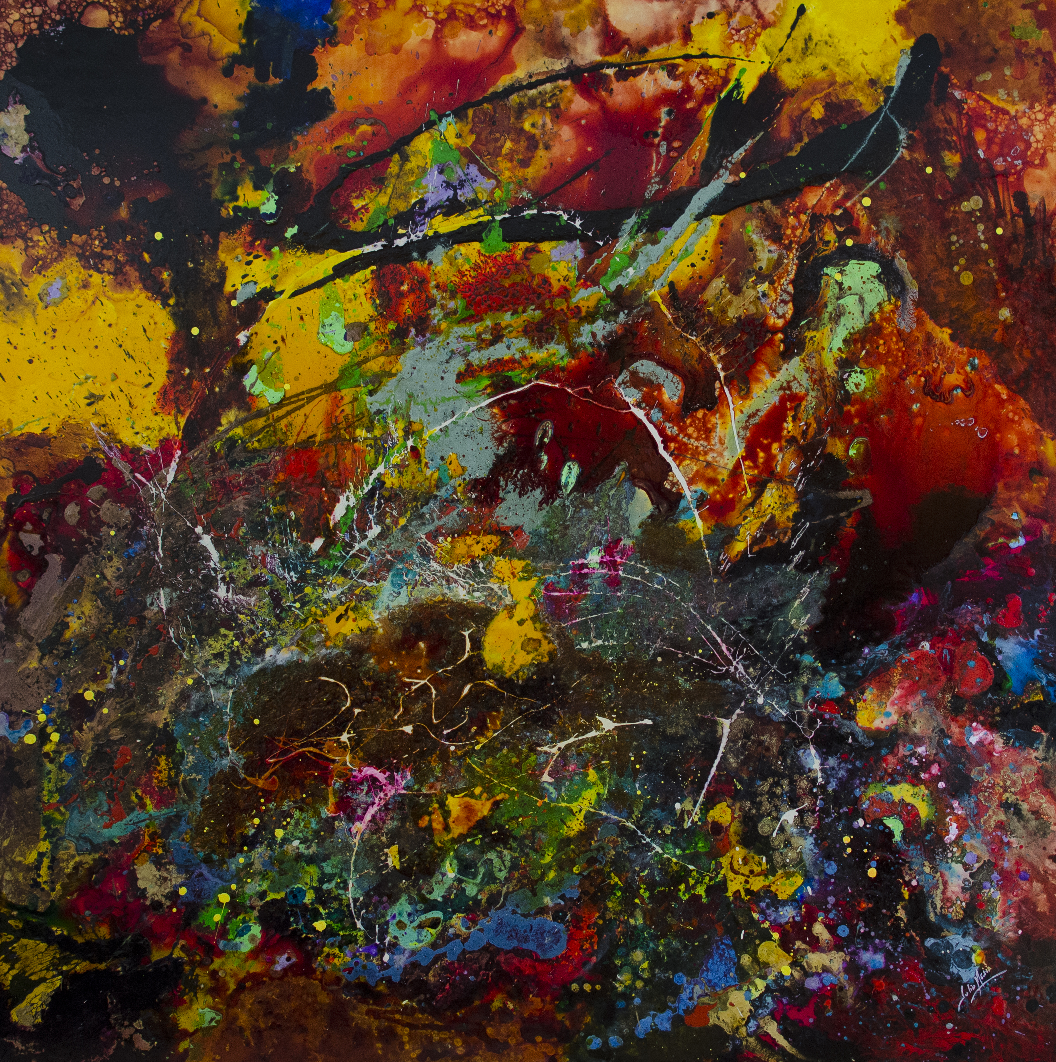
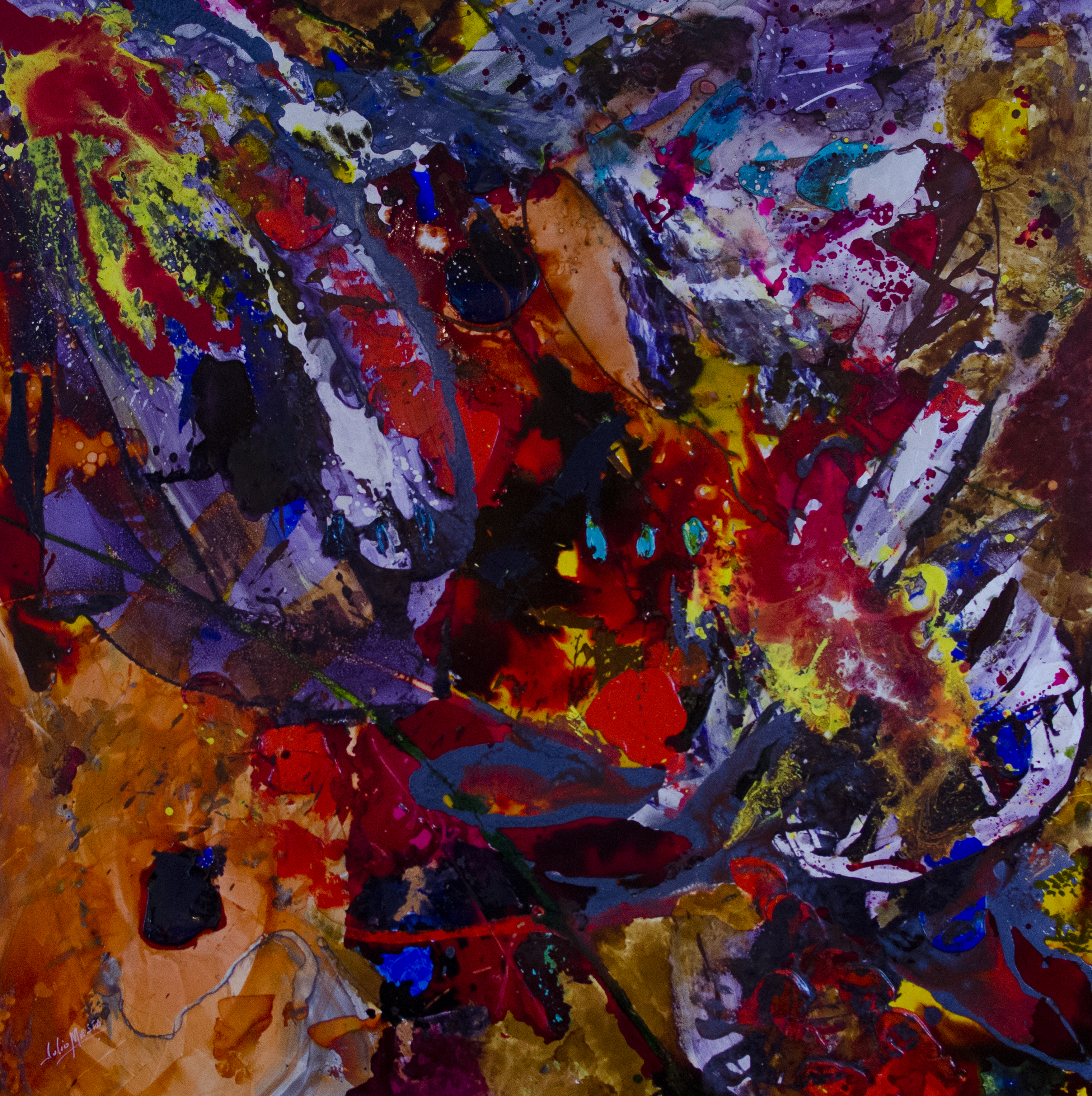
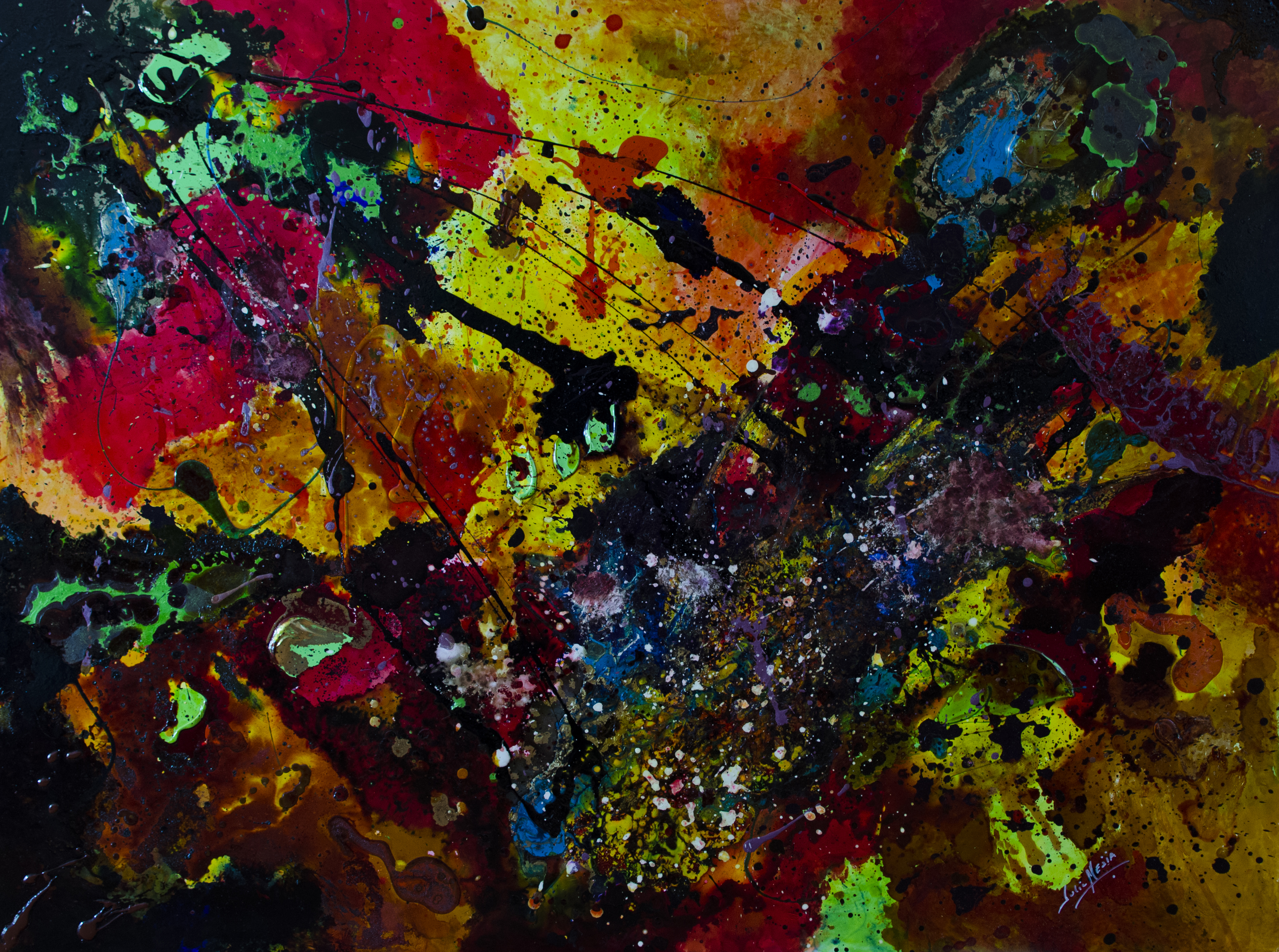
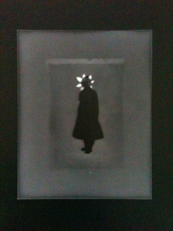
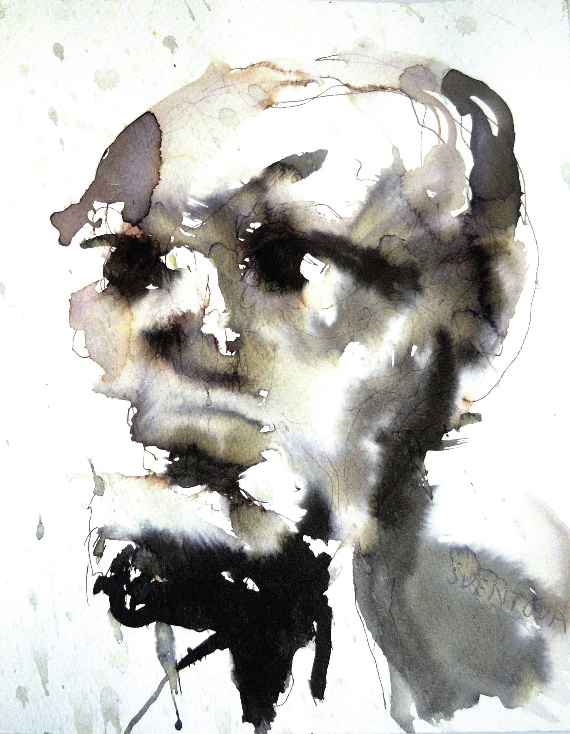
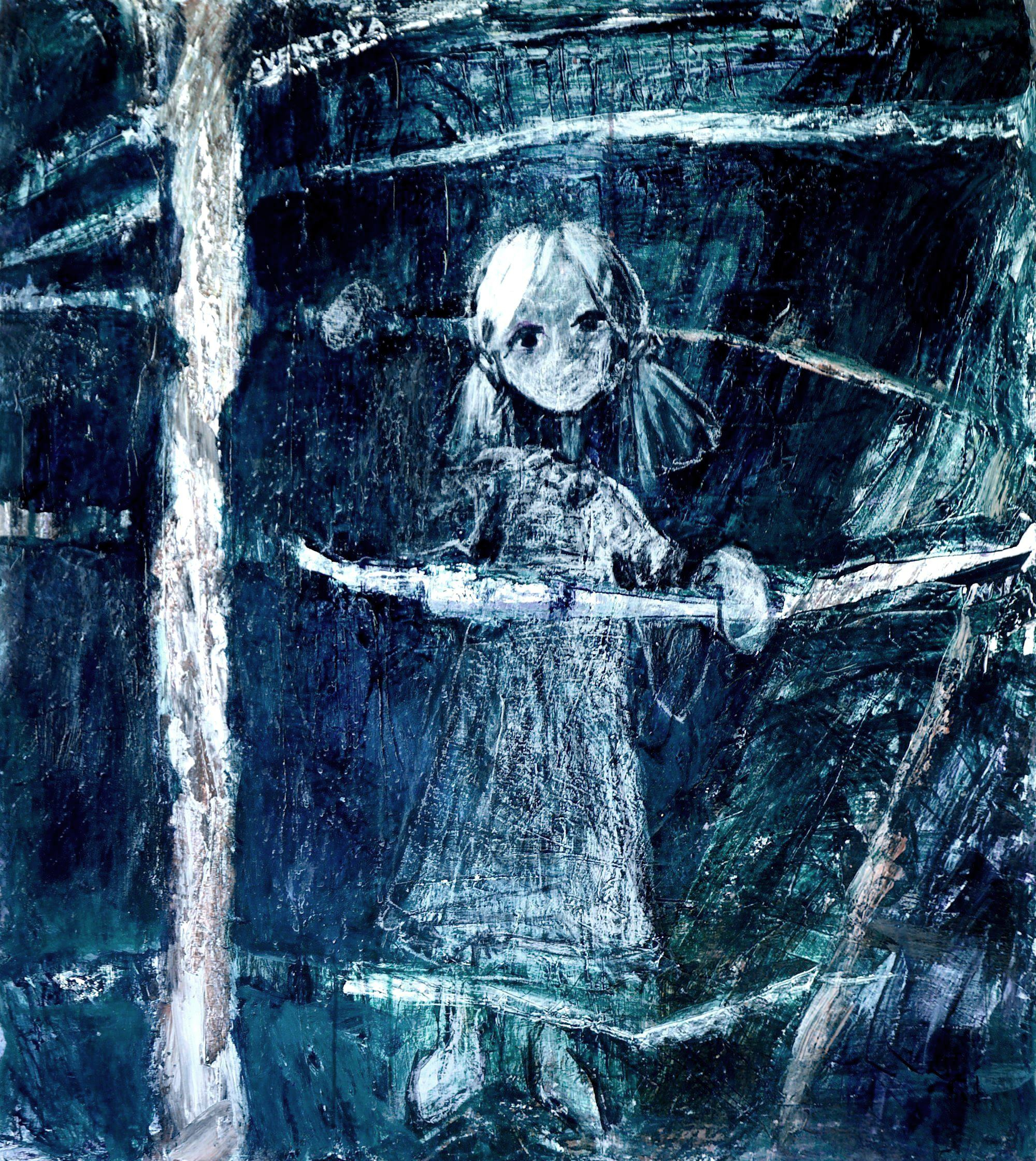
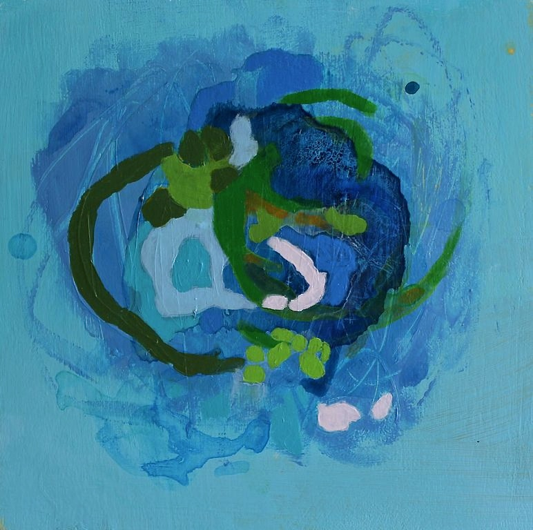
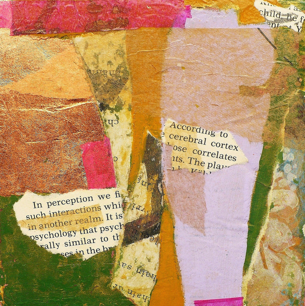
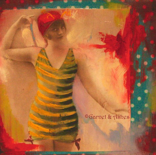
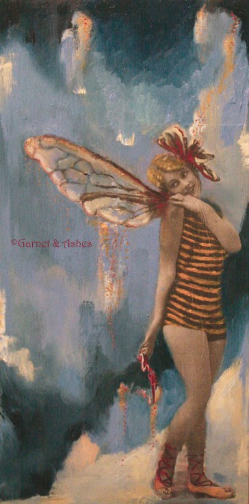
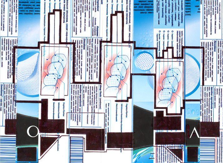
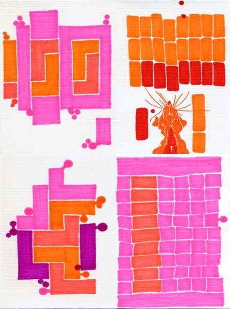
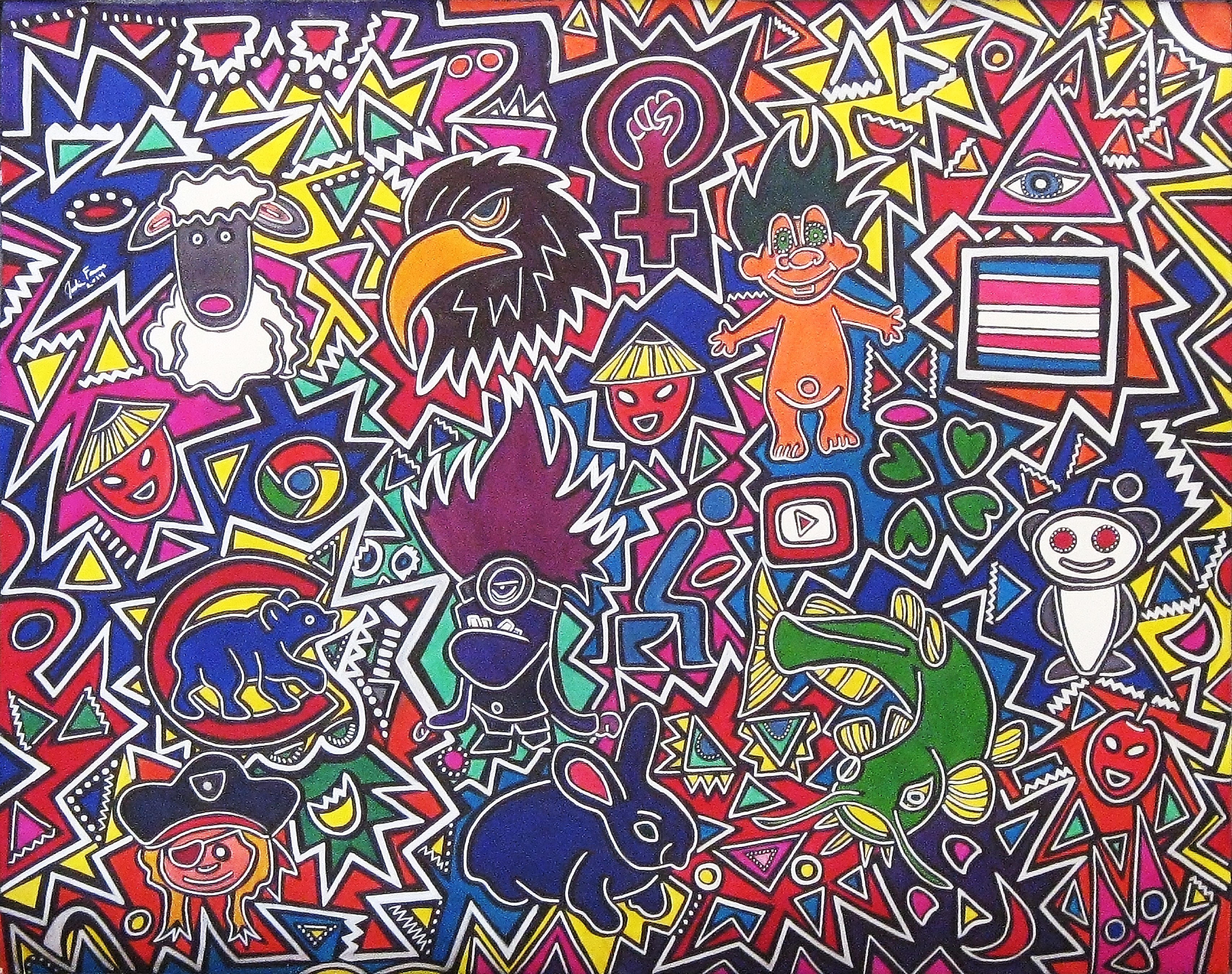
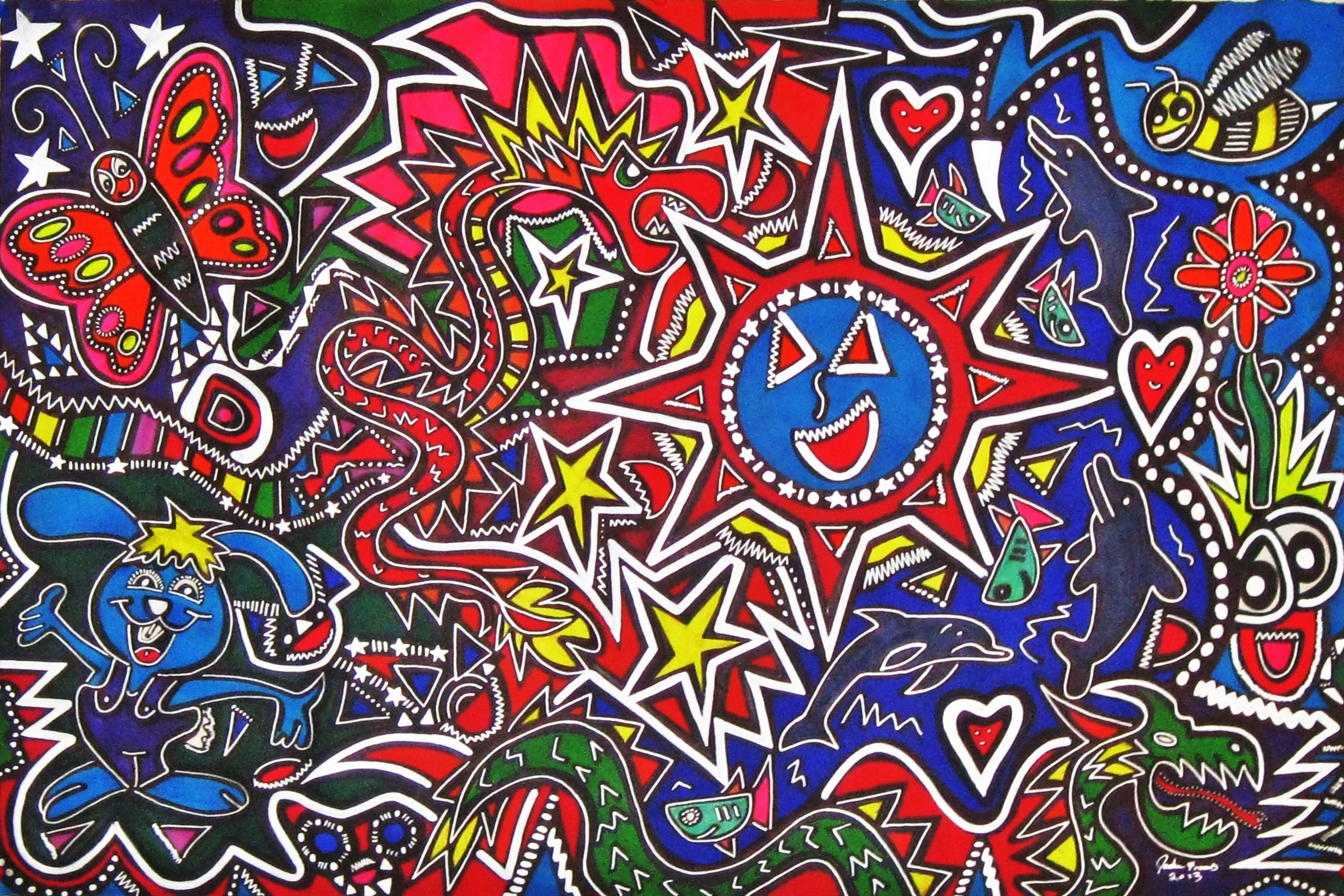
 Artist: Julio Mejia
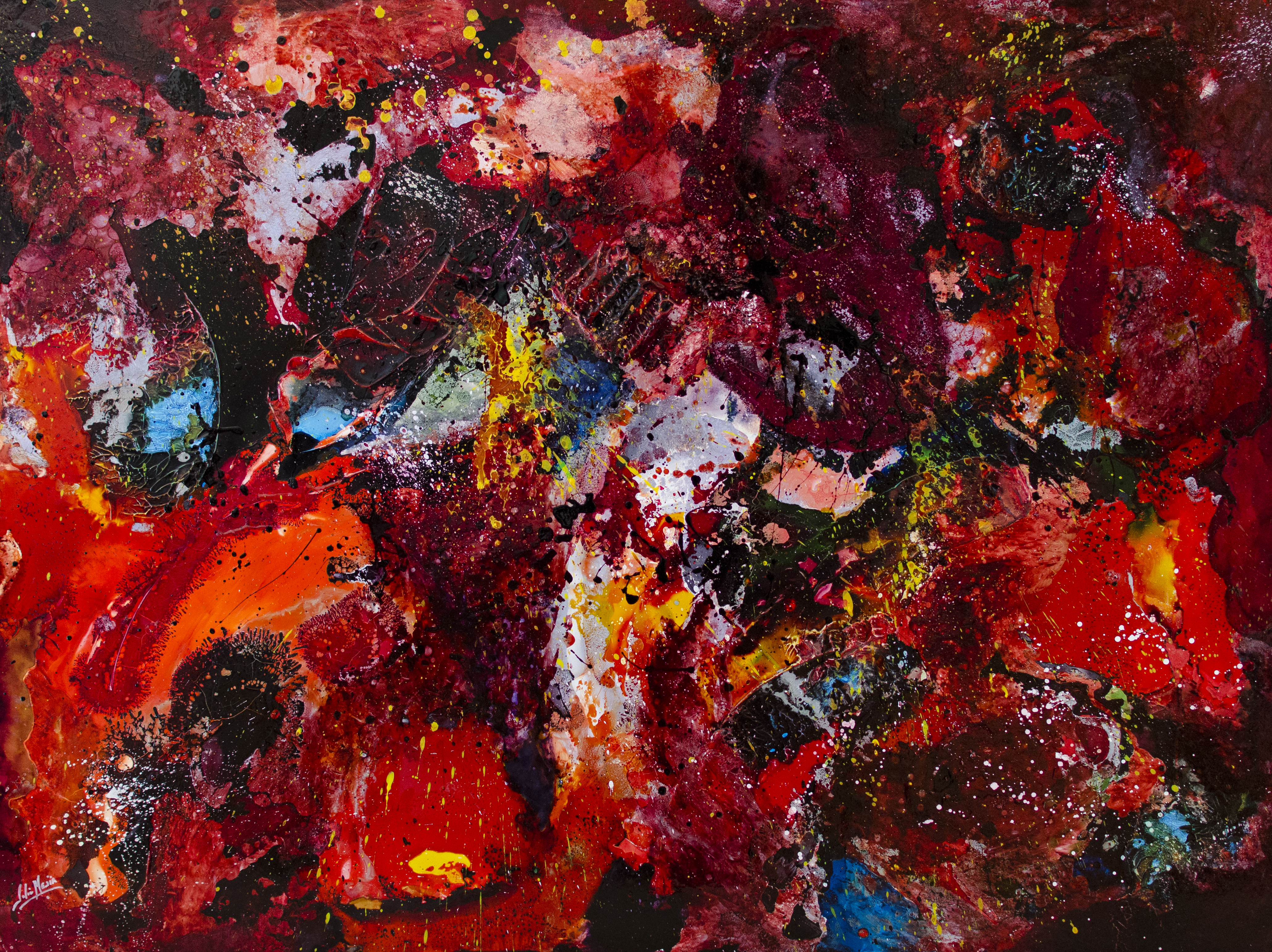
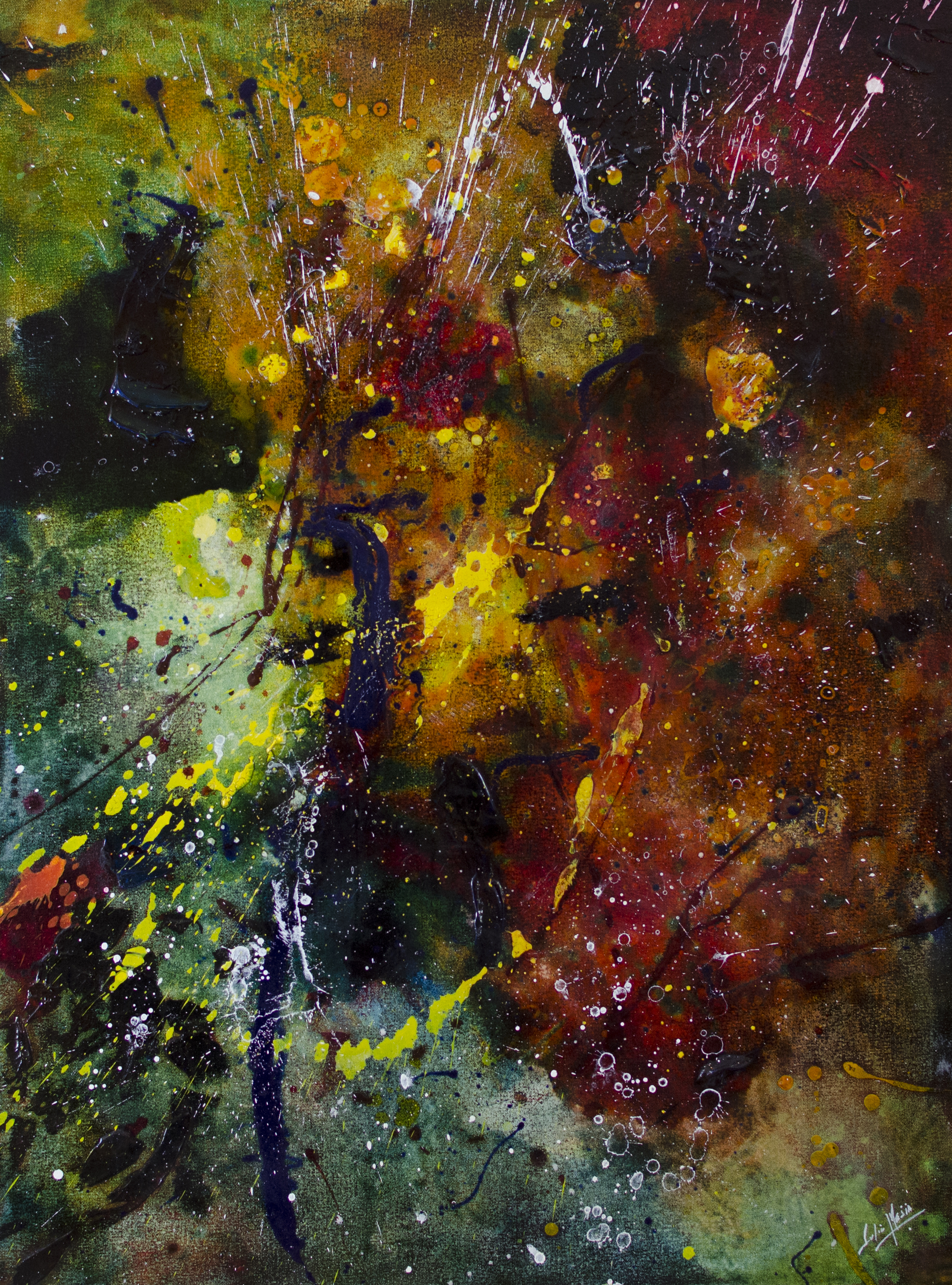
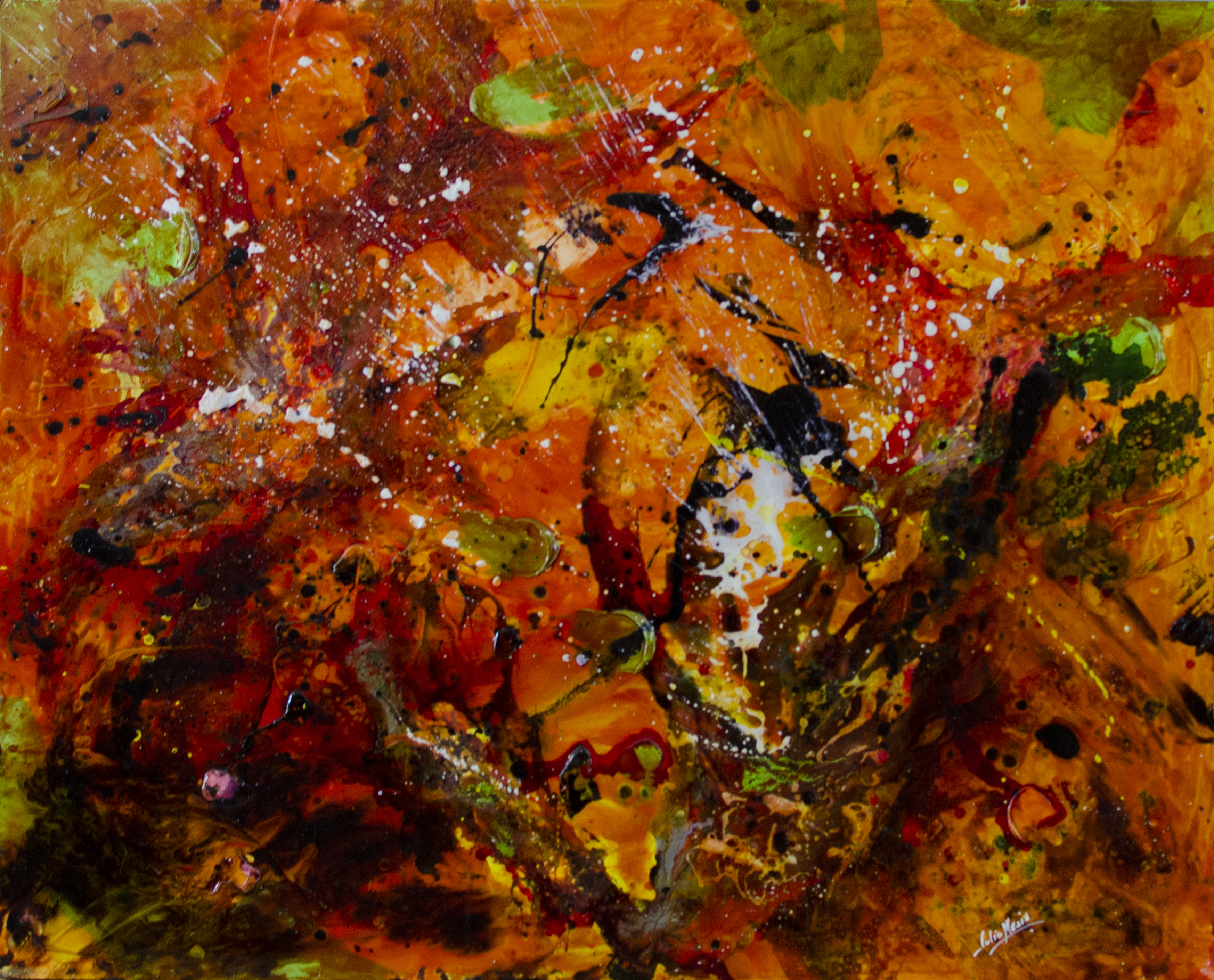
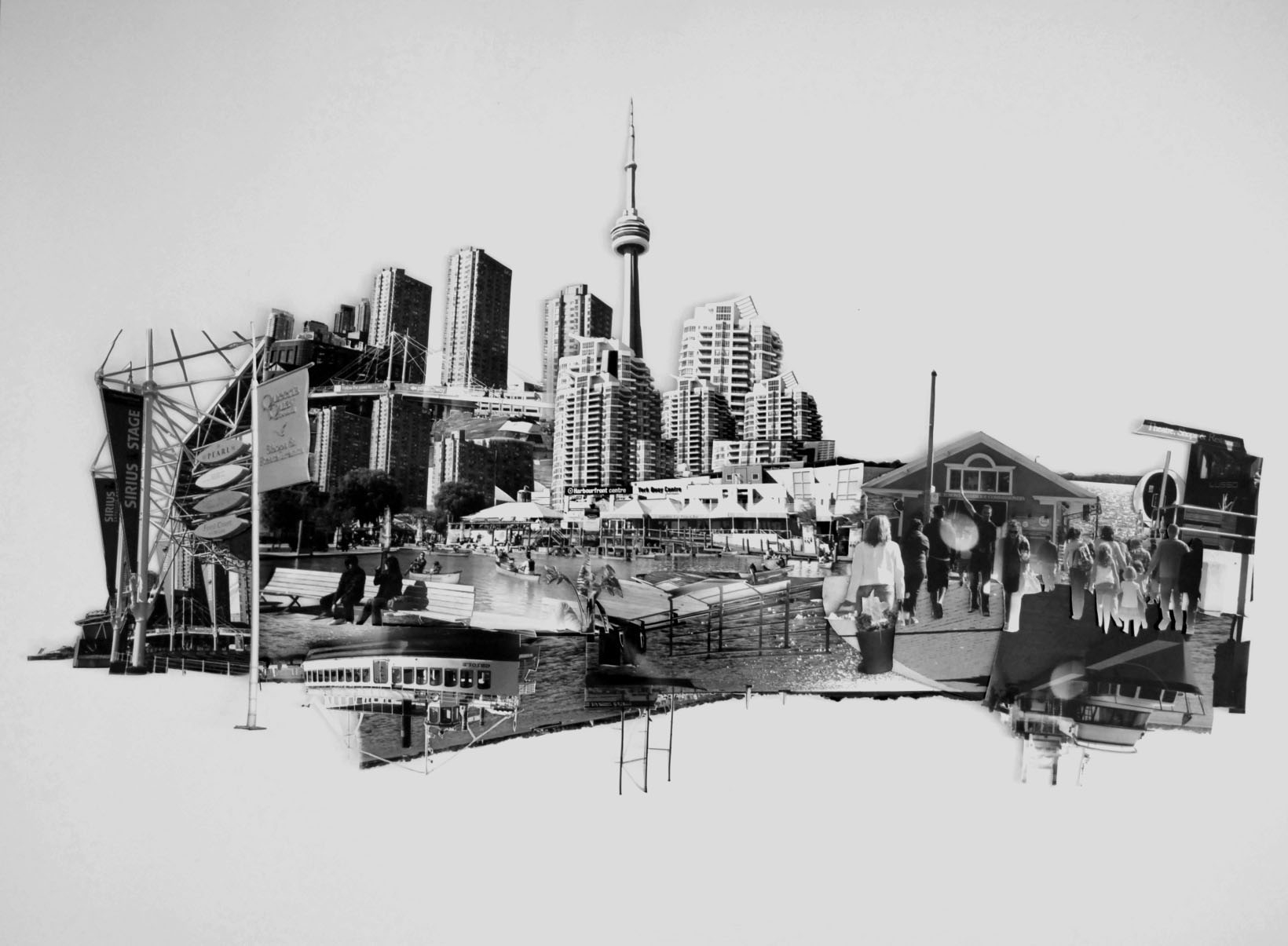
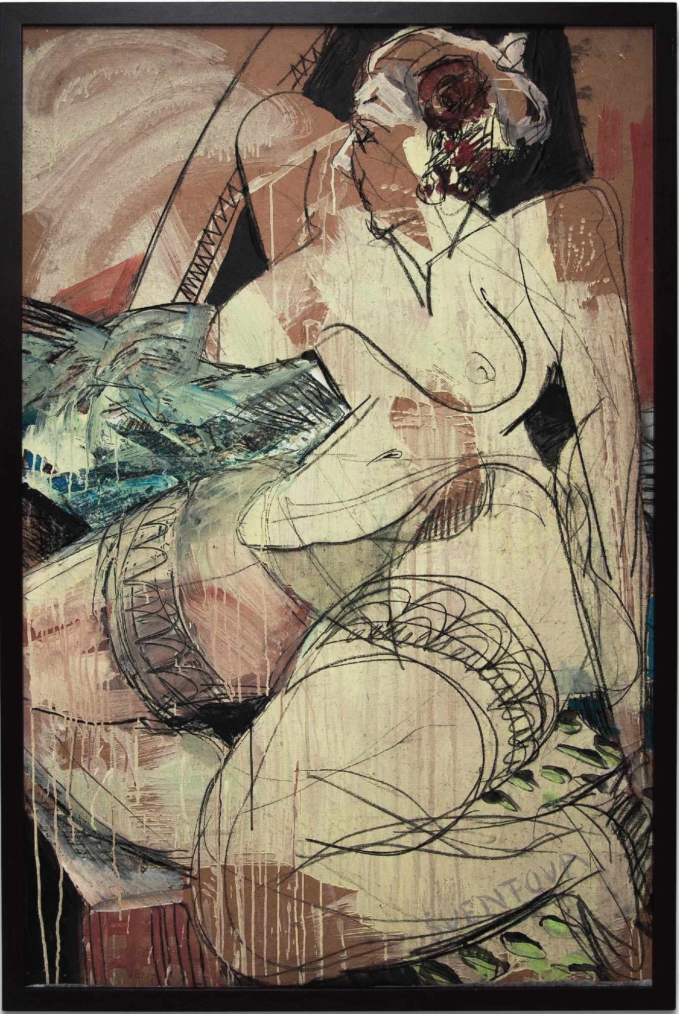
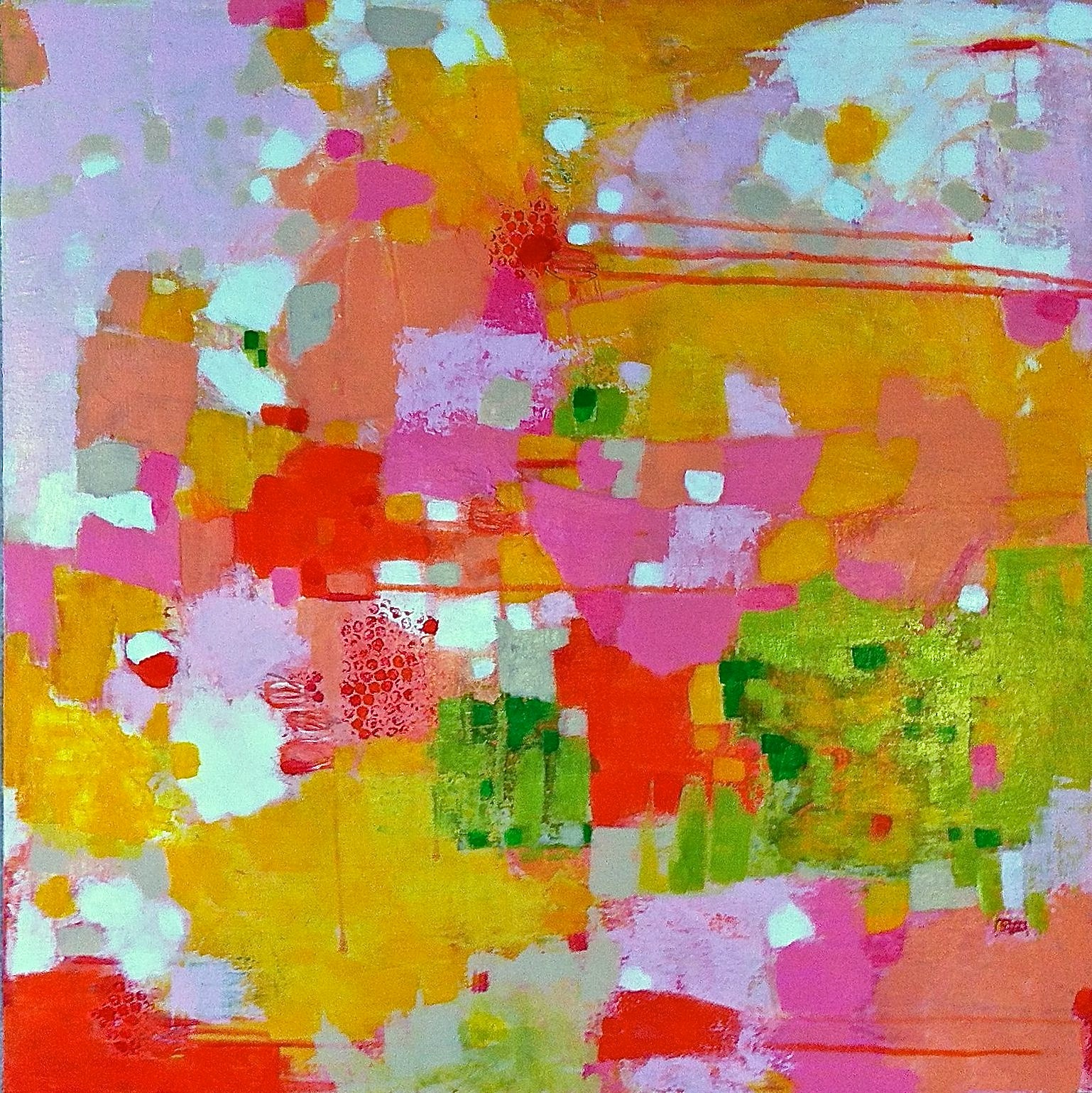
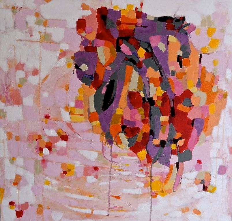
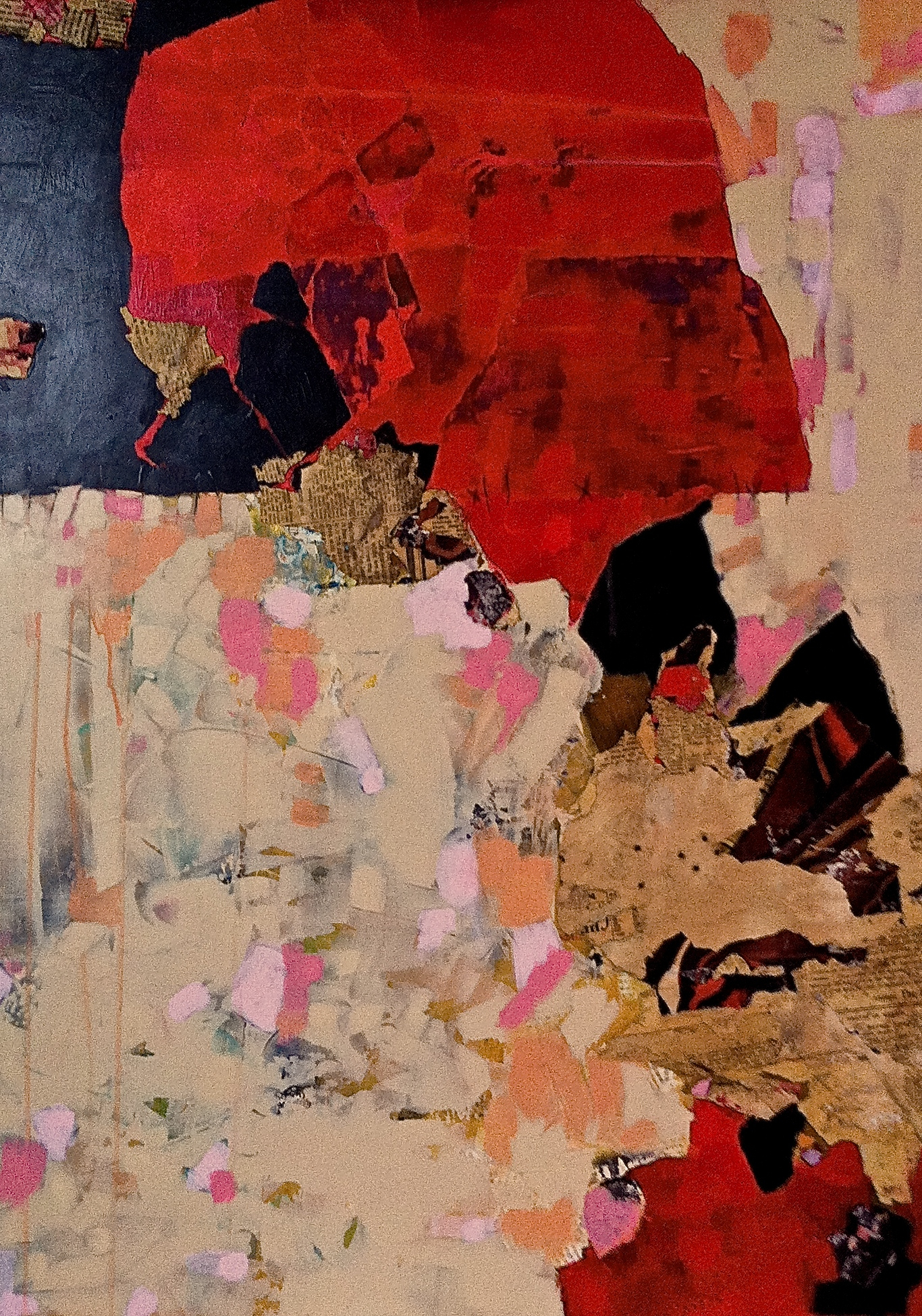
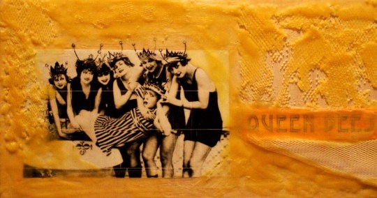
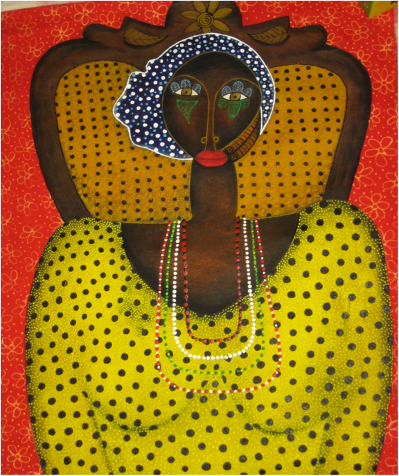
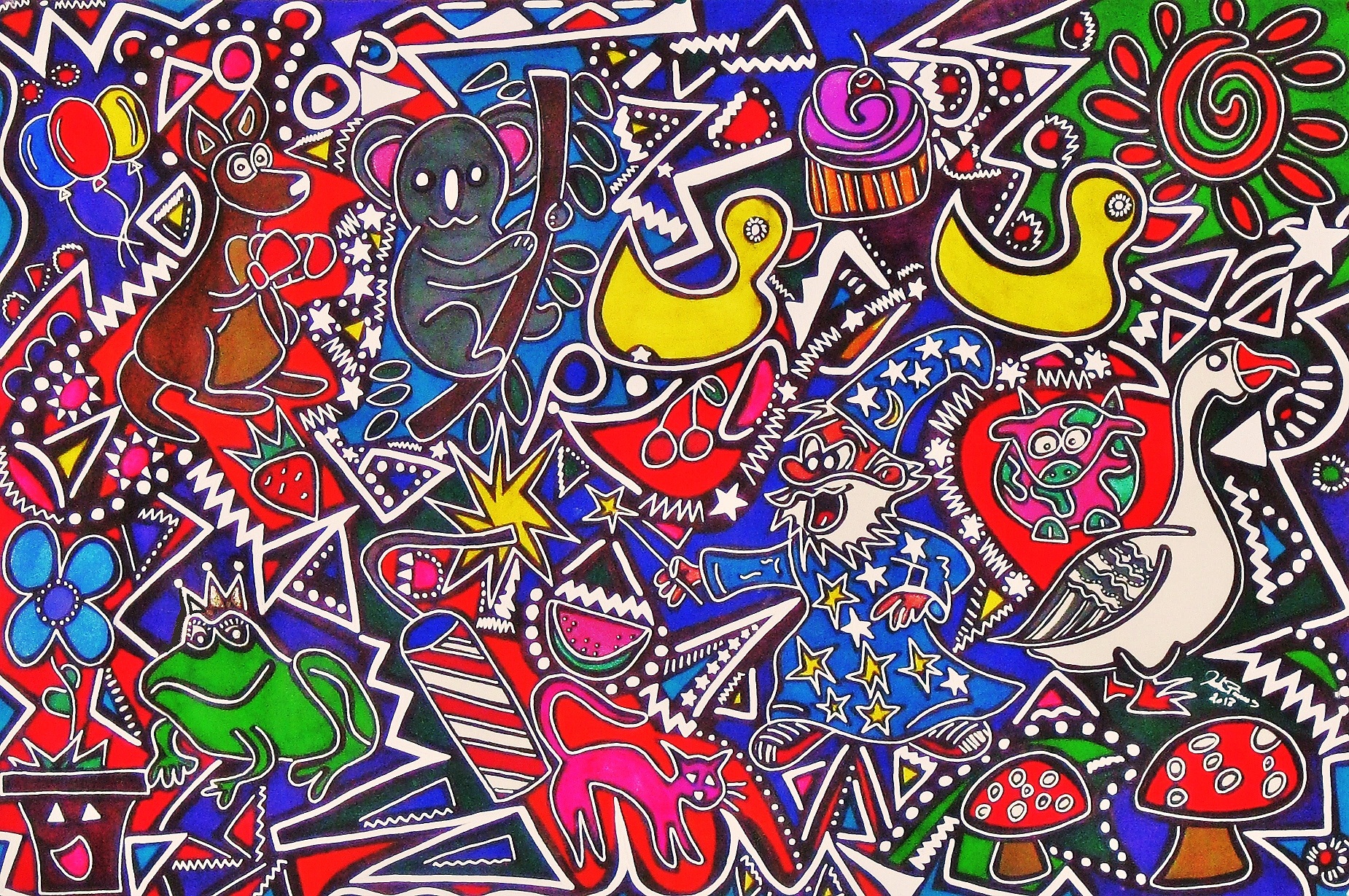


