Postcolonial Thoughts: Barragán’s Spiritual Transcendence through Color
By Christopher Hutchinson
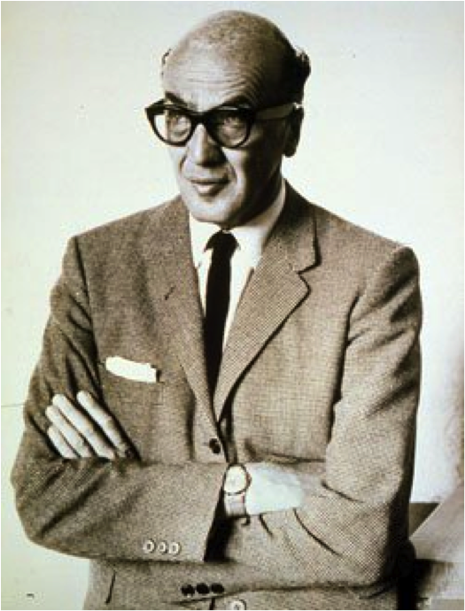
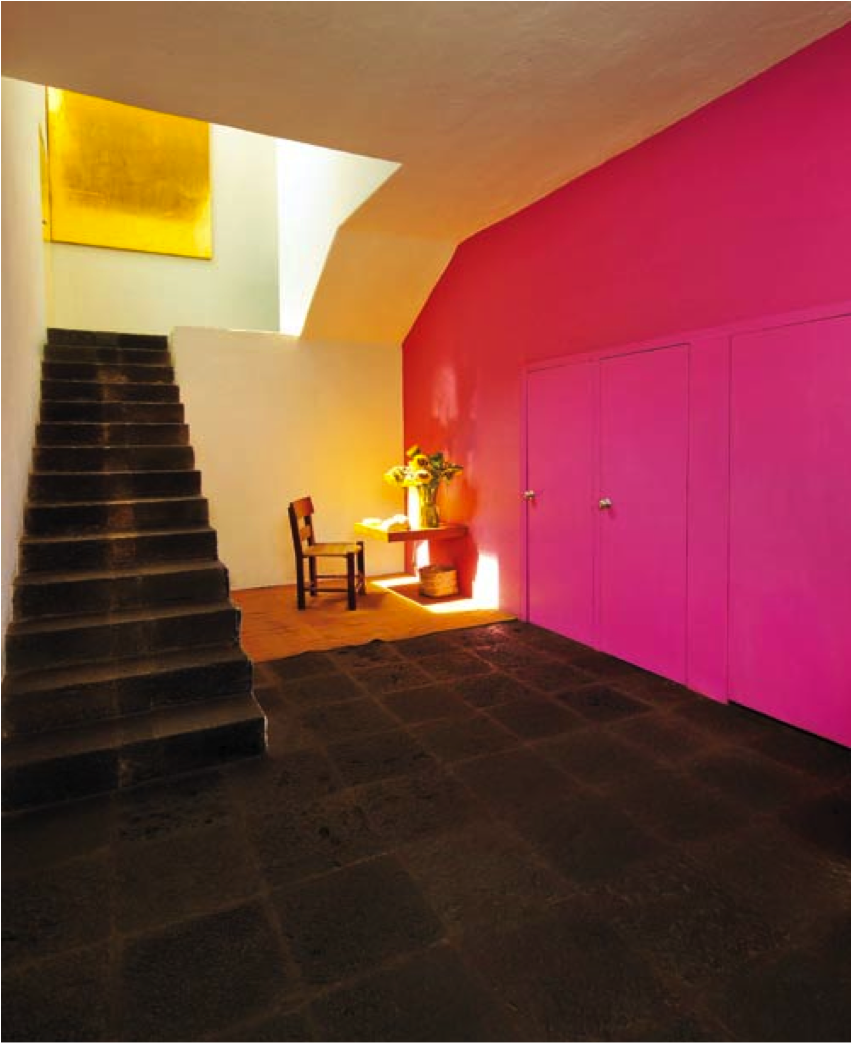
Luis Barragán (1902-1988) was born in Guadalajara, Mexico. His professional training was in engineering, resulting in a degree at the age of twenty-three. His architectural skills were self-taught. In the 1920s, he traveled extensively in France and Spain and, in 1931, lived in Paris for a time, attending Le Corbusier’s lectures. His time in Europe, and subsequently in Morroco, stimulated an interest in the native architecture of North Africa and the Mediterranean, which he related to construction in his own country. http://www.pritzkerprize.com/1980/bio
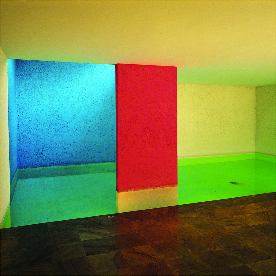
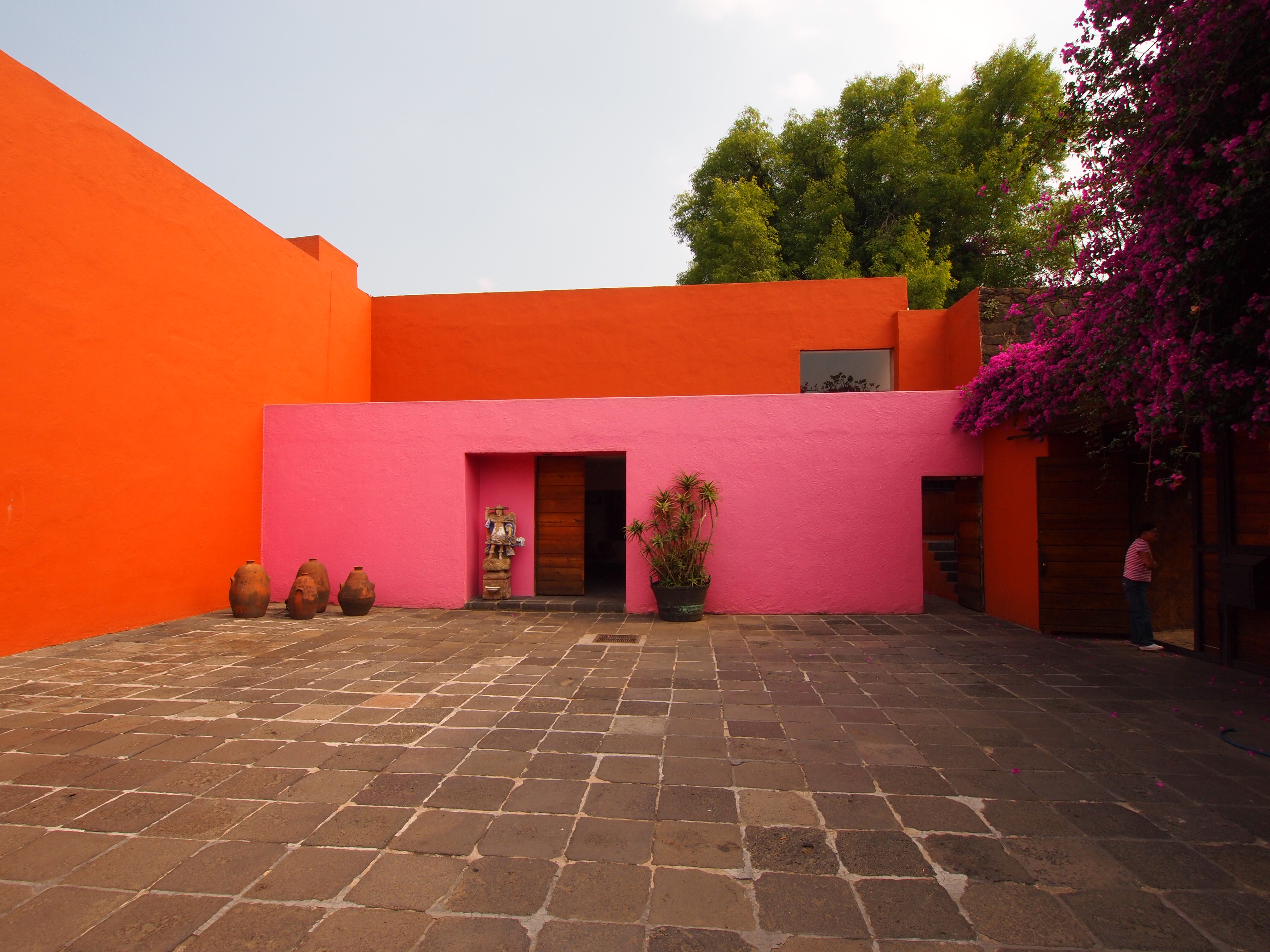
Luis Barragán’s name came up in a recent Smoke School of art discussion about the Art Nouveau movement. When professor Jason Sweet shared images of Barragán’s architecture with the group, there was an immediate connection to his use of color and its relation to the term “local colour.” Barrágan is well respected for his architecture–its inclusion of nature, light and water–but this dialogue is about his use of color specifically.
Ethnicity & Local Colour
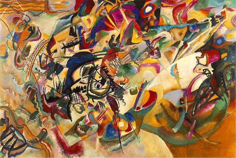
The Impressionists’ study of open-air light effects led them to question the accepted conventions of local colour. They noticed that every object’s local colour appears modified by reflected colours from surrounding objects. Rather than painting the colours they had learned objects to be, the Impressionists tried to put down only the colours they actually saw. http://www.artandarchitecture.org.uk/insight/virag_imptechniques/virag_imptechniques02.html
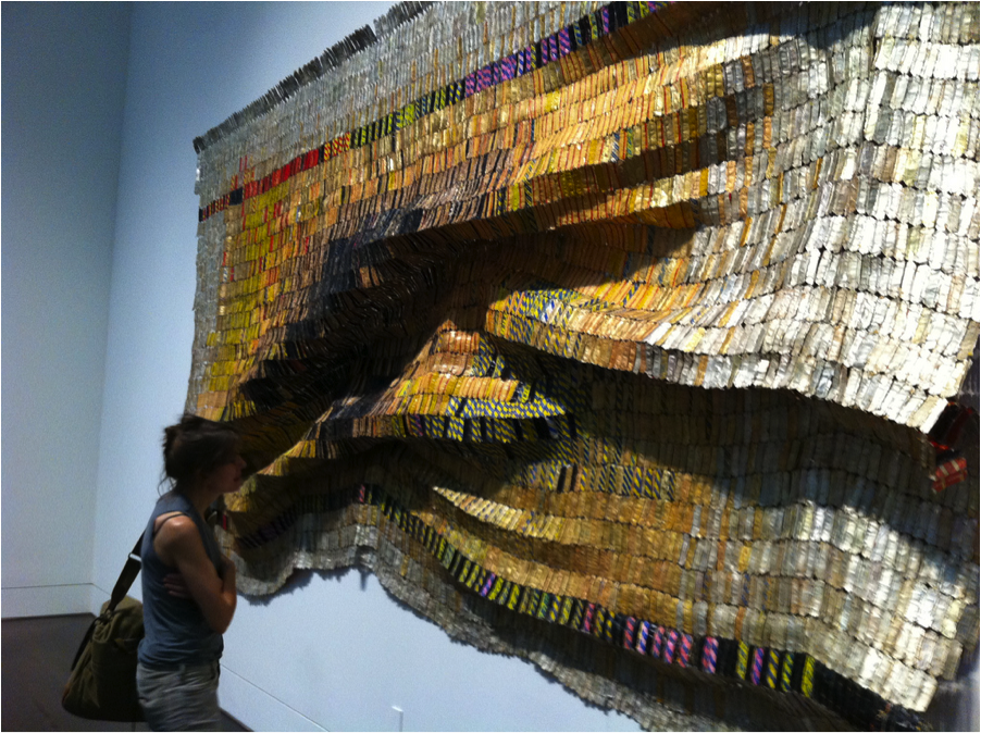
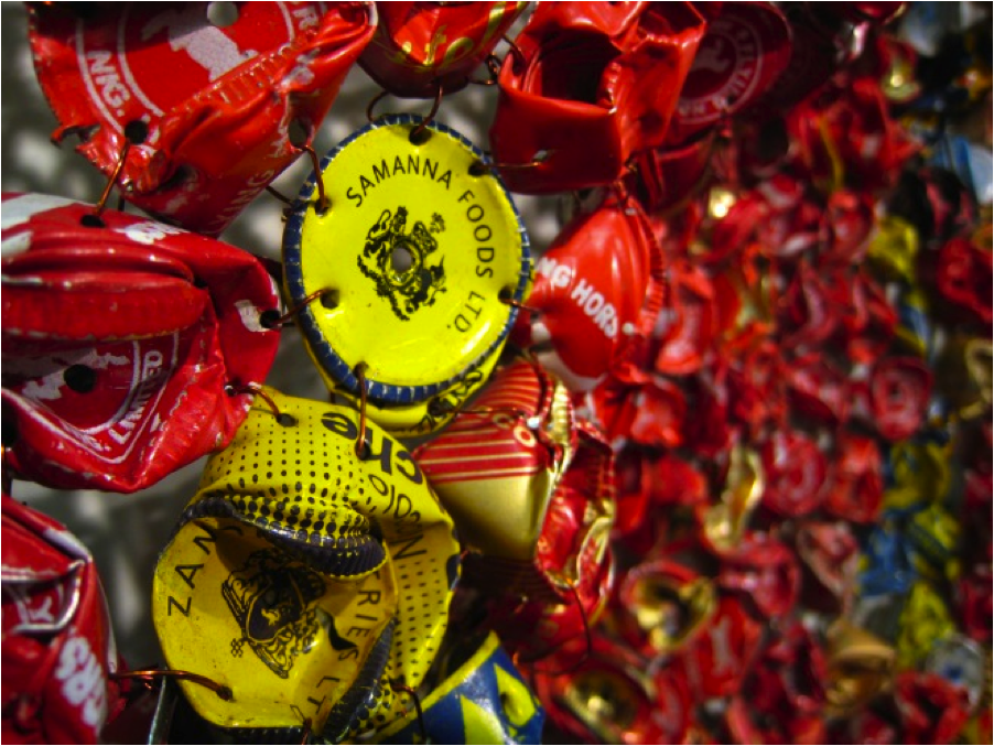
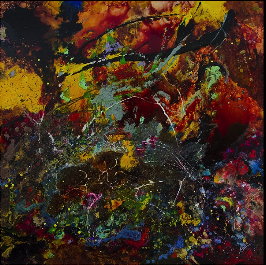
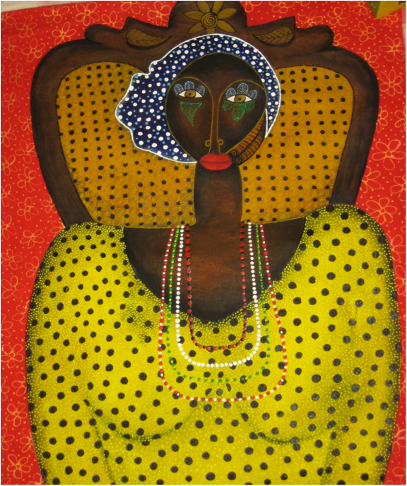
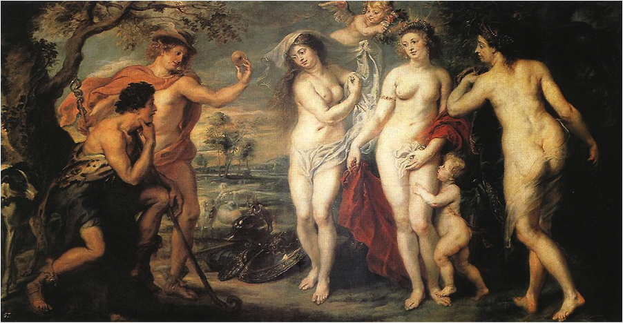
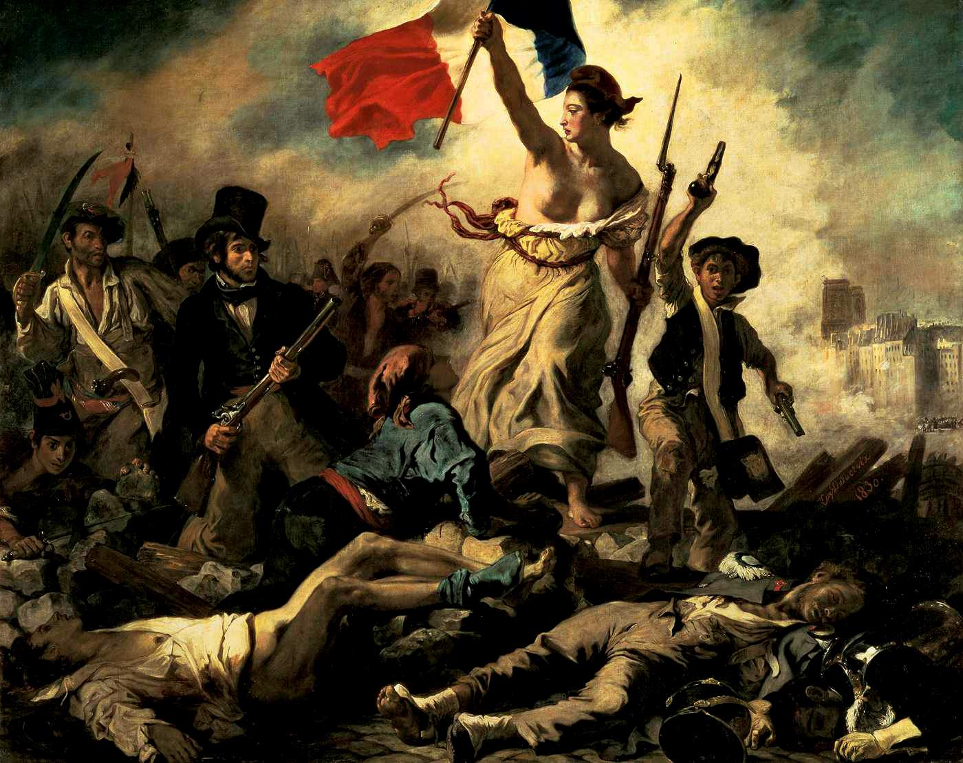
Local colour goes far beyond its technical understanding in painting as the effects of color on the eye. Local colour emits the very spirit of a region and individual. The gloomy grey of London, the vibrant island colors, and the yellow in Van Gogh’s wheat fields are all characteristics of local colour that cannot be separated from the ethnicity/soul of the region. It goes beyond that to Georgia red clay signifying soil in which it’s not good to plant to very the similarly-colored soil found in Jamaica, “red dirt,” which indicates the opposite because it provides the most nutrients. It is in this play of similarity and difference—of Barragán’s color with the Tradition of local colour in the West—that an understanding of his work sharpens. Barragán’s color is rich in spiritual significance while Western color attempts to use color in soulless, detached study. The West dissects and analyses color for optical effects.
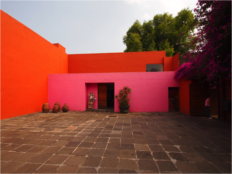
The importance of local colour cannot truly be quantified with just attention to the “colors in front of you.” This was a struggle for the Impressionists because it meant refusing the tradition of depth. It meant leaving the brown varnish technique prevalent before the Impressionists to examine the objects “in front of you” regardless of tradition. As a by-product of painting what was “in front of you,” we begin to see local colours indigenous to the region where the individual artists are from. The palette of Monet, Degas, Renoir, Cassatt, all are as distinct as a fingerprint. Color palettes are a true indicator of an individual’s ethnicity; it’s revealed by the artist’s choice of color. Barragán’s palette is definitely not Western, especially not Western modernism.
Identity and Local Colour
Further, he [Barragan]called it [Modernisim] “alarming” that publications devoted to architecture seemed to have banished the words, “Beauty, Inspiration, Magic, Spellbound, Enchantment, as well as the concepts of Serenity, Silence, Intimacy and Amazement.” He apologized for perhaps not having done these concepts complete justice, but said “they have never ceased to be my guiding lights.” As he closed his remarks, he spoke of the art of seeing. “It is essential to an architect to know how to see—to see in such a way that vision is not overpowered by rational analysis.-BARRAGAN http://www.pritzkerprize.com/1980/bio
Barragán’s use and intention in regard to color is in a spiritual context, not in the sterile, clinical “paint by number” Western use evident in Yves Klein’s monochromatic paintings, patented Yves Klein Blue. YKB is a color distinctiveness of the West. We recognize color on a most basic level and identify with it spiritually. No one routinely asks, “What’s your favorite form, line, shape?” Color seems to function inside formal analysis yet not tied to it at all. Color operates on a visceral level. Western academia has tried its very best to edit that connection to color and that is why it is so obvious when Barragán’s palette emerges.

Yves Klein IKB 79 1959
KB 79 was one of nearly two hundred blue monochrome paintings Yves Klein made during his short life. He began making monochromes in 1947, considering them to be a way of rejecting the idea of representation in painting and therefore of attaining creative freedom. Although it is difficult to date many of these works precisely, the early ones have an uneven surface, whereas later ones, such as the present work, are finer and more uniform in texture. Klein did not give titles to these works but after his death in 1962, his widow Rotraut Klein-Moquay numbered all the known blue monochromes IKB 1 to IKB 194, a sequence which did not reflect their chronological order. Since then further examples have been identified and these have also been given IKB numbers. In 1974 Rotraut Klein-Moquay wrote to Tate saying that she was fairly certain that IKB 79 was one of about four monochrome paintings Klein made when they were together at Gelsenkirchen, West Germany in 1959. http://www.tate.org.uk/art/artworks/klein-ikb-79-t01513/text-summary
Mexican Modernism & Transcendance
LUIS BARRAGAN (1902-1988) was one of Mexico’s most influential 20th century architects. Famed for his mastery of space and light, he reinvented the International Style as a colourful, sensuous genre of Mexican modernism. http://design.designmuseum.org/design/luis-barragan
Barragán’s “Pink Palette” can be seen in the work of American artist James Turrell. Turrell’s spaces are filled with the saturated spiritual color that was injected by Barragán’s Mexican tradition. Barragán and Mexican modernism influenced the majority of the Cool school artists whether they are aware of it or not. The Mexican influence is heavy in the California style distinctively different from the cold New York school. The New York abstract expressionists talked about the sublime and transcendence. Those who used those terms sought to achieve it through color, through vast fields of intense resonating color. The search for spiritual transcendence through color is not Western.
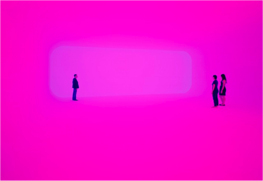
James Turrell
Breathing Light, 2013. LED light into space, Dimensions variable.
http://www.pacegallery.com/artists/473/james-turrell
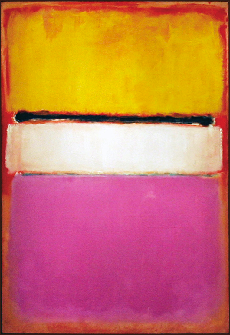
MARK ROTHKO: White Center (Yellow, Pink and Lavender on Rose)
Color Field Painting in 1950 by Mark Rothko (1903-1970)
http://pictify.com/218489/mark-rothko-white-center-yellow-pink-and-lavender-on-rose
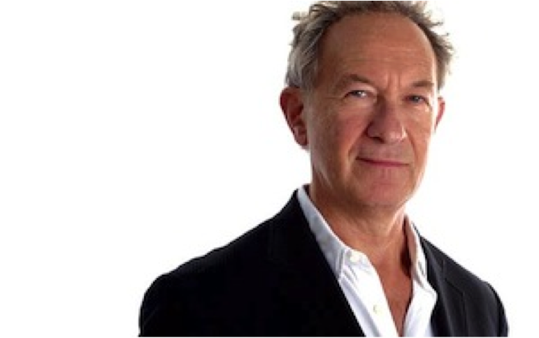
 Christopher Hutchinson is an Assistant Professor of Art at Atlanta Metropolitan State College, Archetype Art Gallery Owner in Atlanta, Ga, and Smoke School of Art Founder. He received his Master of Fine Arts Degree in Painting from Savannah College of art & Design, Atlanta and his Bachelor of Arts Degree from the University of Alabama in Huntsville, Alabama. He lived in Alabama for 10 years before moving to Atlanta in 2008.
Learn more about Christopher and his work at Black Flight 144.


