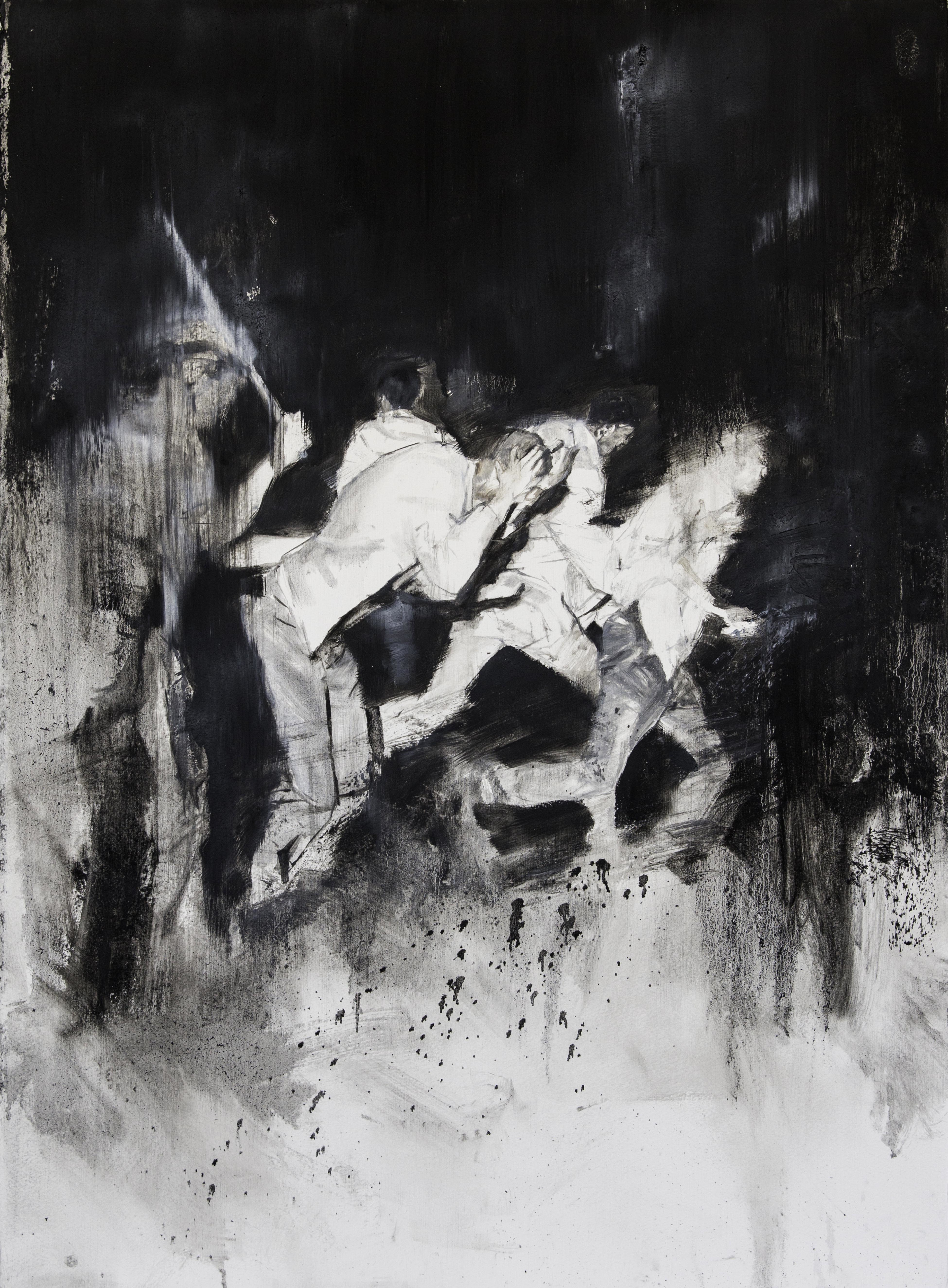
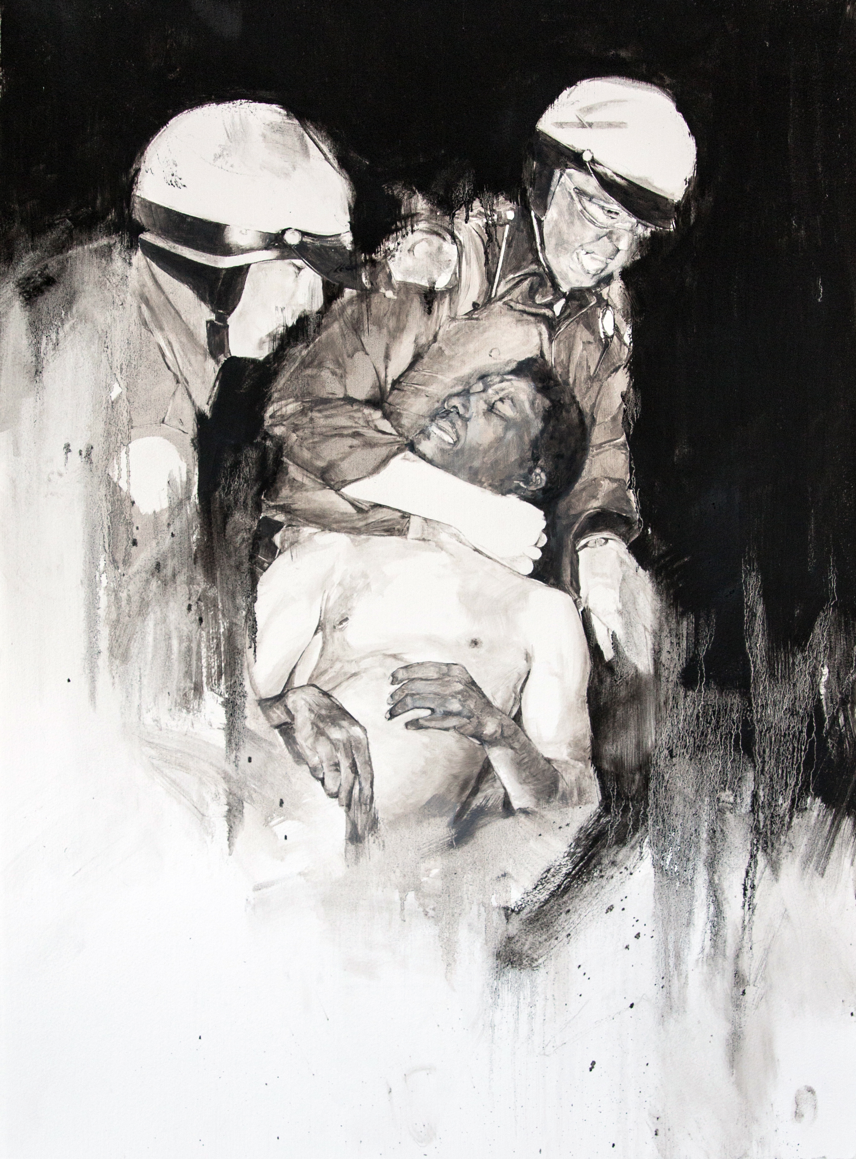
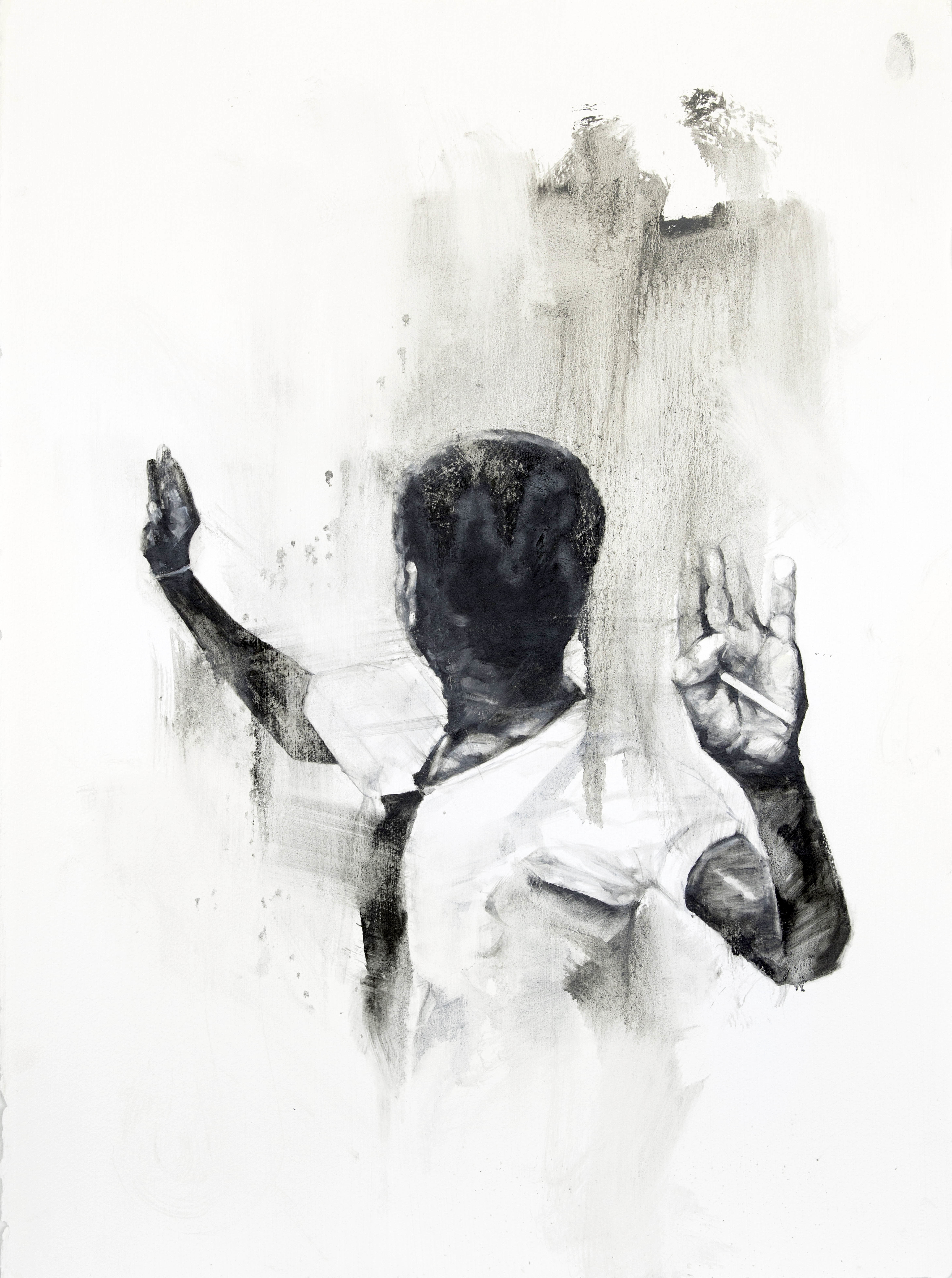
by David Feingold and Michael Quaintance
“Teeth is Tears” is a collaboration series between artists David Feingold and Michael Quaintance. Michael writes poetry in response to David’s images. As Michael says in his bio, “Feingold’s images act as doorways, as pathways to those avenues of thought and feeling that have been sequestered in the corners of my efforts to belong and be seen… as.” Both artists’ works are informed by their lived experience of disability. This is the first in a series of their collaborations to appear on Creative Thresholds.

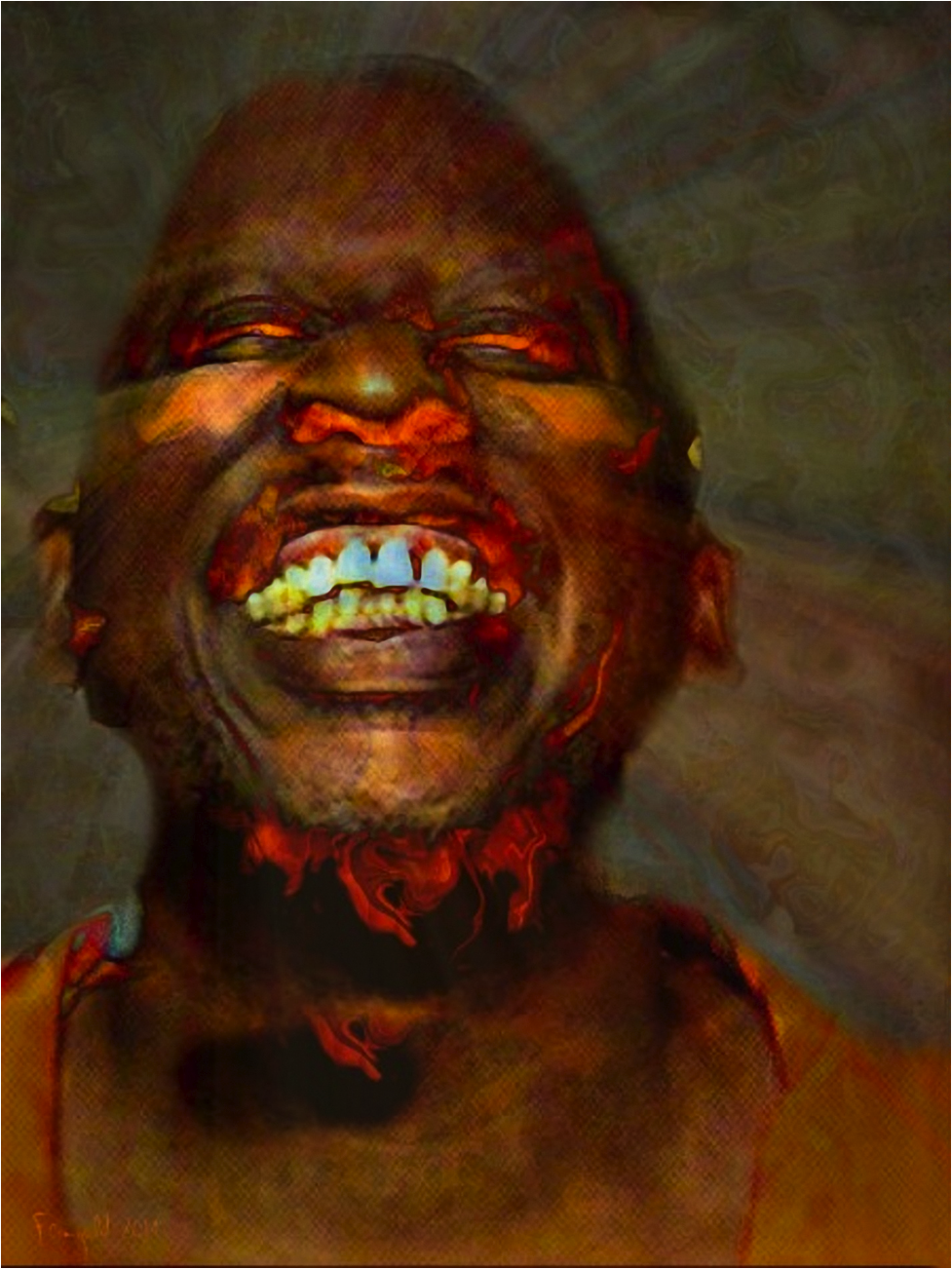
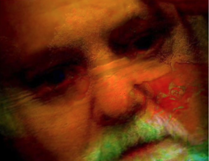
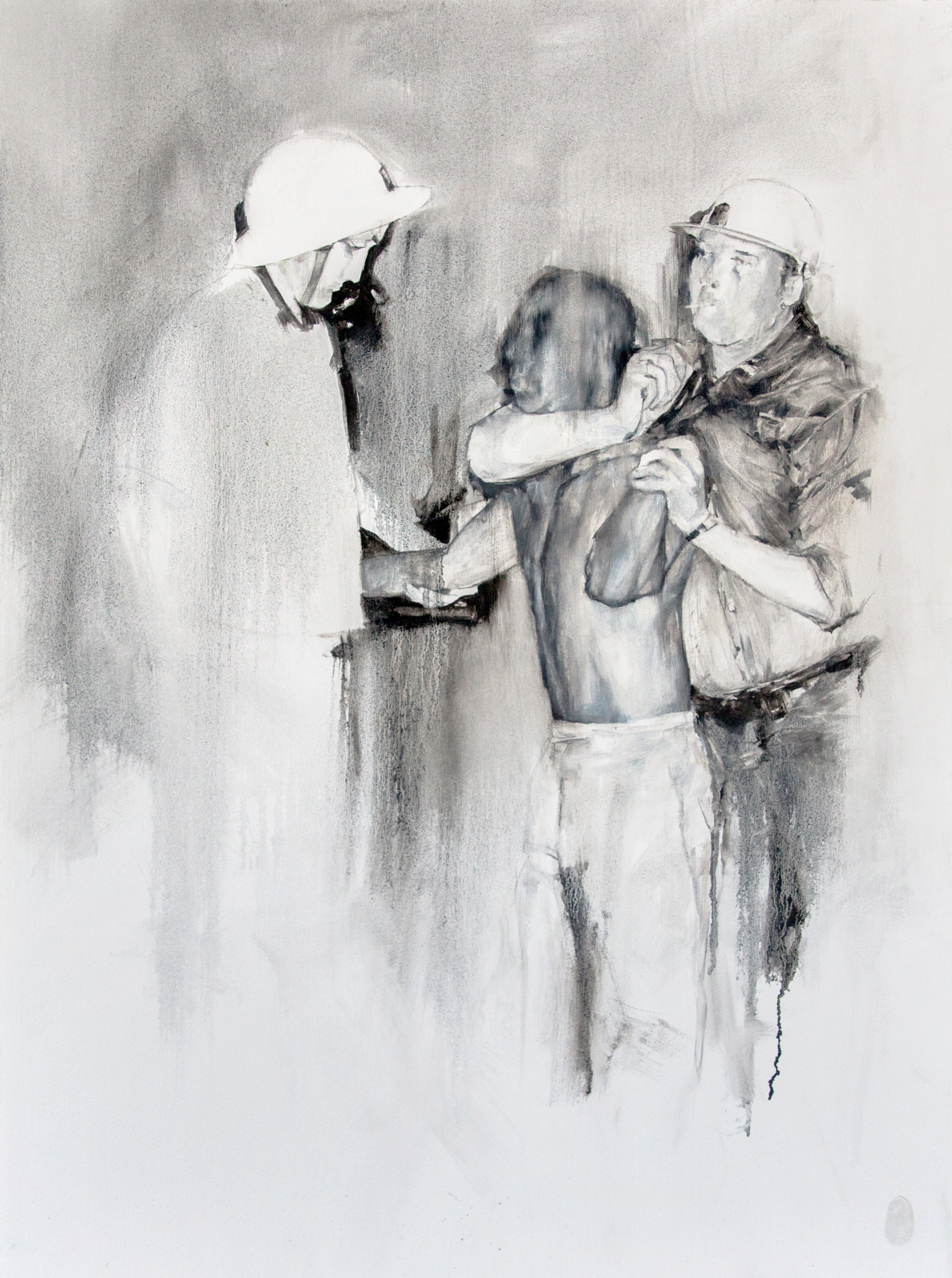
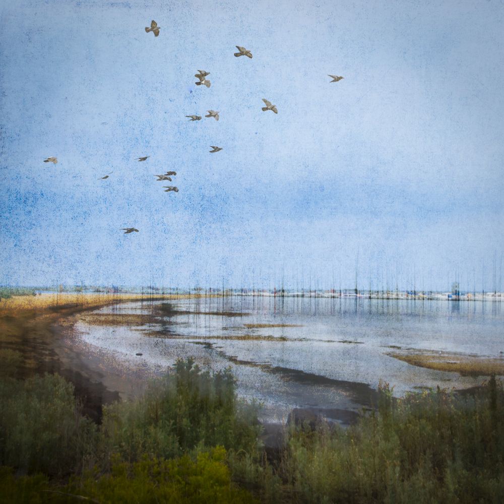
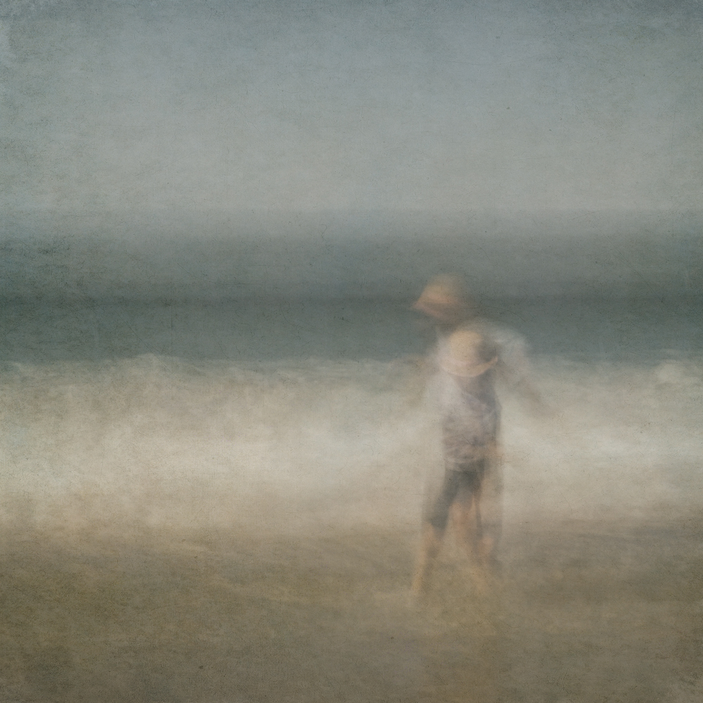
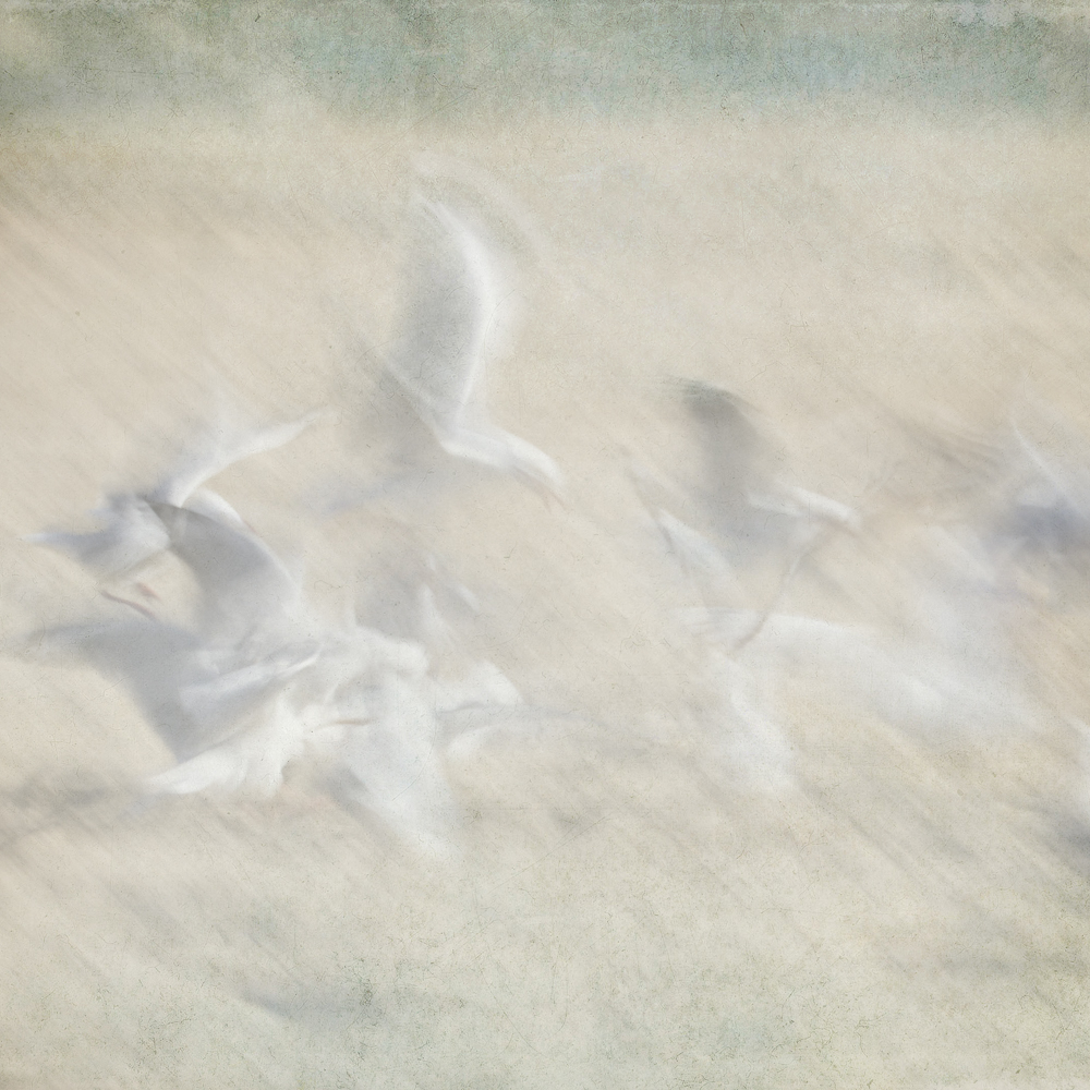
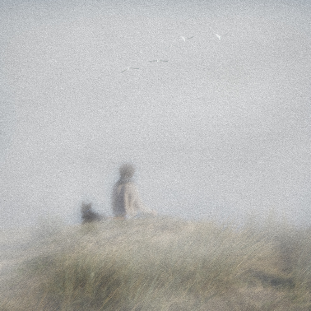
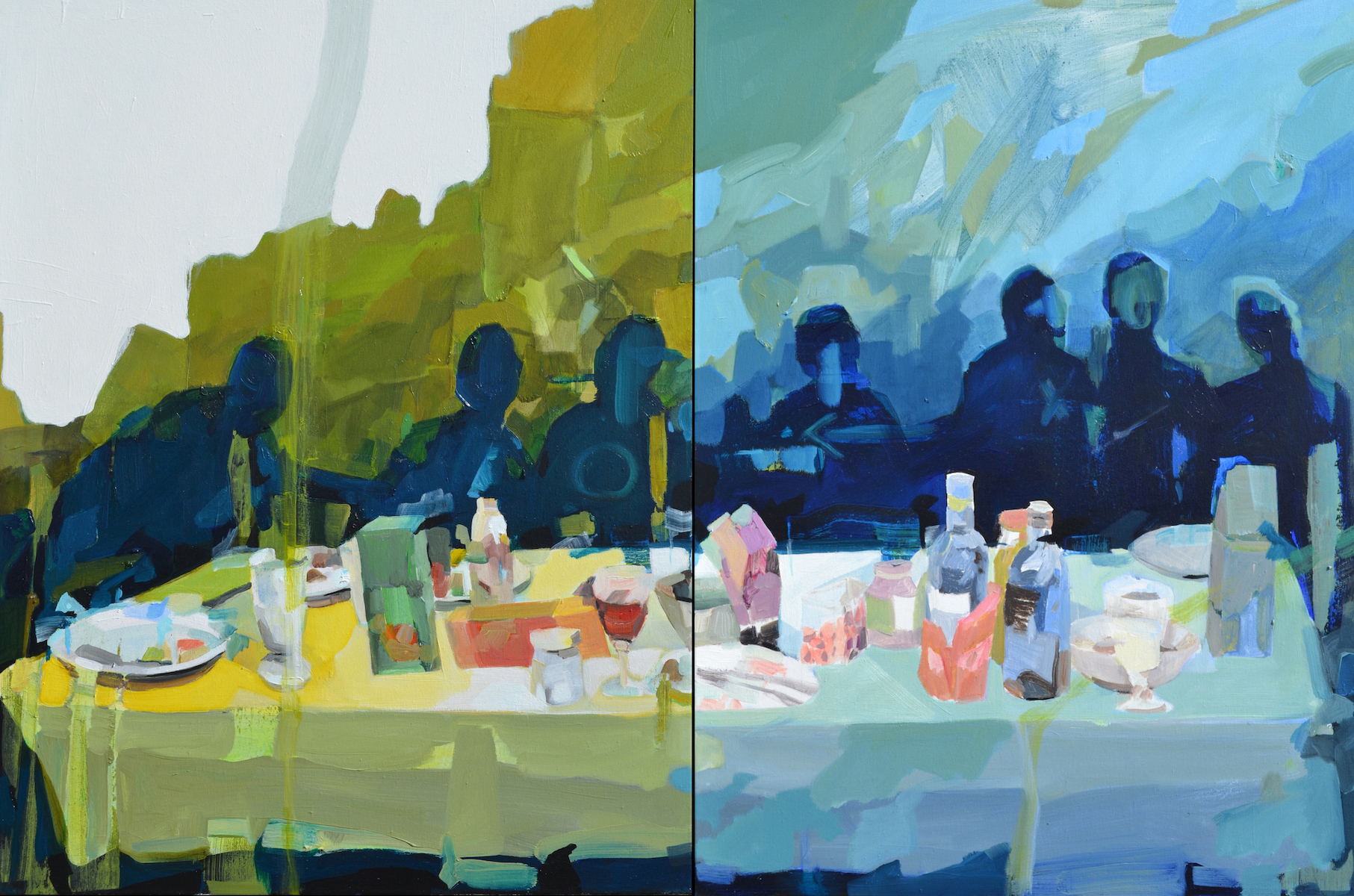
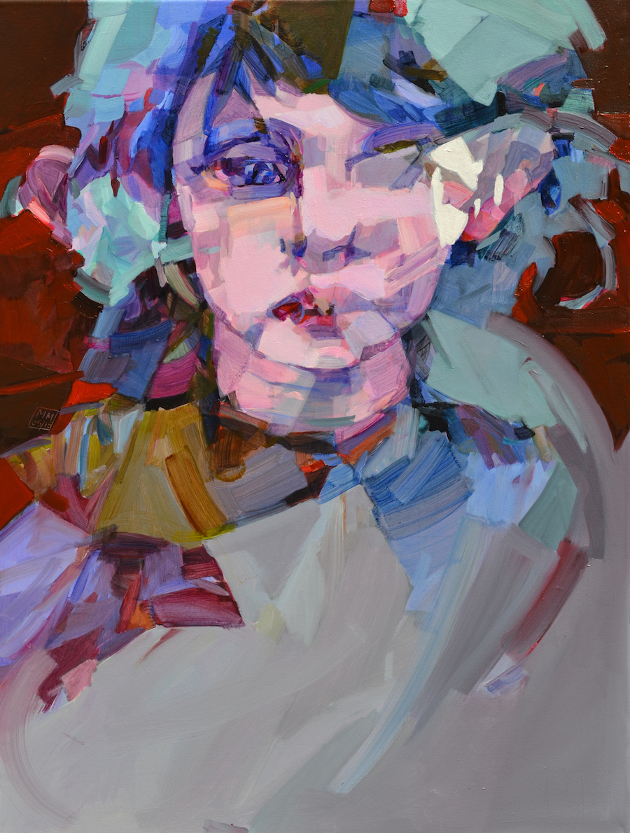
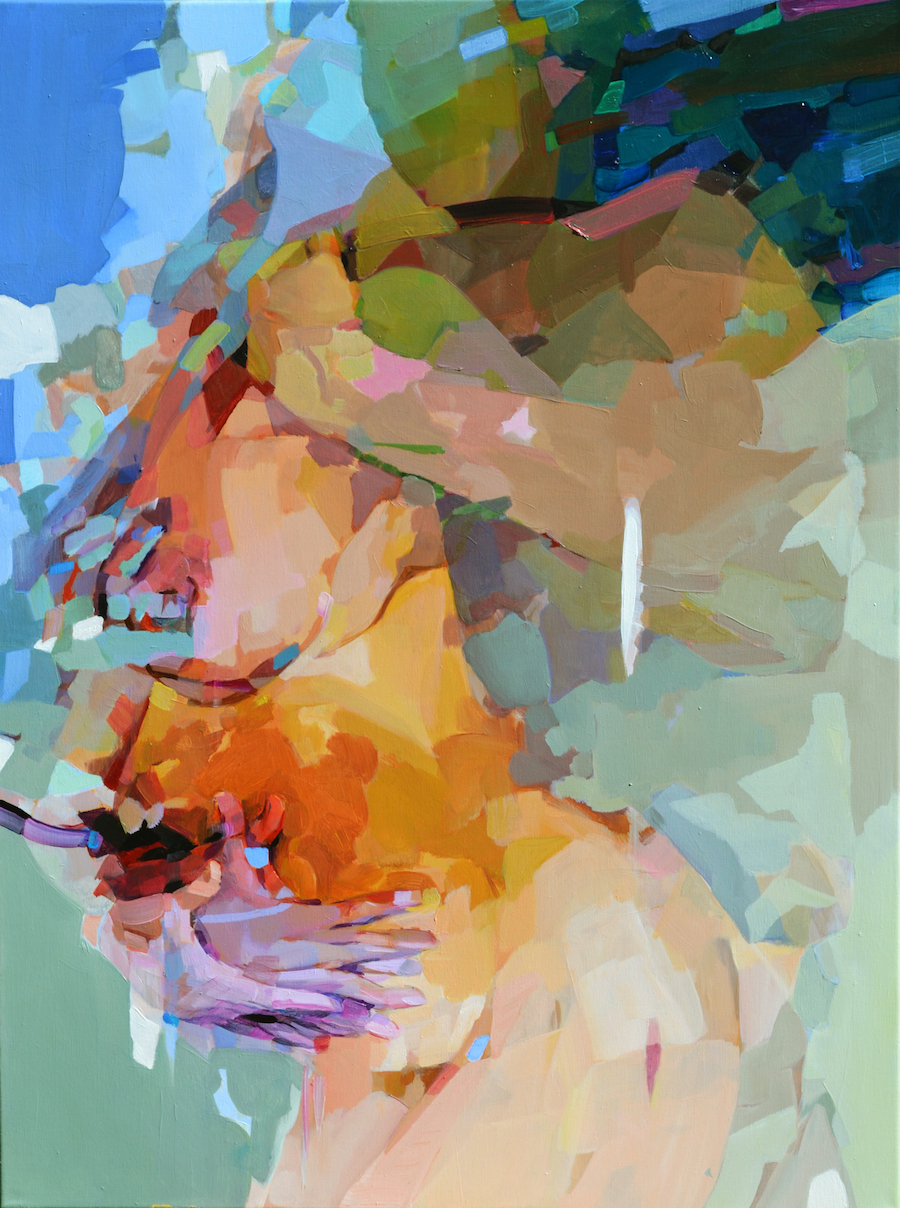
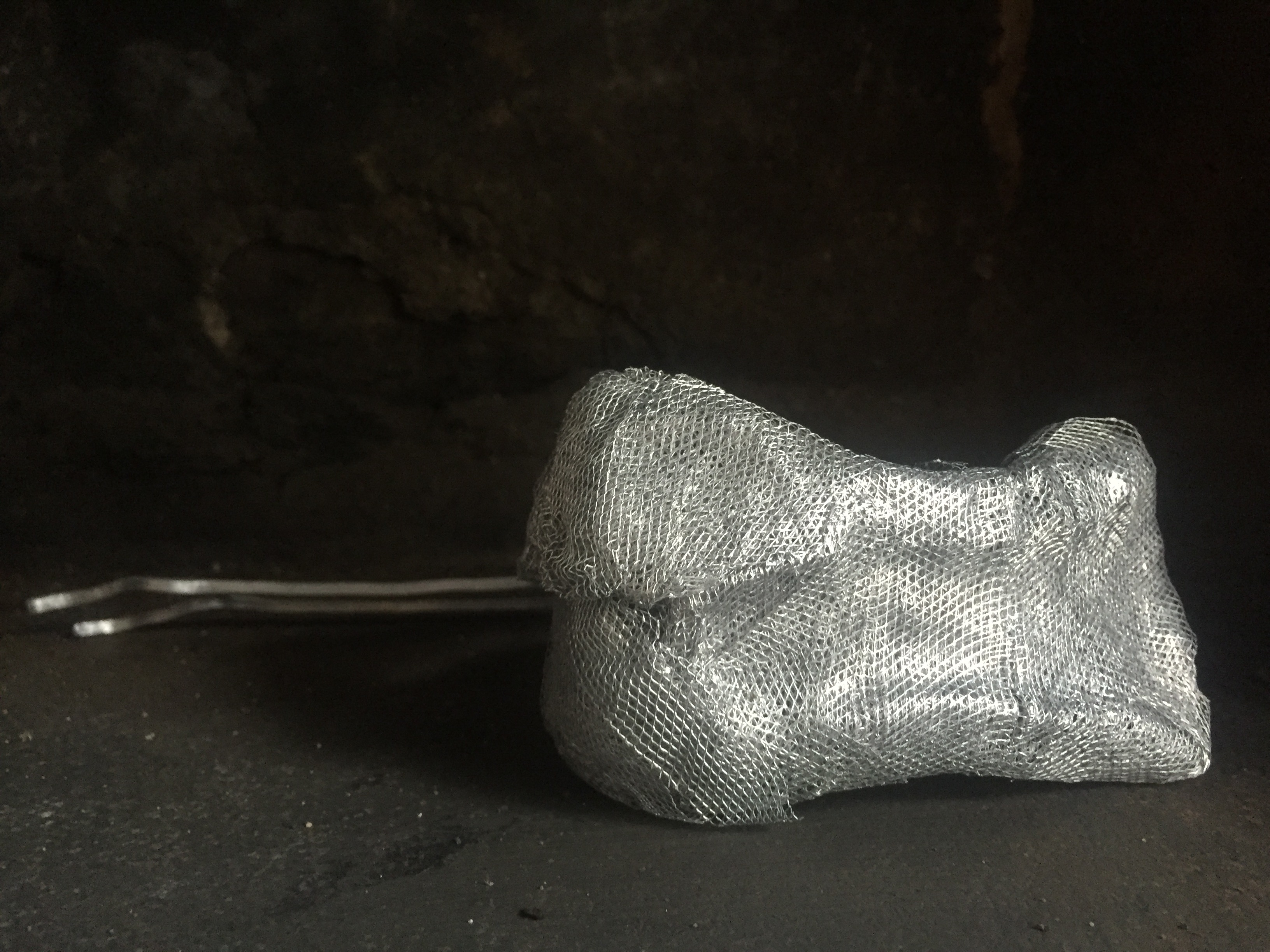
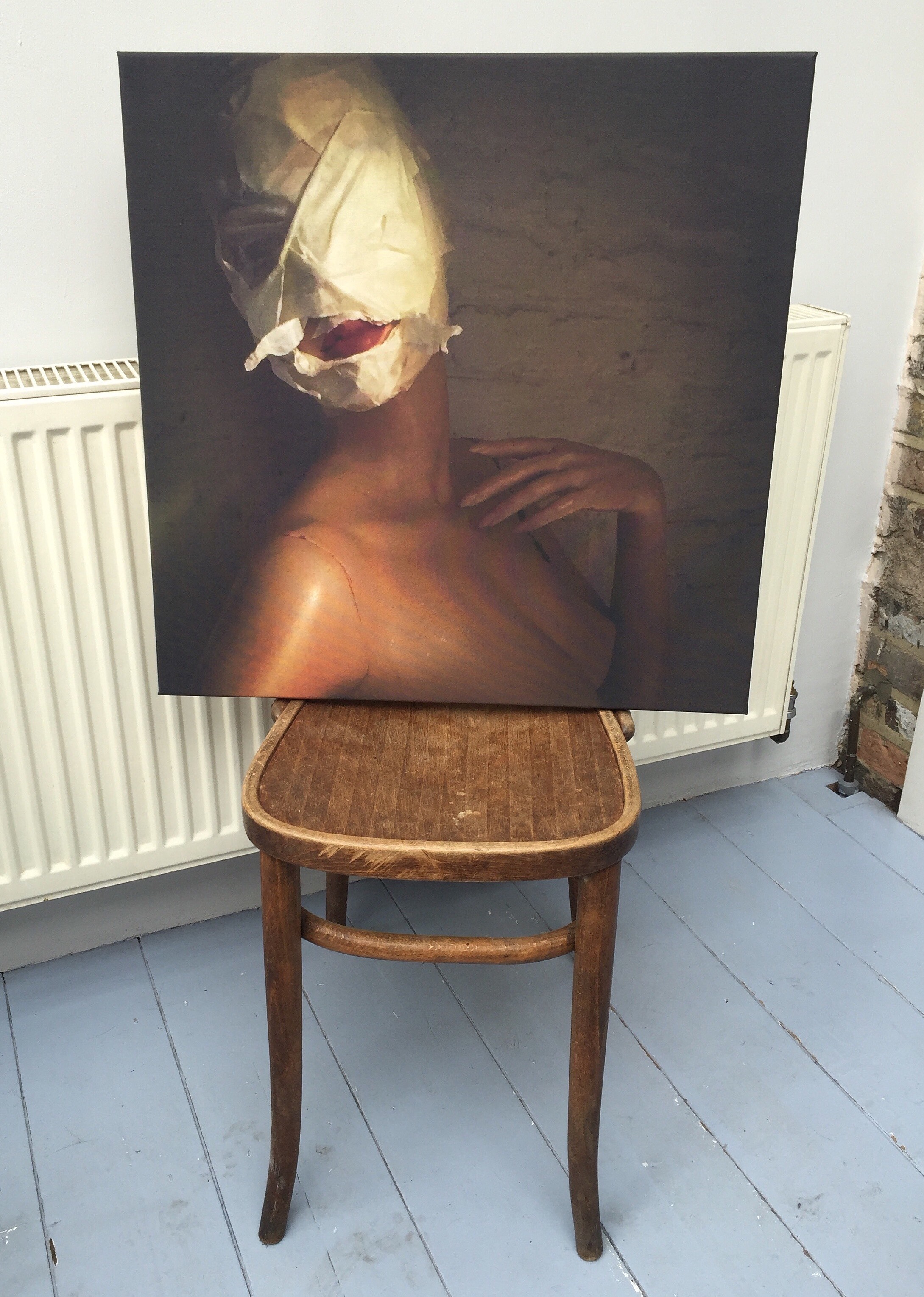
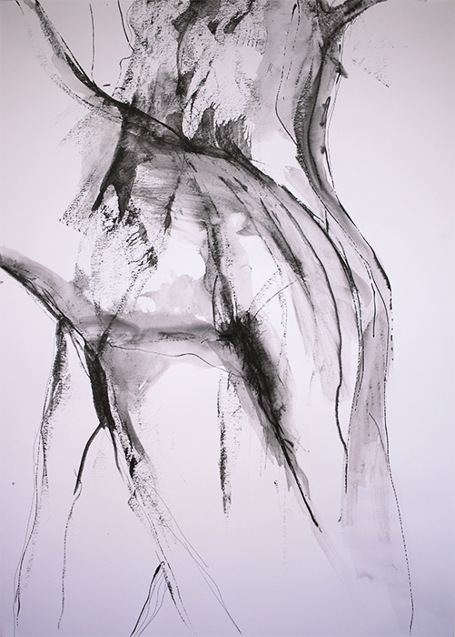
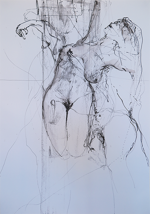
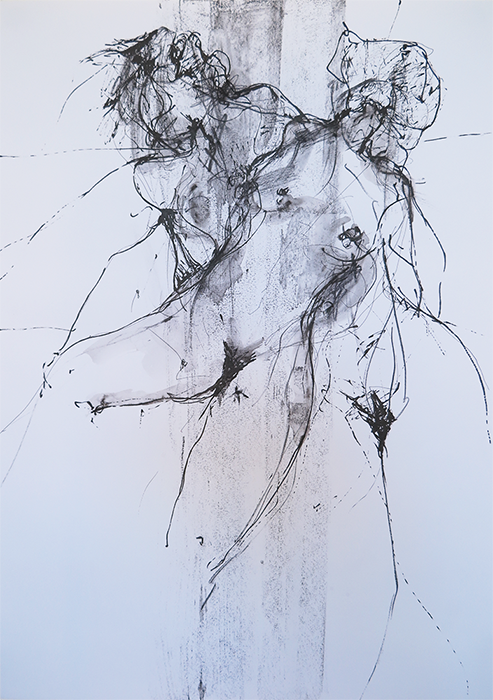
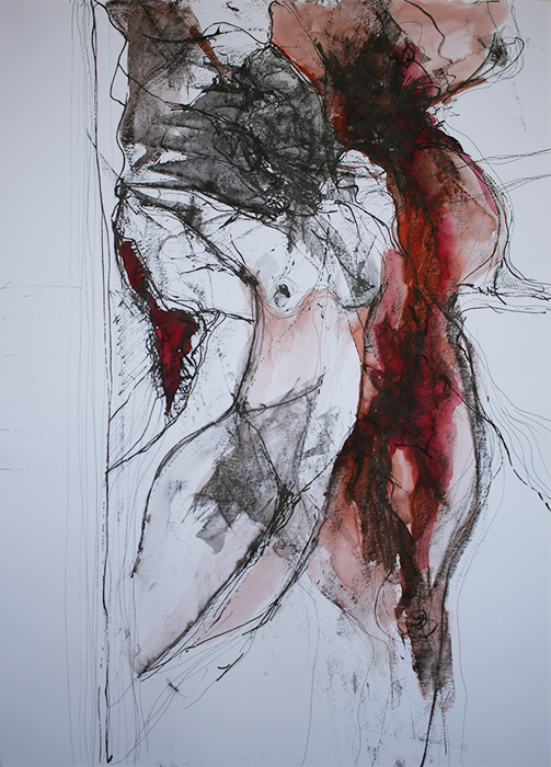
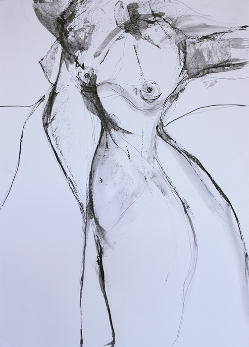
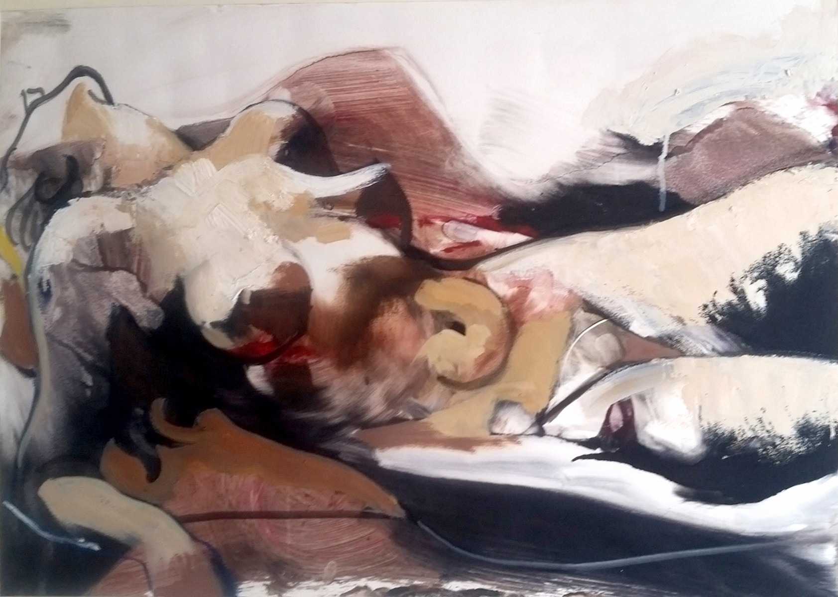
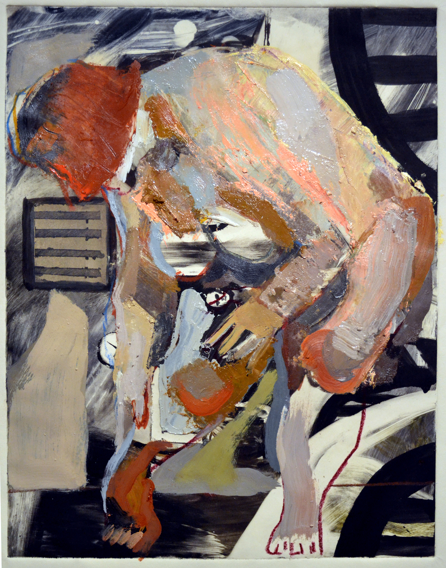
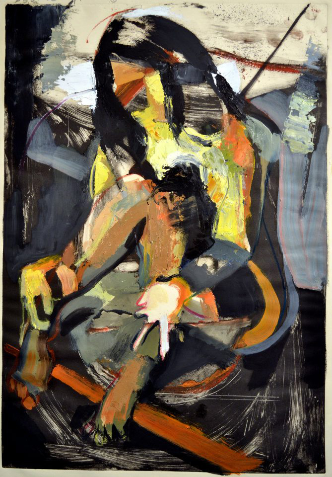
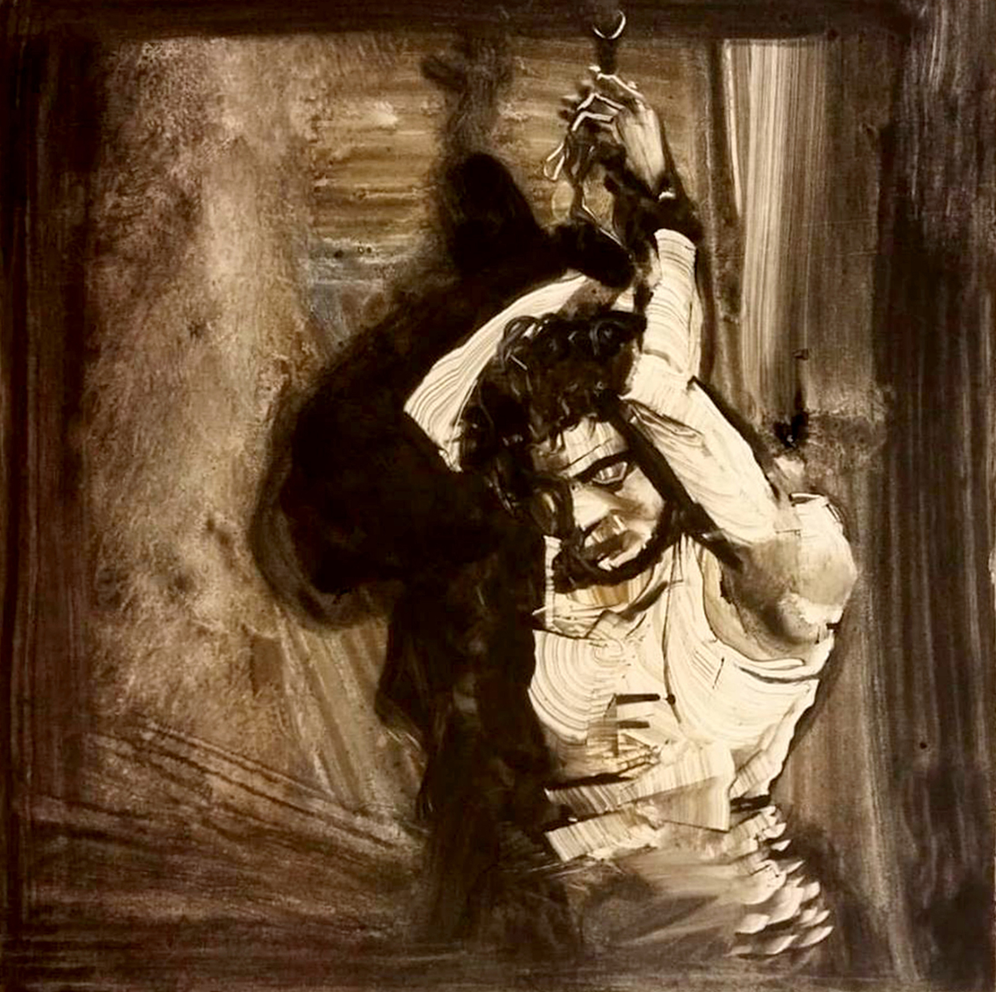
David Feingold, Seeing the Light
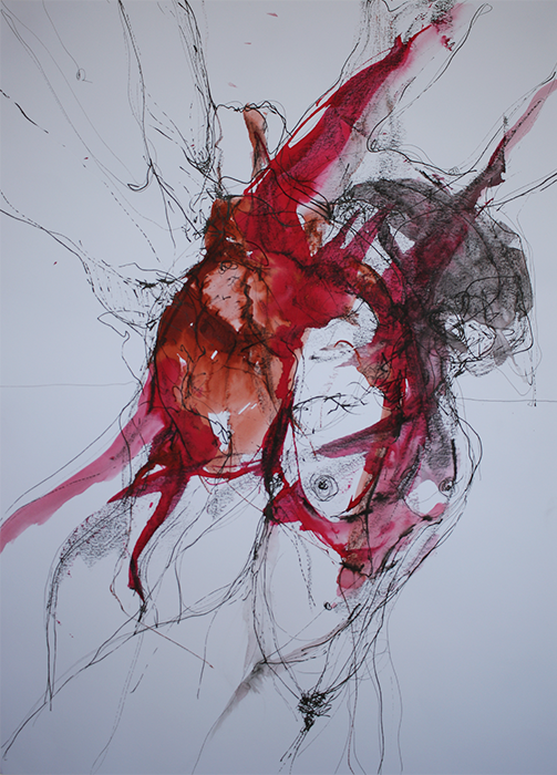
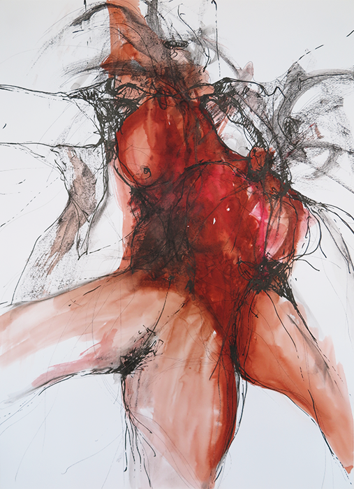
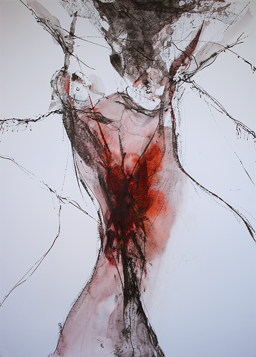
Teeth is Tears
The first thing you learns
Before the silence and the shame
Is the high cost of suffering and the impudence of pain
That god’s gone a-callin’
and the devil’s home to stay
That the hurt gon’ hurt forever
But you bes’ laugh hard today.
The second thing you learns
Is you a ditch for irrigation
A furrow in the fields
So all the blood run fresh and free,
Wait, with yo’ legs spread
For the plow to split you open
Pray the Lord gon keep his promise
That you be free, one day, to flee.
My daddy was a teeth man
My granddaddy too
They smiled for Mr. Charlie’s
Number one and number two,
They tilted they heads backward
While they smiled and smiled and smiled
So they tears fell back behind they thoughts
And their rage got washed to ground.
My daddy was a teeth man
My mamma cried in pain
She told him it was sorrow
But he knew that it was shame,
That everythang he loved he’d lose
Get stripped and passed away
If they saw the fire in his eyes
If the laughter turned to rage.
My daddy died a toothless man
My granddaddy did too
He never brushed the stains away
Kept proof of their abuse,
He ate the rot
Day after day, felt the grit rough on his tongue
He kept his breath rank and stale
So they breathed in what they’d done.
The first thing you learn
Before the silence and the shame
Is the high cost of suffering and the impudence of pain,
So, our niggers, keep on smiling
Niggers new and niggers old
All our bent and limp and cracked and gimped
Made to stand out in the cold.
The second thing you learn
Is those yellowed teeth, are tears
Lines of carefully coded history
Passed down through generations
And ignored
year after year.
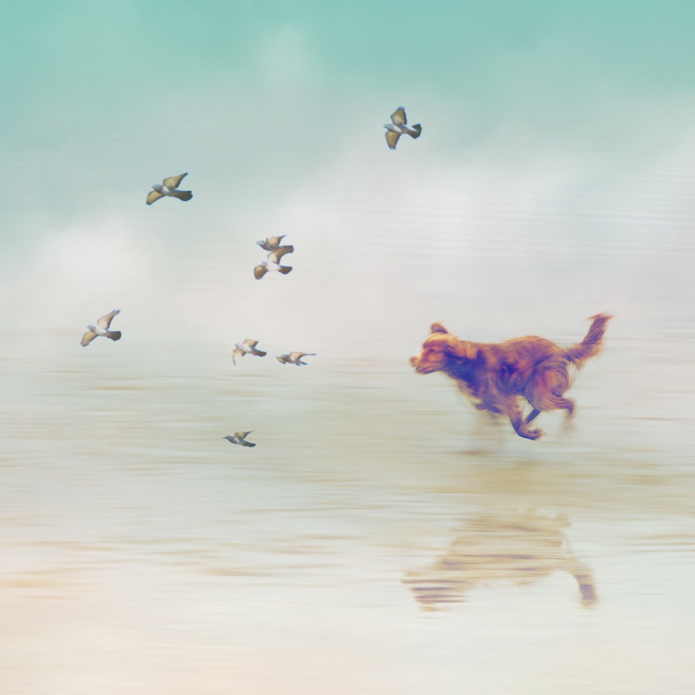
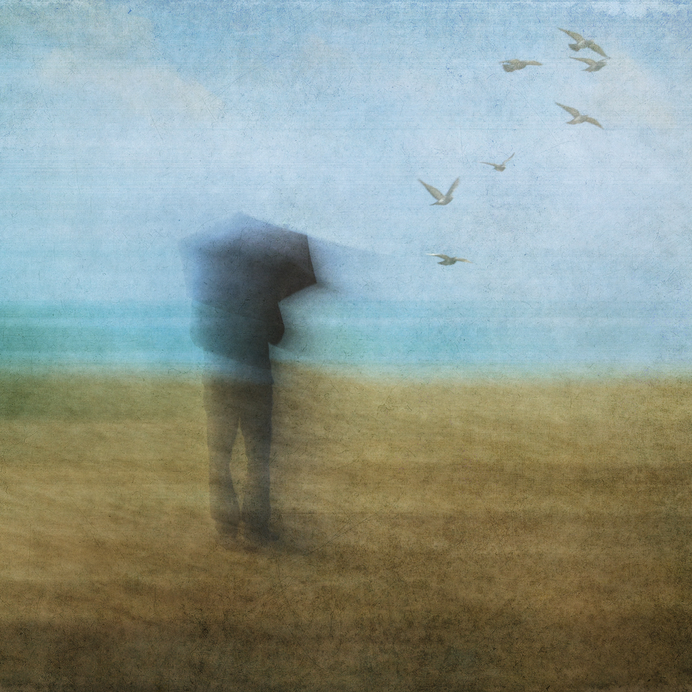
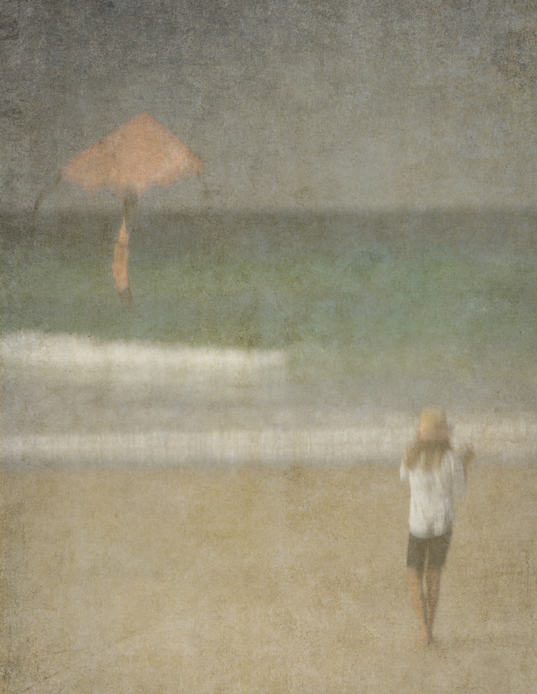
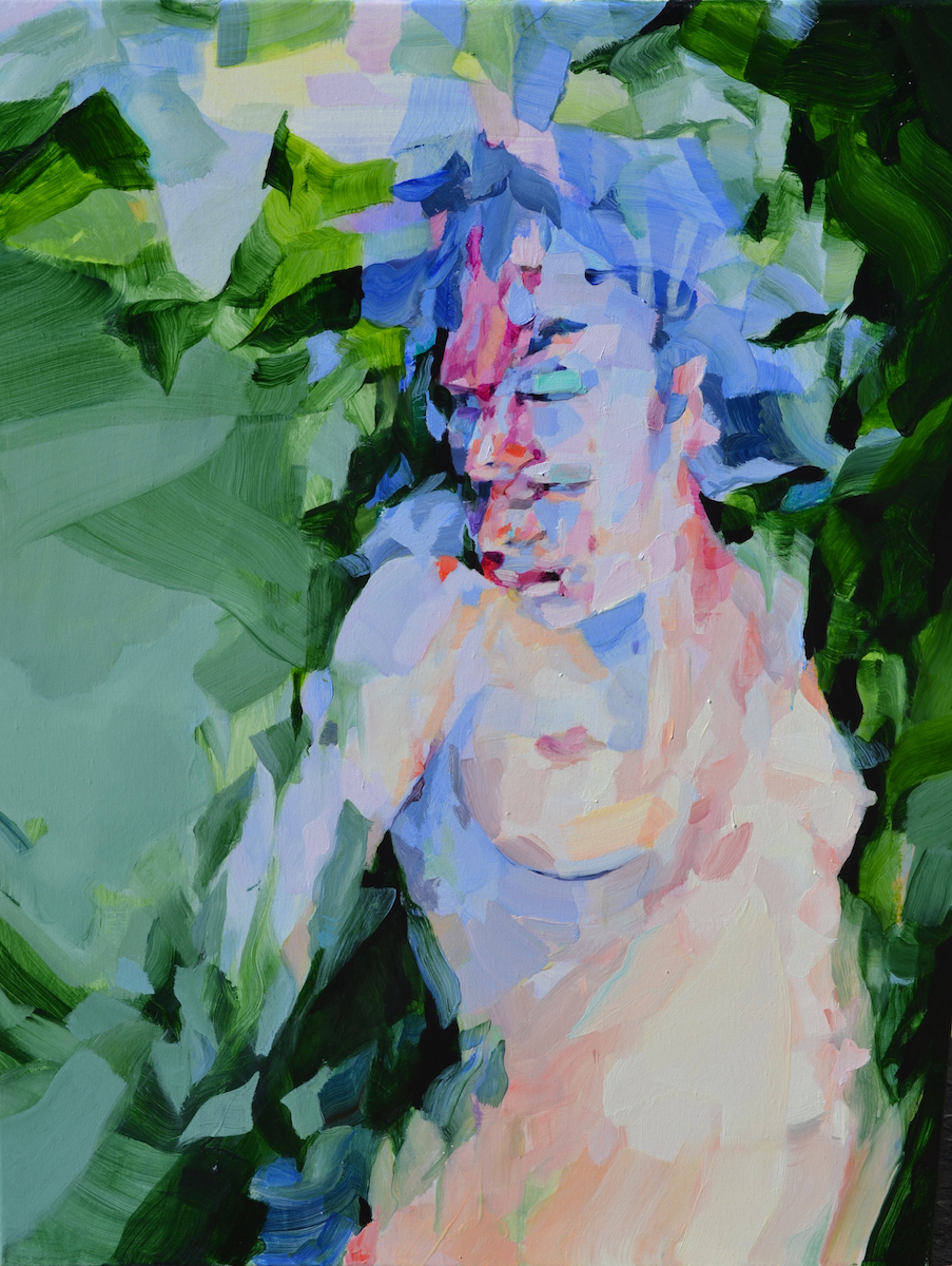
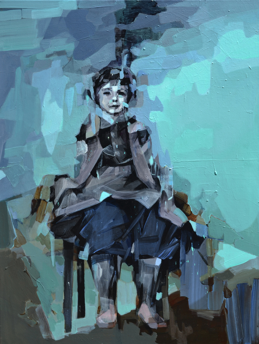
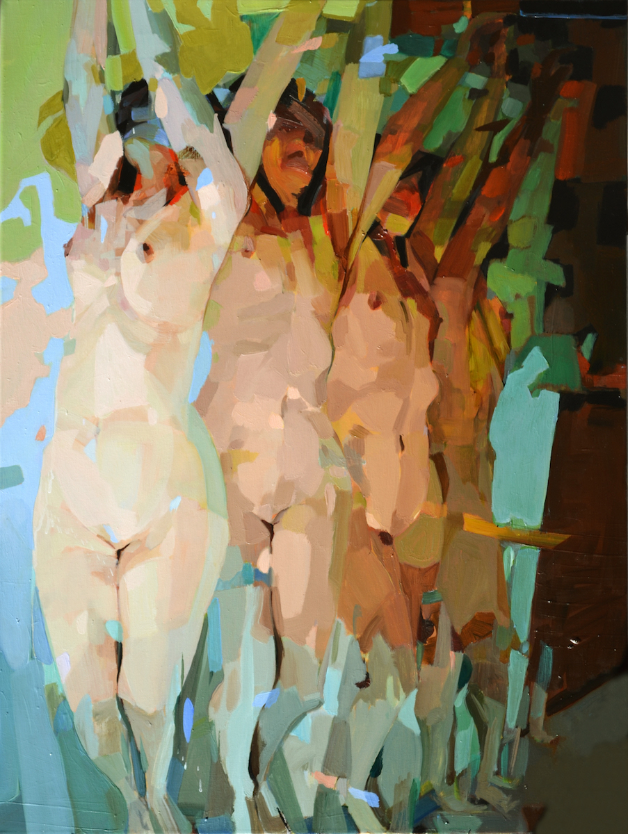
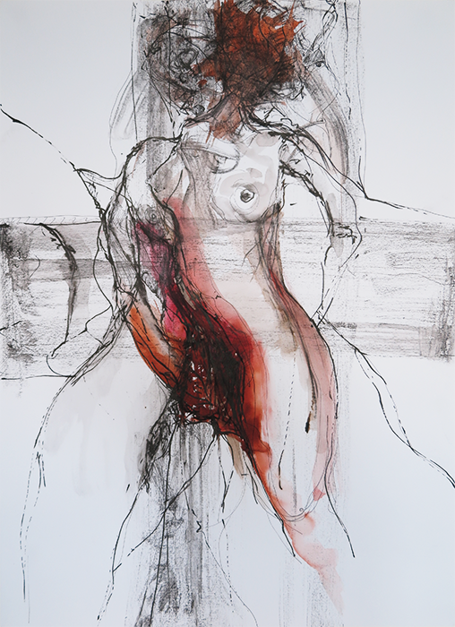
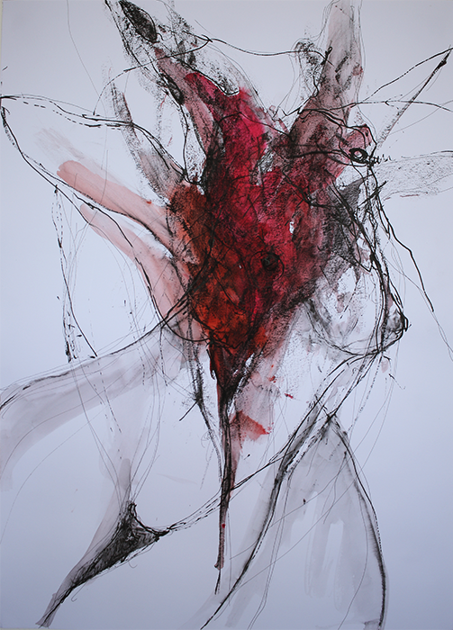
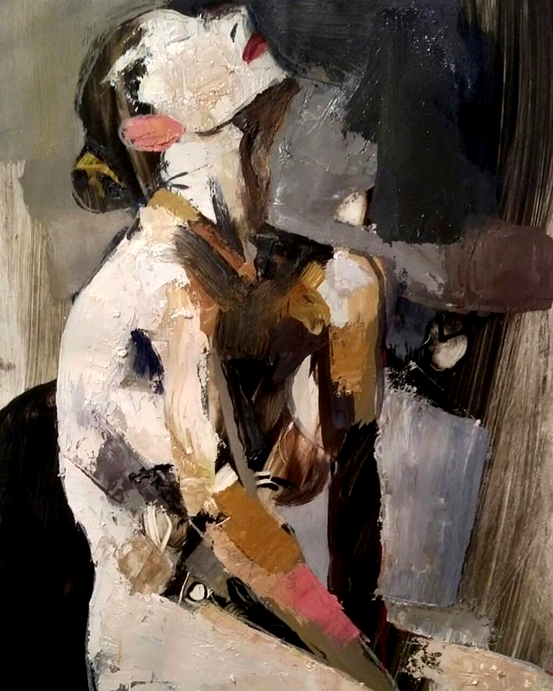
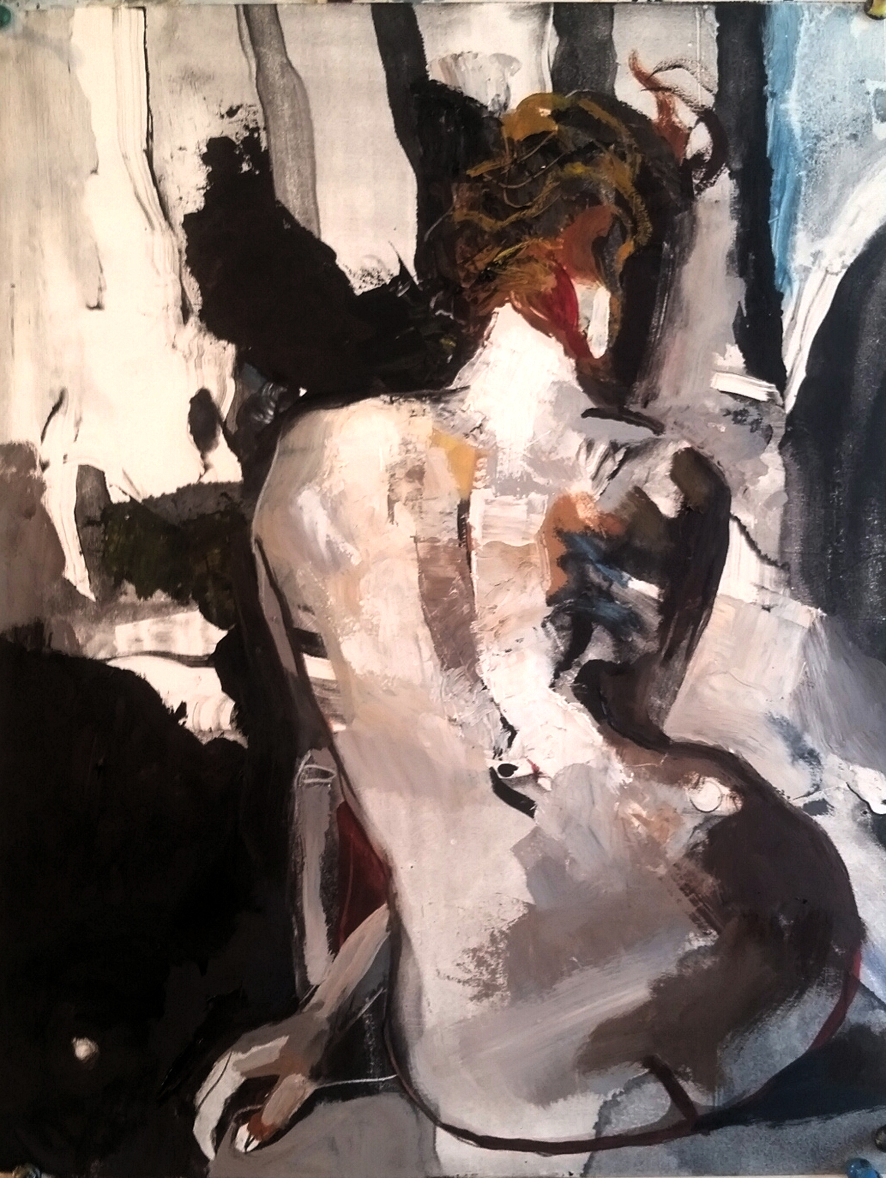
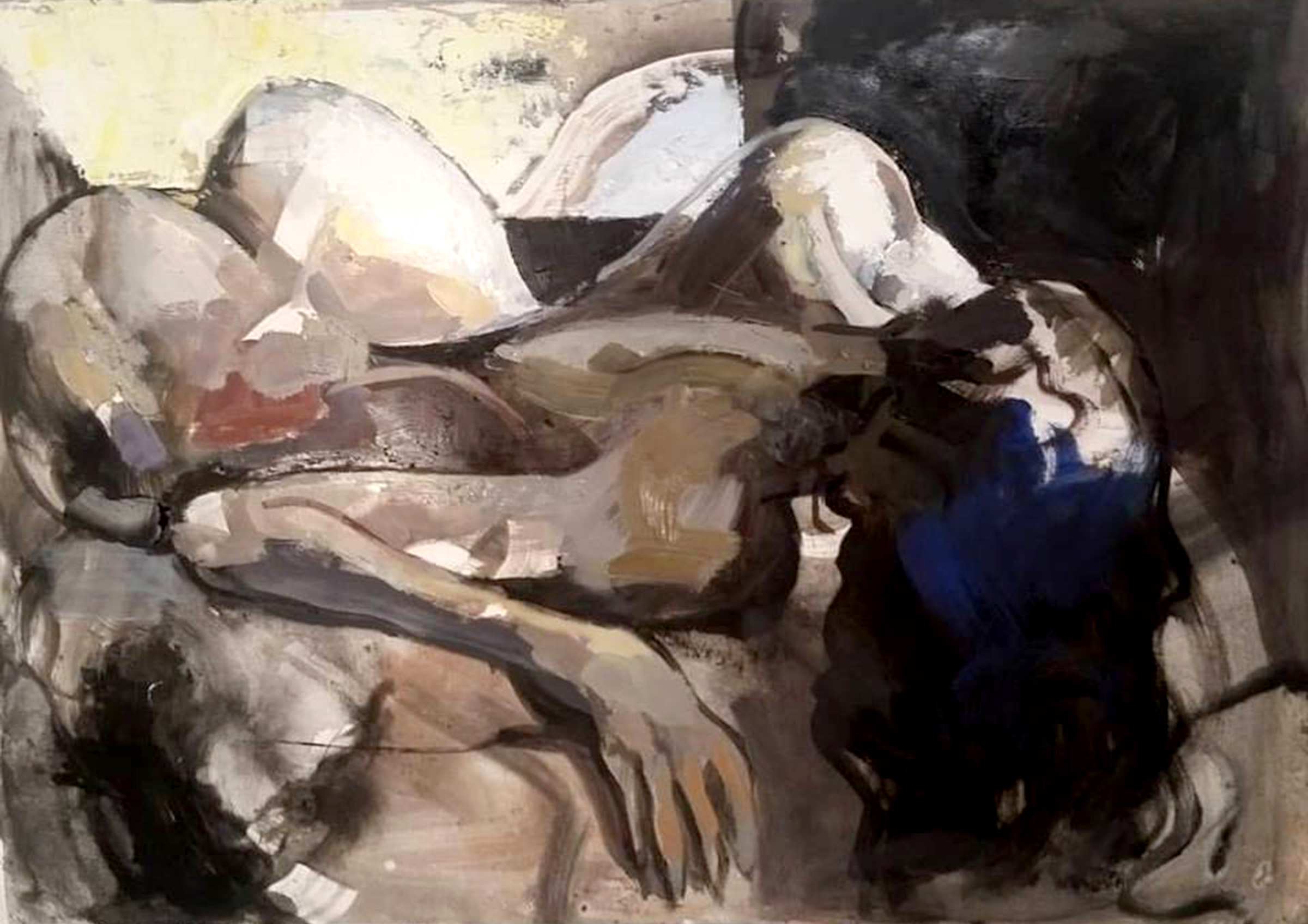
 Artist: David Feingold
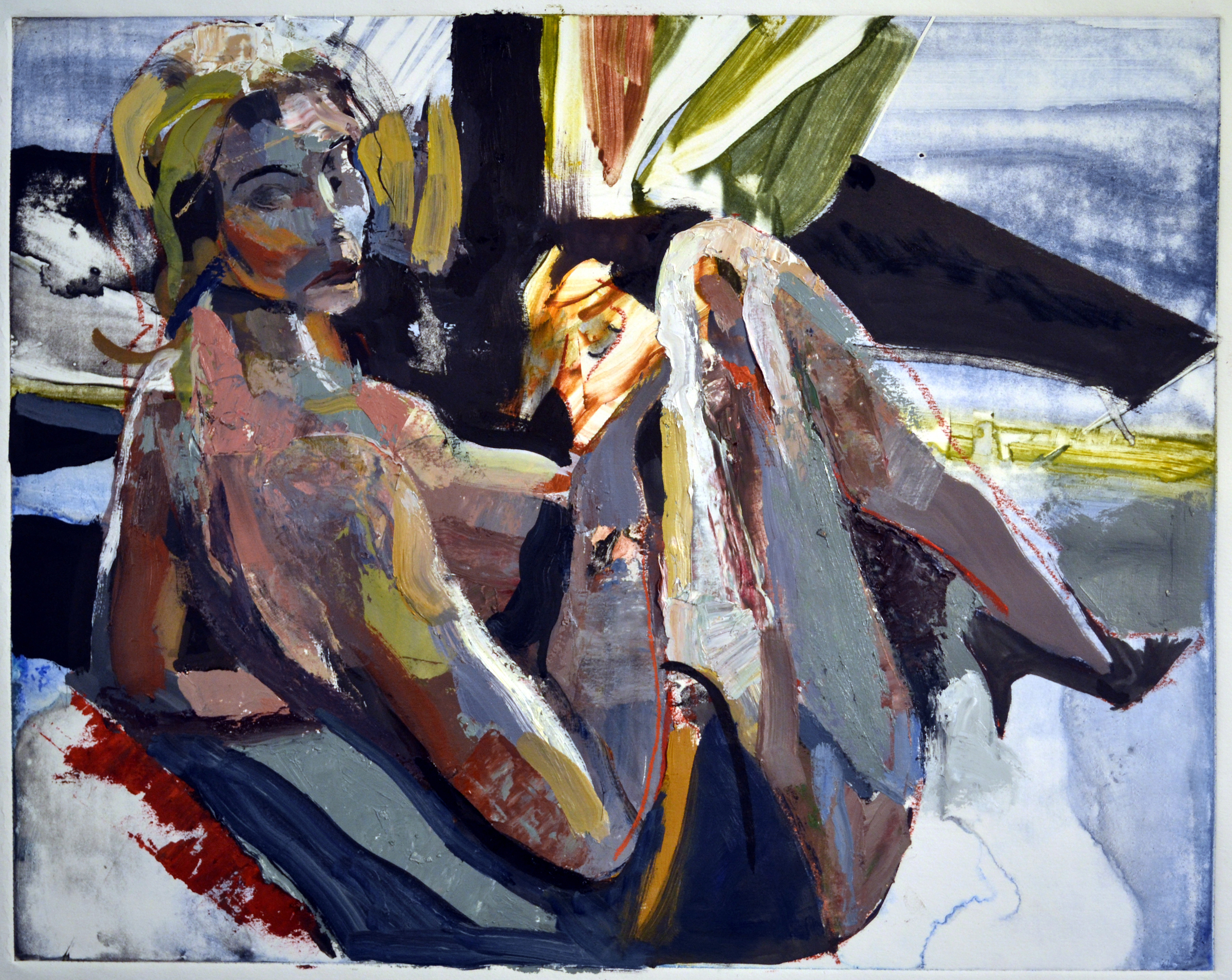
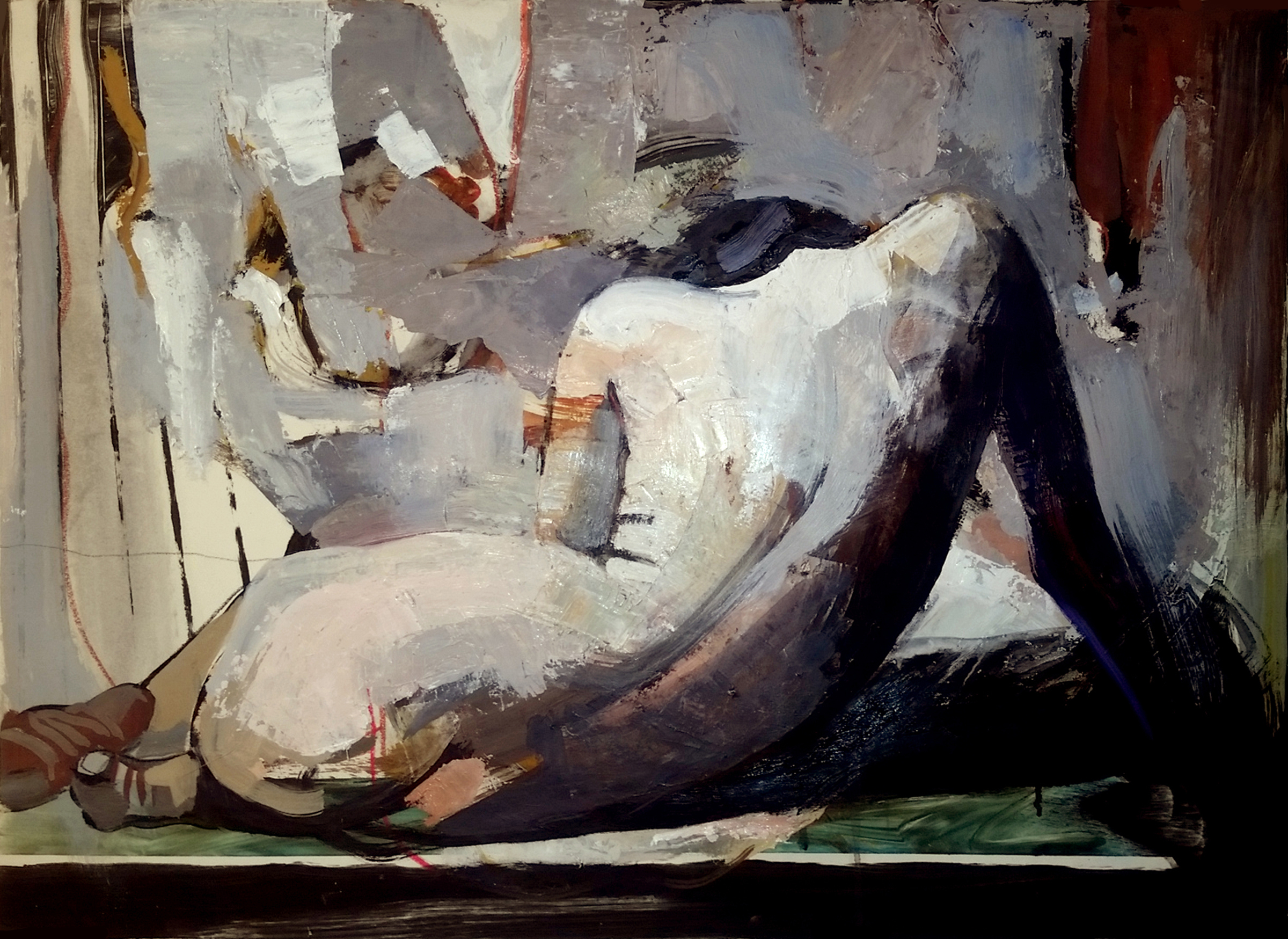
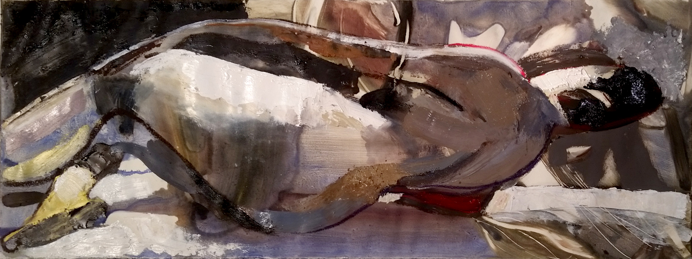
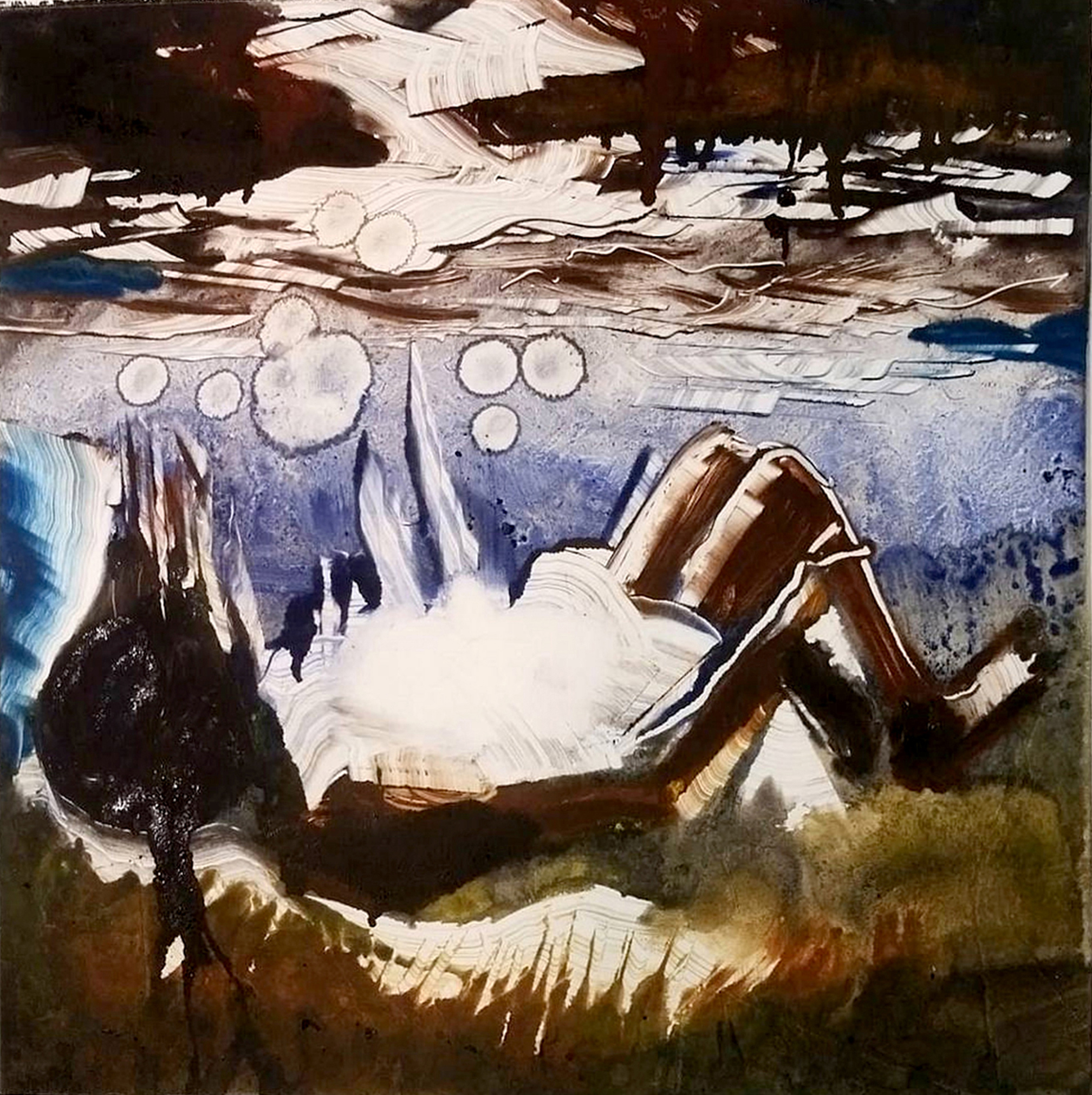
David Feingold was born in Chicago, Illinois in 1951. Feingold works in the medium of digital art. Much of his art is used in conjunction with his anti-stigma awareness campaigns to the lay public as well as professionals and academicians.
Feingold has a varied education and professional background, which along with his personal experience with bipolar disorder, influence much of his art: Bachelors in Art Education; Masters in Visual Design; Masters in Social Work; and a Doctorate in Disability Studies.
His work has been represented both nationally and internationally in both brick and mortar and online galleries. His ultimate purpose in creating “bipolar art” is to present the inner struggles of those with psychiatric disorders and through understanding and acceptance, reduce the stigma and prejudice associated with all mental illness.
Feingold worked for 15 years as a visual designer and 15 years as a school social worker, when he had to take early retirement, due to advancing cognitive impairments stemming from a closed head injury from a hit-and-run accident in his teens. The closed head injury was the genesis of Feingold’s temporal lobe epilepsy and bipolar disorder. He resides in rural Michigan in a simple, one room dwelling, complete with a wood burning stove and a pond in the back yard. Feingold states that his home provides a perfect environment in which to produce his artwork as well as a harmonious balance and stability in light of the unpredictable challenges associated with his diagnoses of bipolar and seizure disorders.
This is Feingold’s second art collaboration. His first collaboration was with a musician/composer, whose music was informed by his own seizure activity as well as Feingold’s art imagery.
Website: www.feinart.me
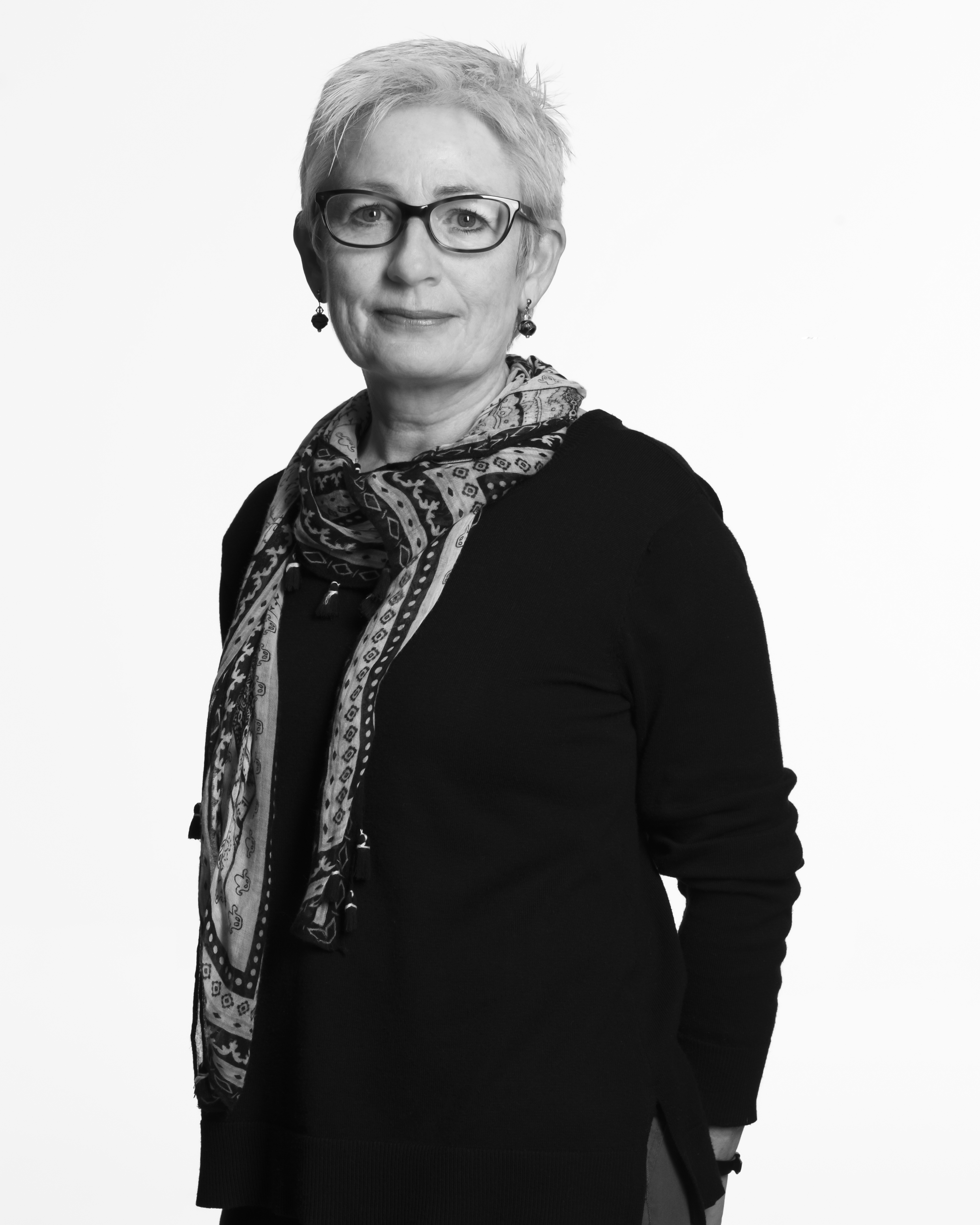
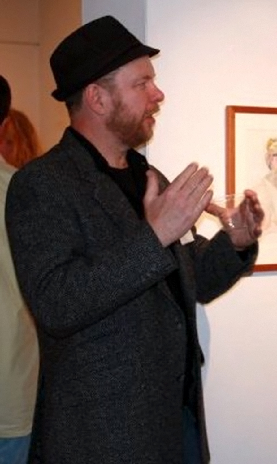
 Artist: Michael Quaintance
How long has “depression” been a central part of your life experience? Before answering, I need to respond to the assumptions and preconceptions that haven’t be voiced, but have proven to be inherent in this kind of question. “Depression” (for me) is a region of sight and insight that exists outside of the constraints of belonging and the constructs of being used to set the terms and conditions of normalcy. I also need to add that I use the term “depression” for the sake of convenience, so that you and I can begin our conversation from a shared point, even though our interpretations will differ at the outset.
So, what is depression… for you? Depression is not—depression does not—depression will not. Is, does and will, belong to form, formality and functionality; the need to assert, discern and determine. What you call depression, I call imposition and the limitation of the unique by mandates of compliance that have little to no tolerance for difference, or that which cannot/will not be defined.
My work, my writing is motivated by this unfinished—recently began—lifelong discussion. Feingold’s images act as doorways, as pathways to those avenues of thought and feeling that have been sequestered in the corners of my efforts to belong and be seen… as. The gift of isolation and aloneness over the past few years, has opened doorways and pathways that I’ve only begun to discover; and in word, design.
Ex-Dancer—Actor, Bachelors in Philosophy and Performing Arts, Masters in Education, presently completing a Doctorate in Disability Studies
Blog: hotsauceanddill.blogspot.com

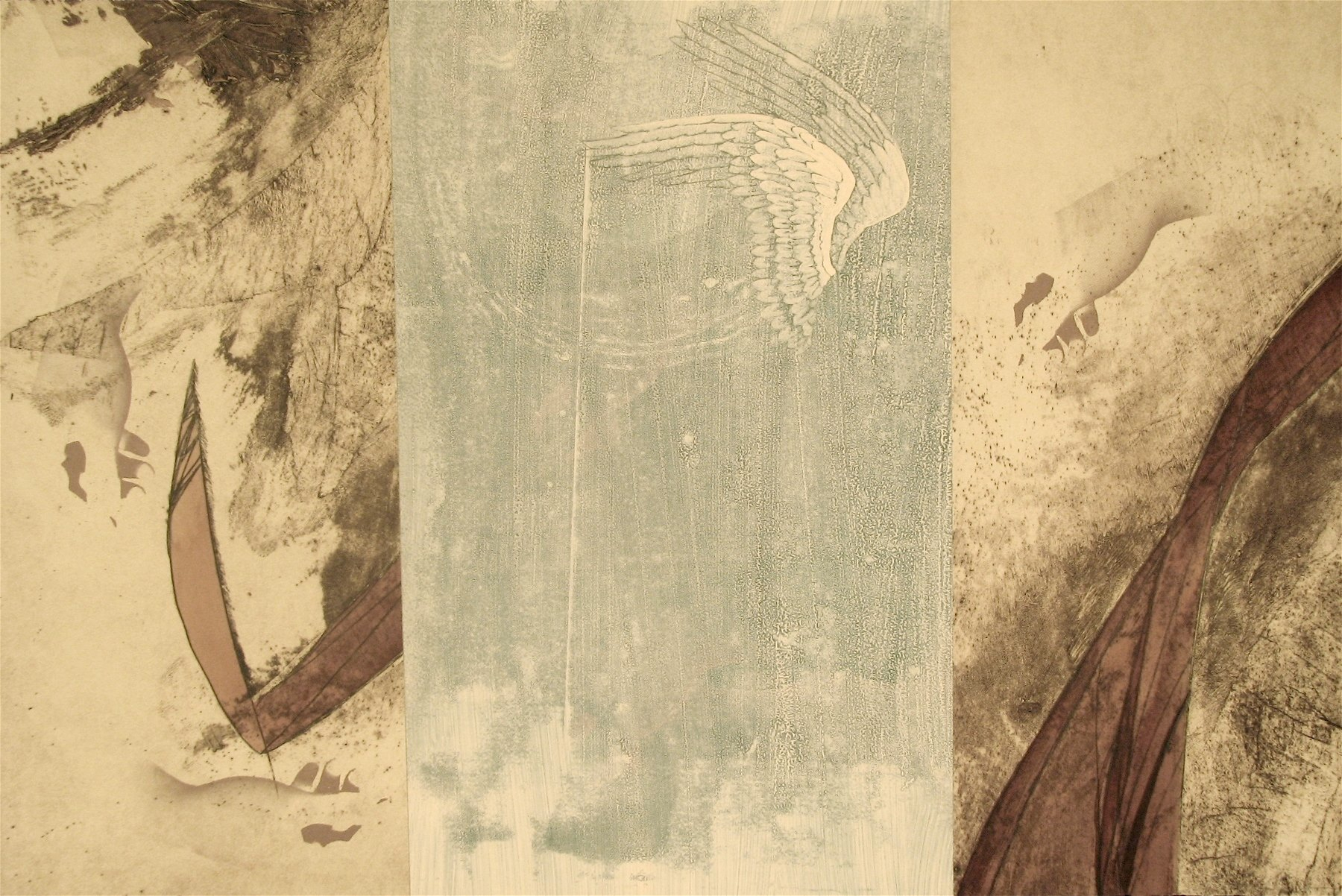

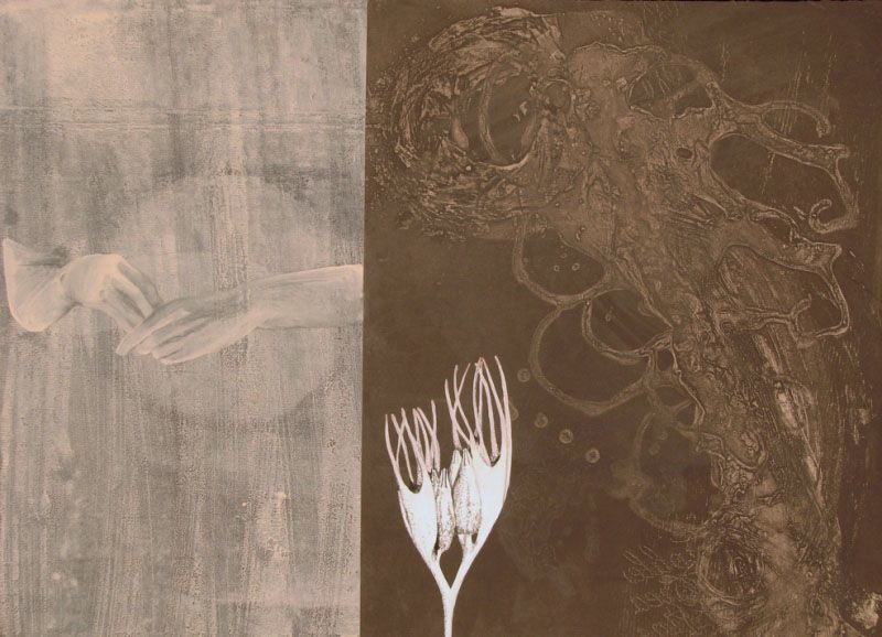

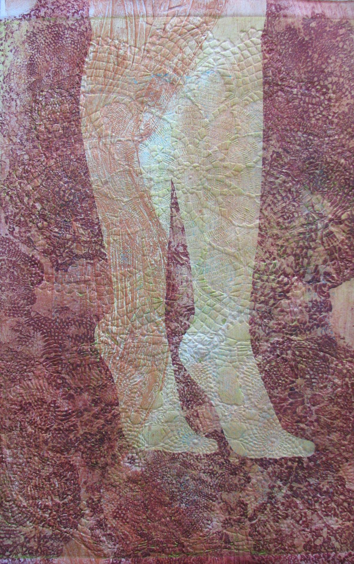


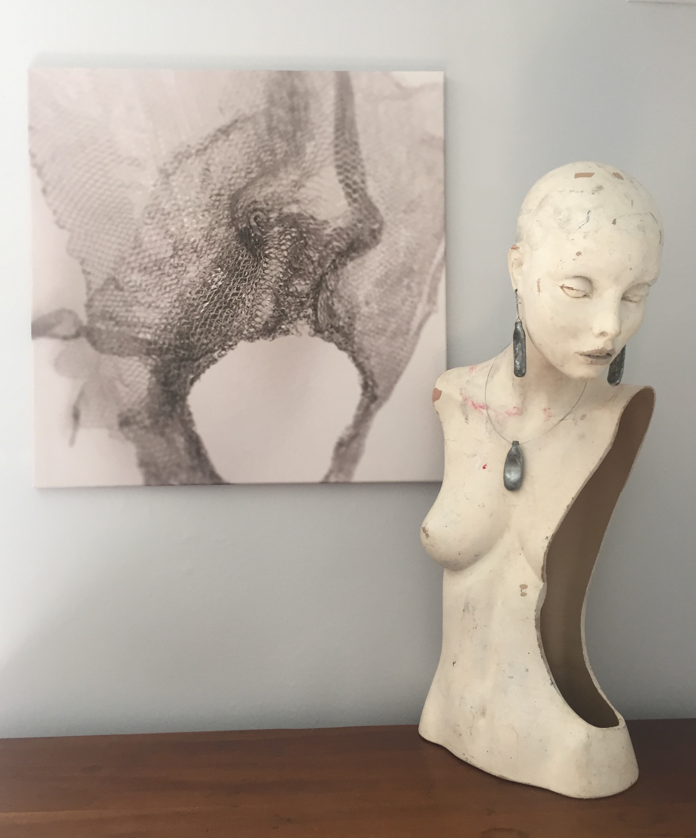
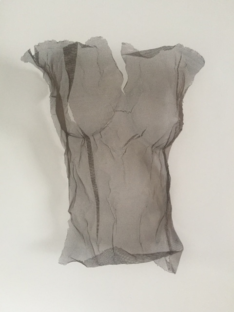
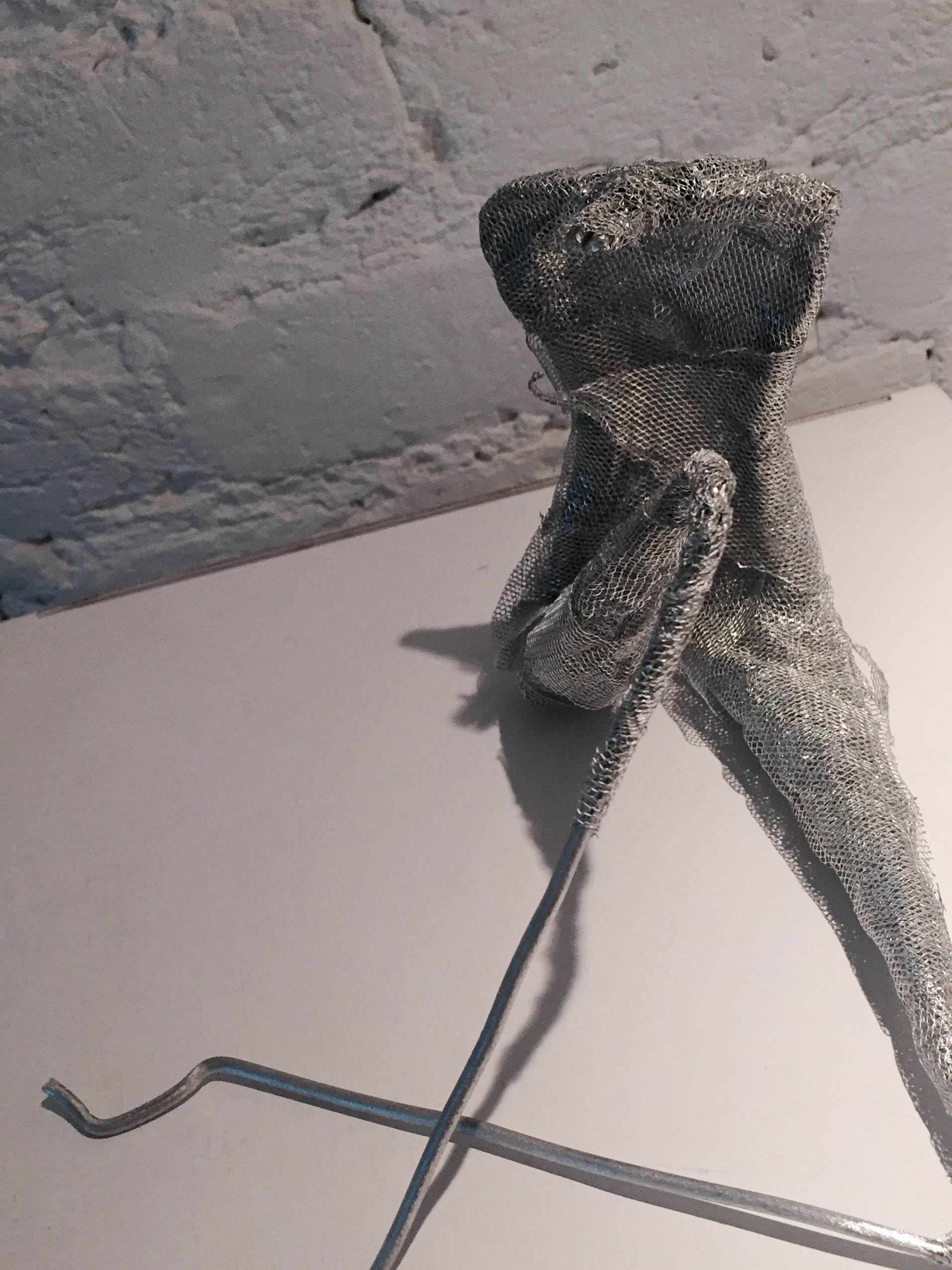
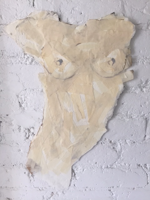
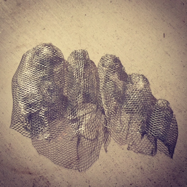
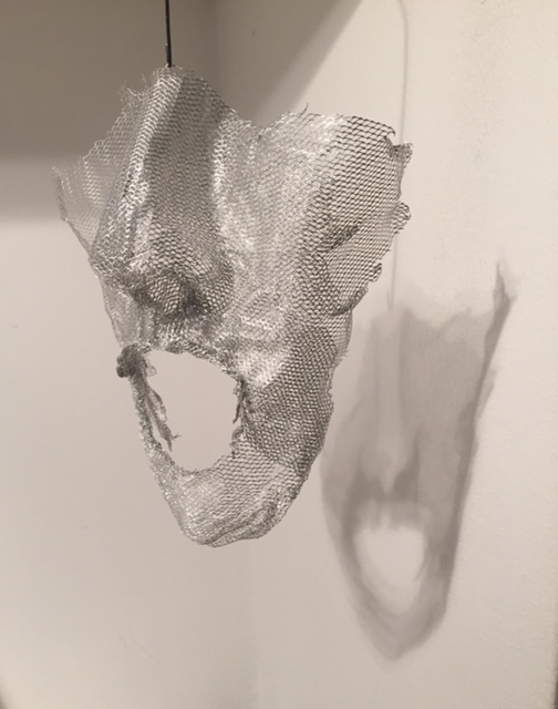
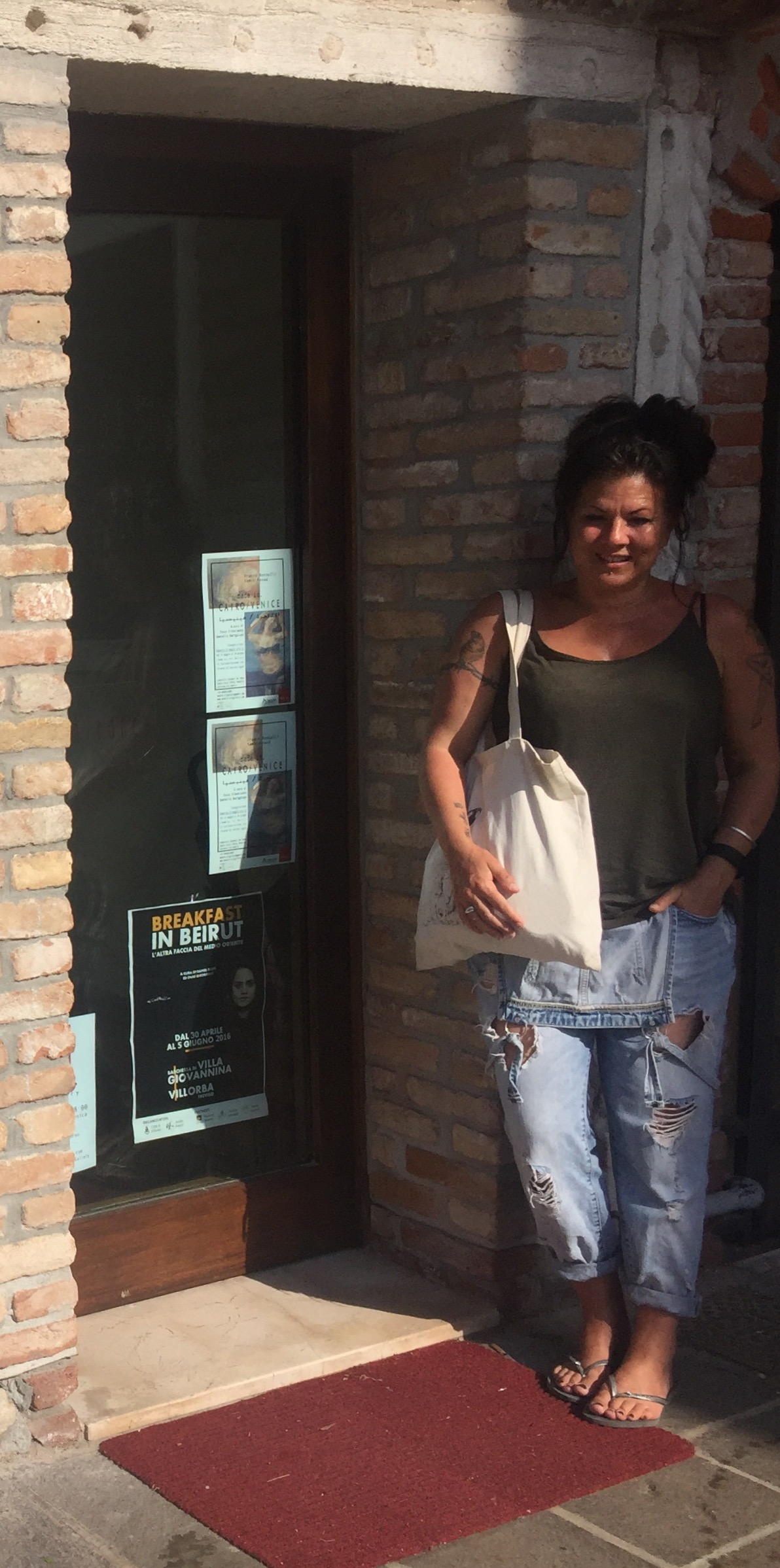
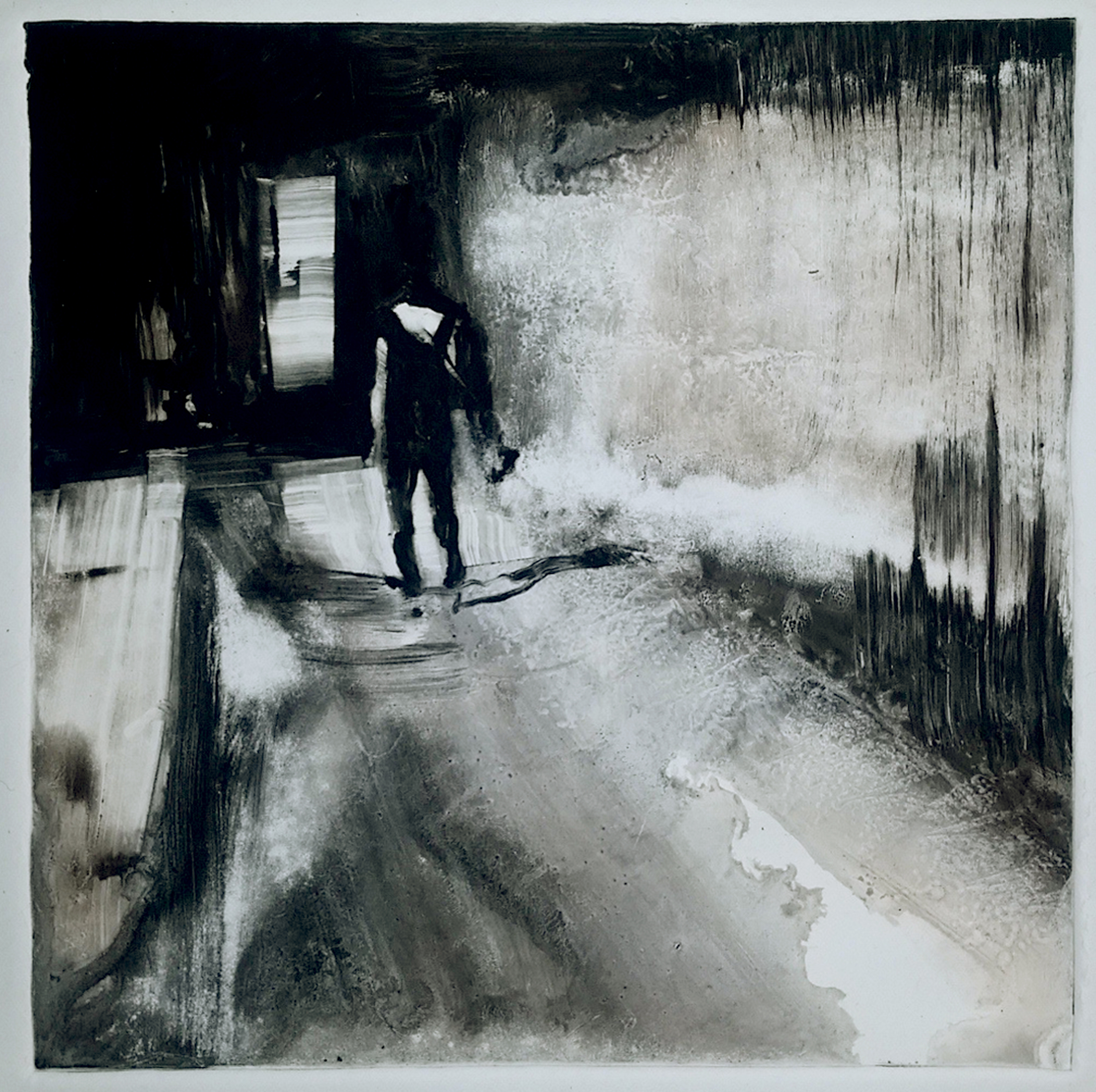
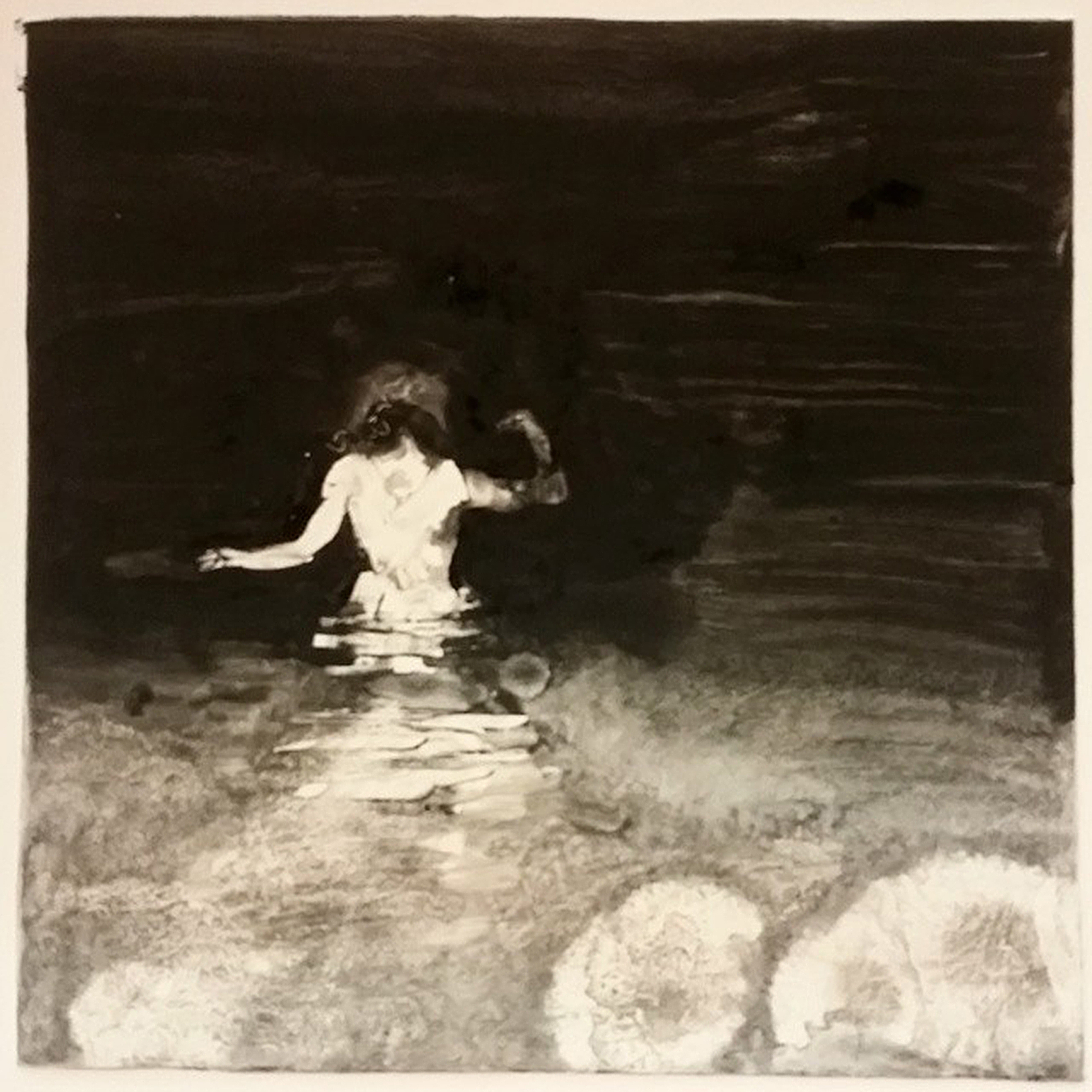
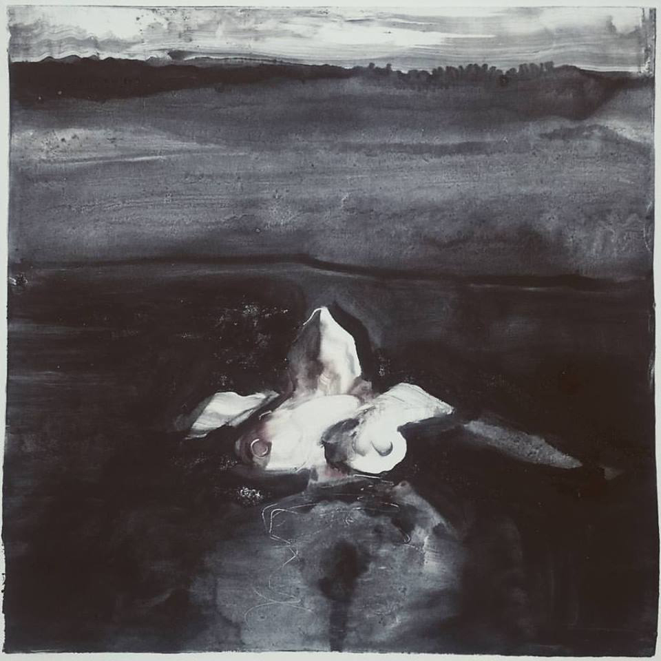
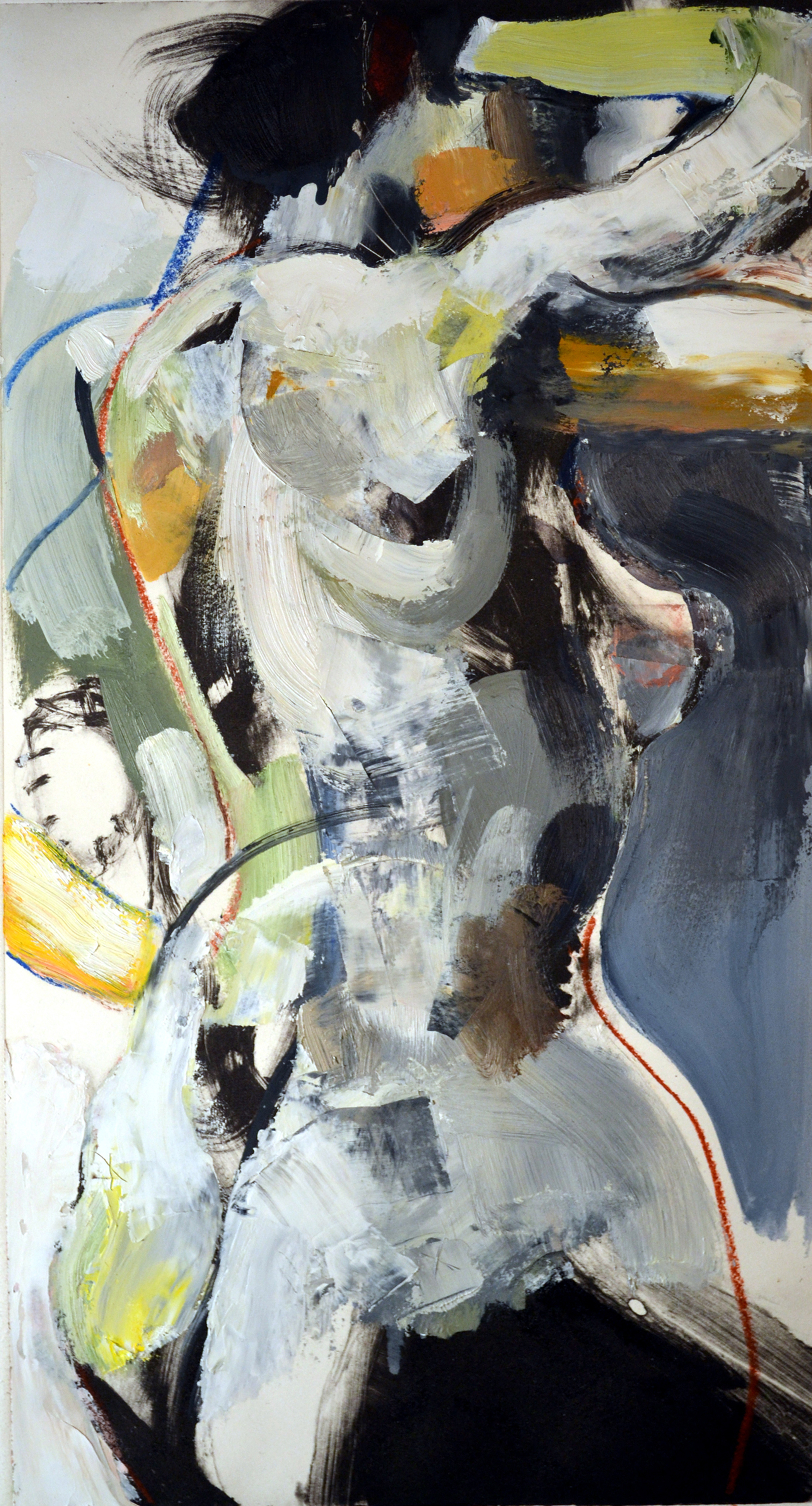
 Susan M Heggestad received her Bachelors of Fine Arts degree in Printmaking from the University of South Dakota, and her Masters of Fine Arts degree, with an emphasis in Printmaking, from SUNY at Buffalo. She creates mixed-media works on paper utilizing collagraph, monotype, screen-printing, and relief processes, as well as larger works in sculpture and installation. Her work has been showcased at the Washington Pavilion of Arts and Sciences in Sioux Falls, the Haydon Art Center in Lincoln, Neb., North Dakota State University in Fargo, as well as numerous other venues. In addition, she is the recipient of several awards, including a South Dakota Arts Council Artist Grant in 2007 and 2011, and is currently on the Artists in Communities and Schools roster for the South Dakota Arts Council.


